GOT A UI/UX
DESIGN PROJECT?

Designing a Sturdy Learning Management System (LMS Platform)
Domain: Edtech
Platform: Web – LMS Platform
Service: UX and UI Design
The Challenge
An acclaimed name among universities in Southern India, approached us to help them go digital – (which is probably the near-future of learning). They were looking for a custom LMS platform that would be used by teachers, students, and parents.
We’d be remiss if we didn’t address the fact that the COVID-19 pandemic has changed the traditional structure of teaching along with the idea of classrooms forever. On a positive note, research suggests that online learning has been shown to increase retention of information, and takes less time.
Creating a custom LMS platform is a daunting task, and without the right planning, a simple project can turn into an incomprehensible jumble. Our challenge was to build an LMS platform that empowered all users across ages and mindsets – from students to teachers, to parents and university admins. The biggest consideration was to build a product that housed multiple users across different levels of digital literacy and technical knowledge without it being too inane for the adults to use or too boring for the younger audience so that they would lose interest.
The Approach
With the immediate shift of all educational services and institutes online during the pandemic, the phrase ‘Learning never stops’ takes on a deeper meaning. We wanted to build a system designed for maximum usability that empowered all users and acted as a solid foundation for all educational needs of all the audiences involved.
The agenda was to create a platform keeping in mind scalable design considerations. We wanted to design screen frameworks, user interface structures, and other components to enable the product to gracefully accommodate new features, new users, and dynamic content, without the need to redesign.
Our final goal was to create an online LMS platform that made the offline-online shift imperceptible.
UX Strategy
With the atmosphere of fierce competition in the industry in the Indian landscape, we wanted to add the value that only our client could give to the product.
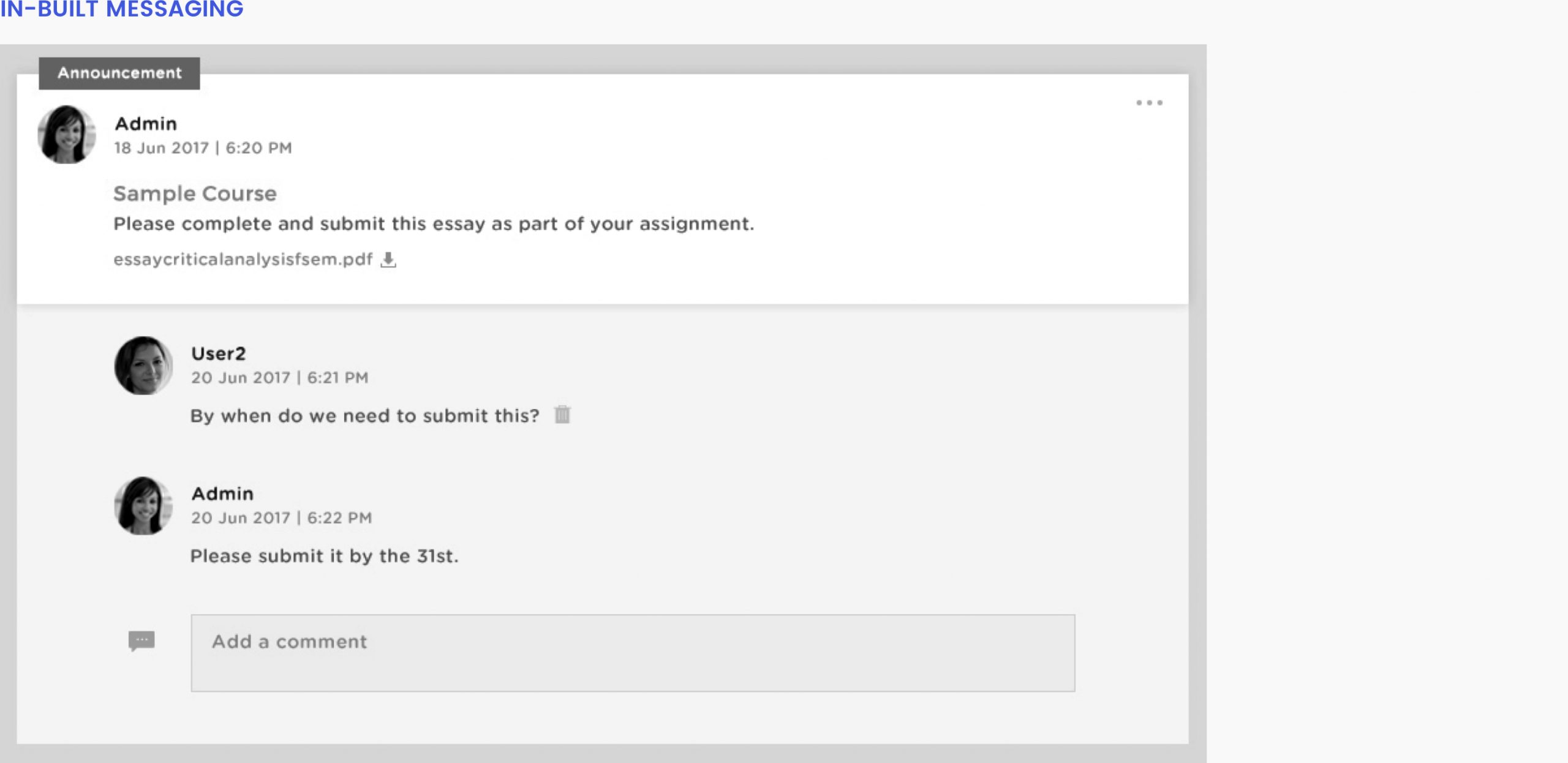
We were intent on using data-driven insights to make sure that all users could gain the maximum potential out of the platform. After extensive user research and competitive analysis, we gleaned that an imbalance between interactivity and communication is what makes most learning systems flat and unable to mirror an offline setup. Since our main goal was to provide a smooth transition from offline to online, we designed each component with that in mind.
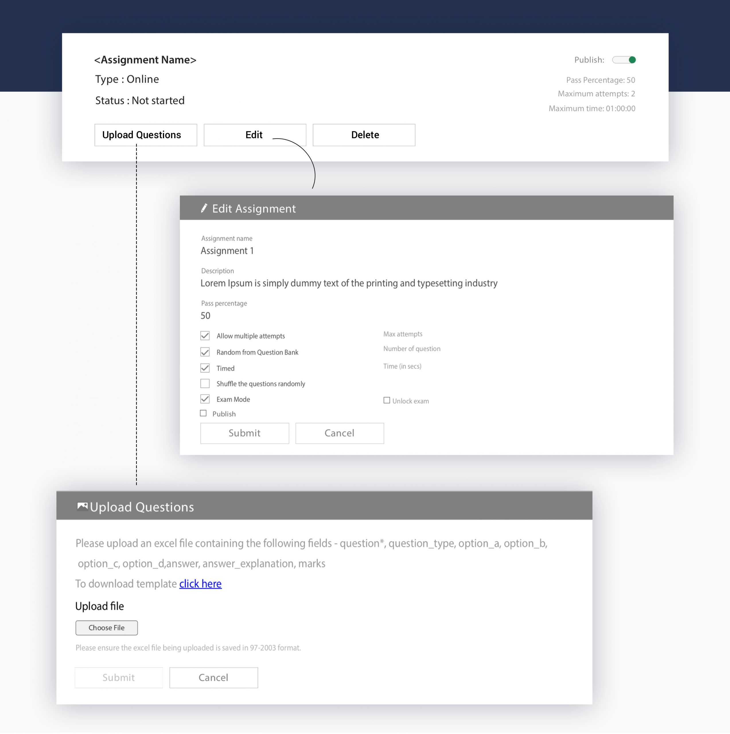
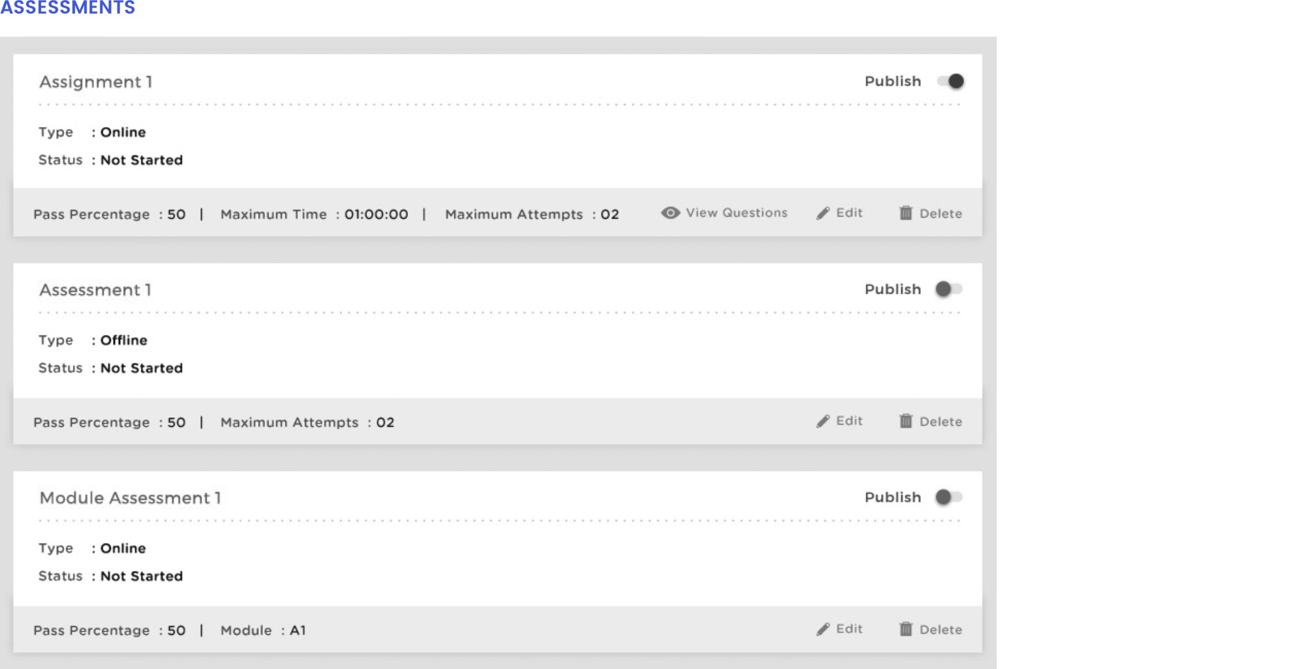
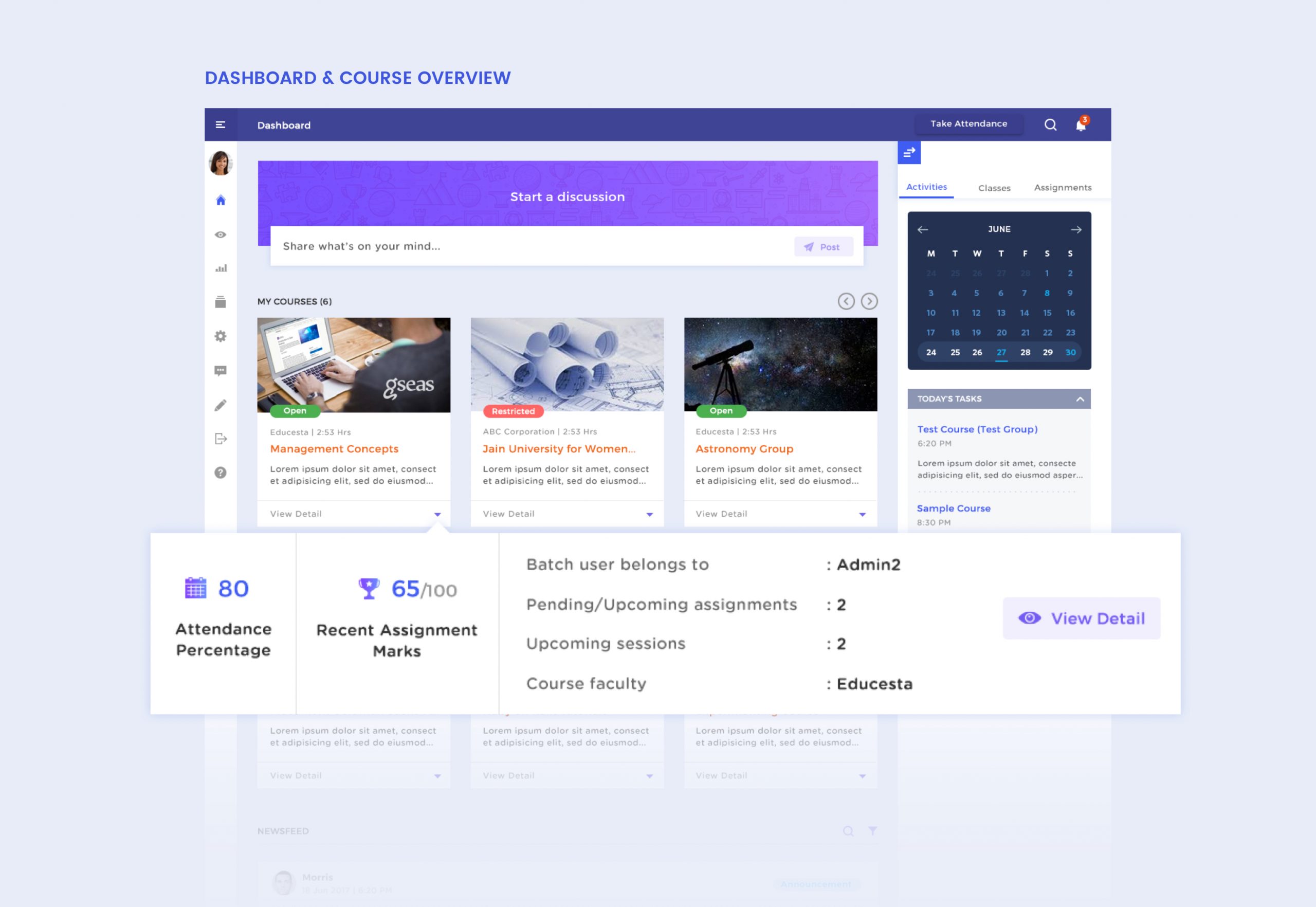
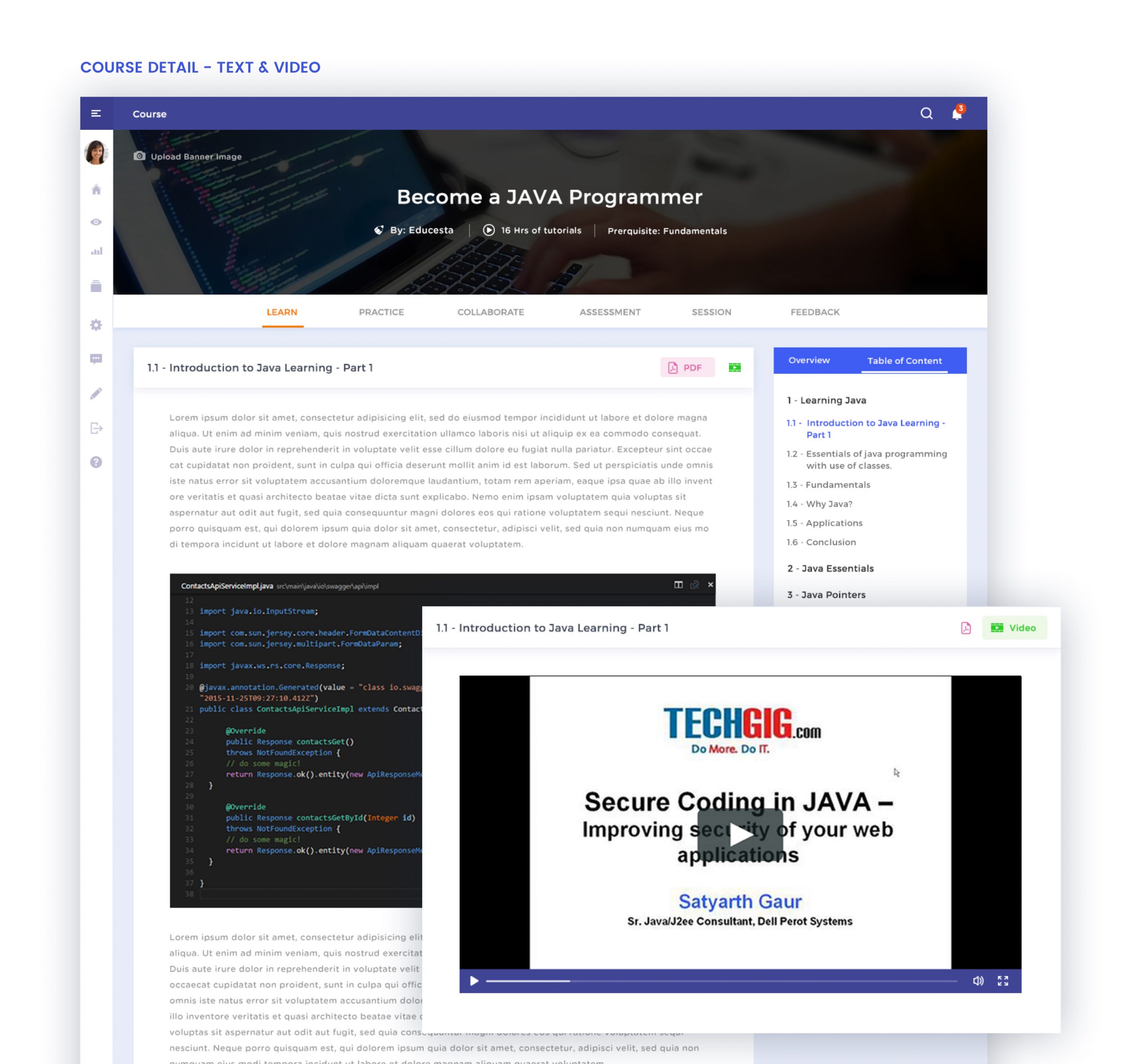
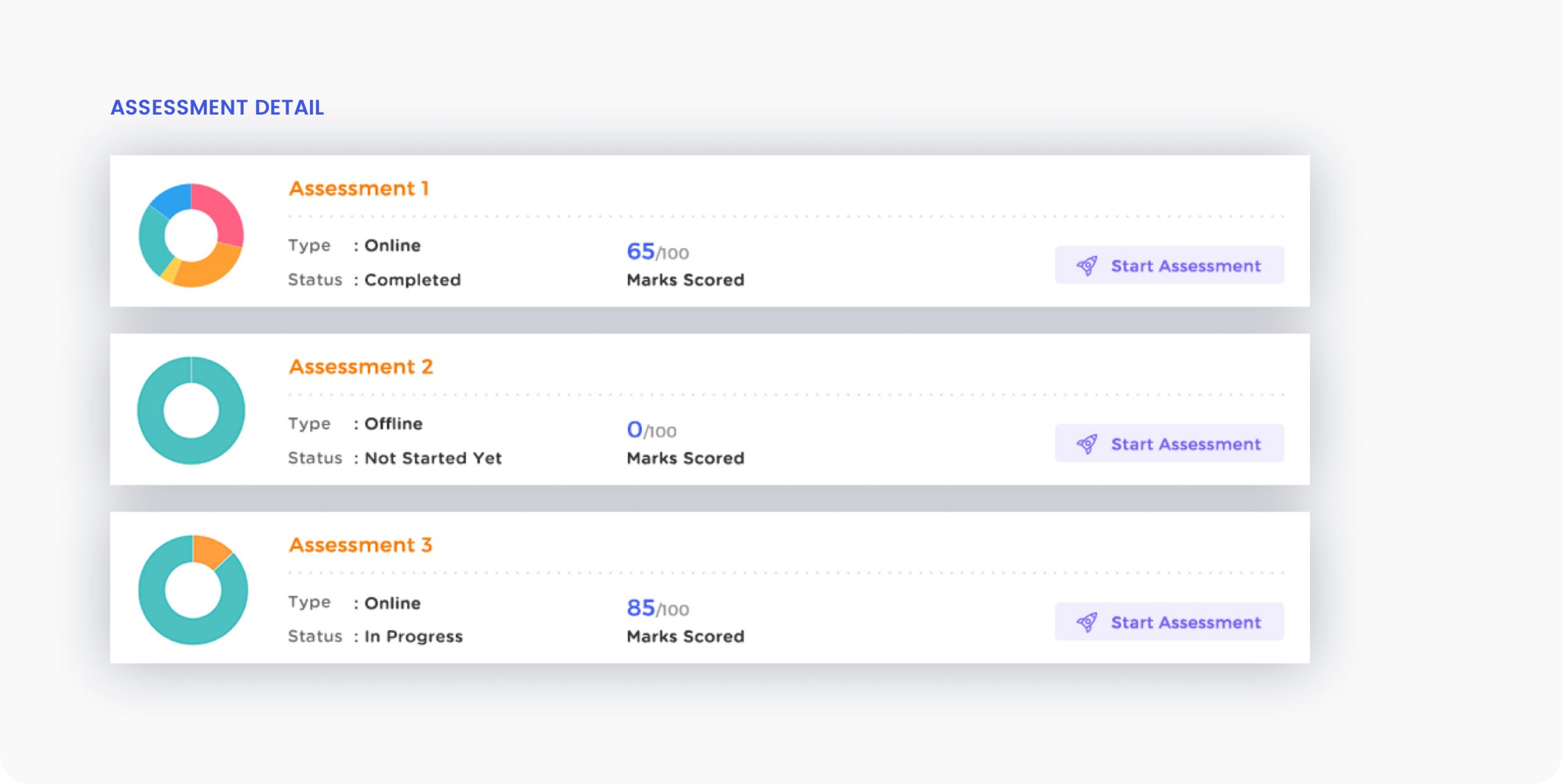
UI Design
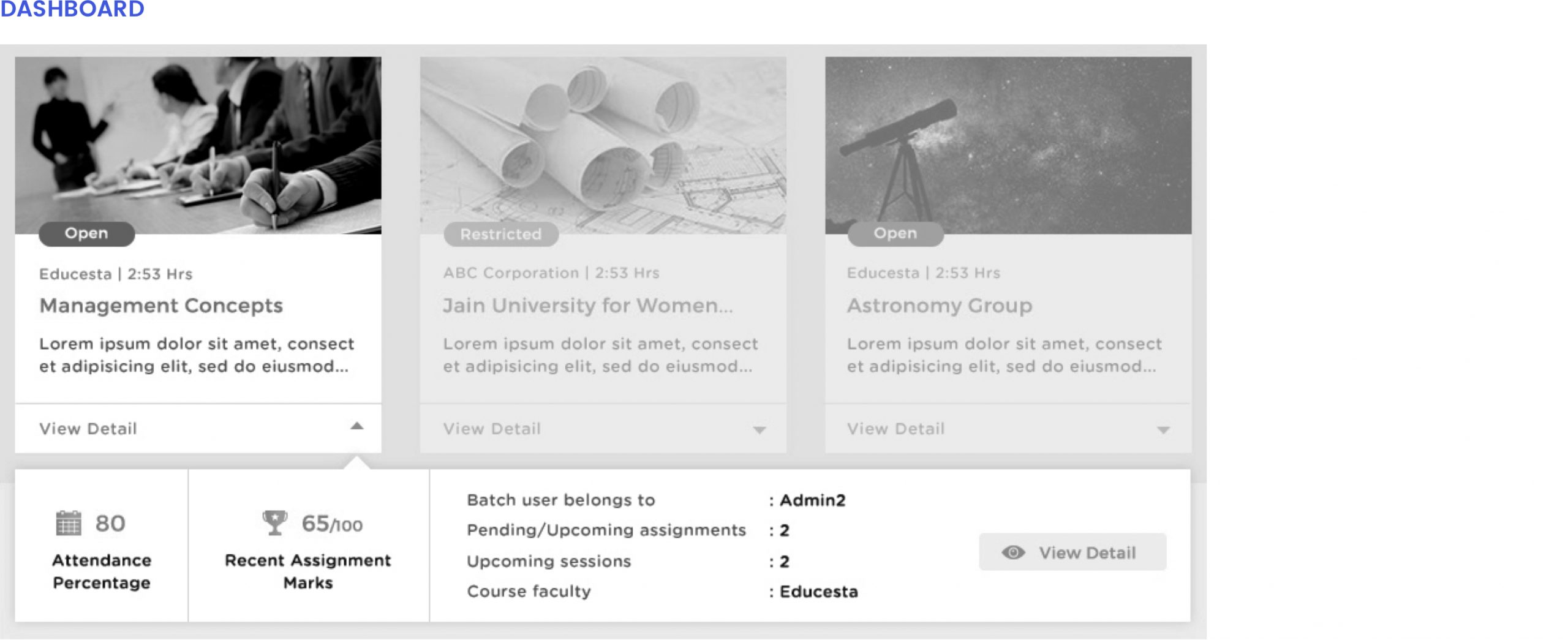
For the user interface and visual design of the LMS platform, we wanted to have a simple and clean layout that presented all information in an easy to consume manner. The defined data hierarchy helped users find what they were looking for in the most straightforward way possible.
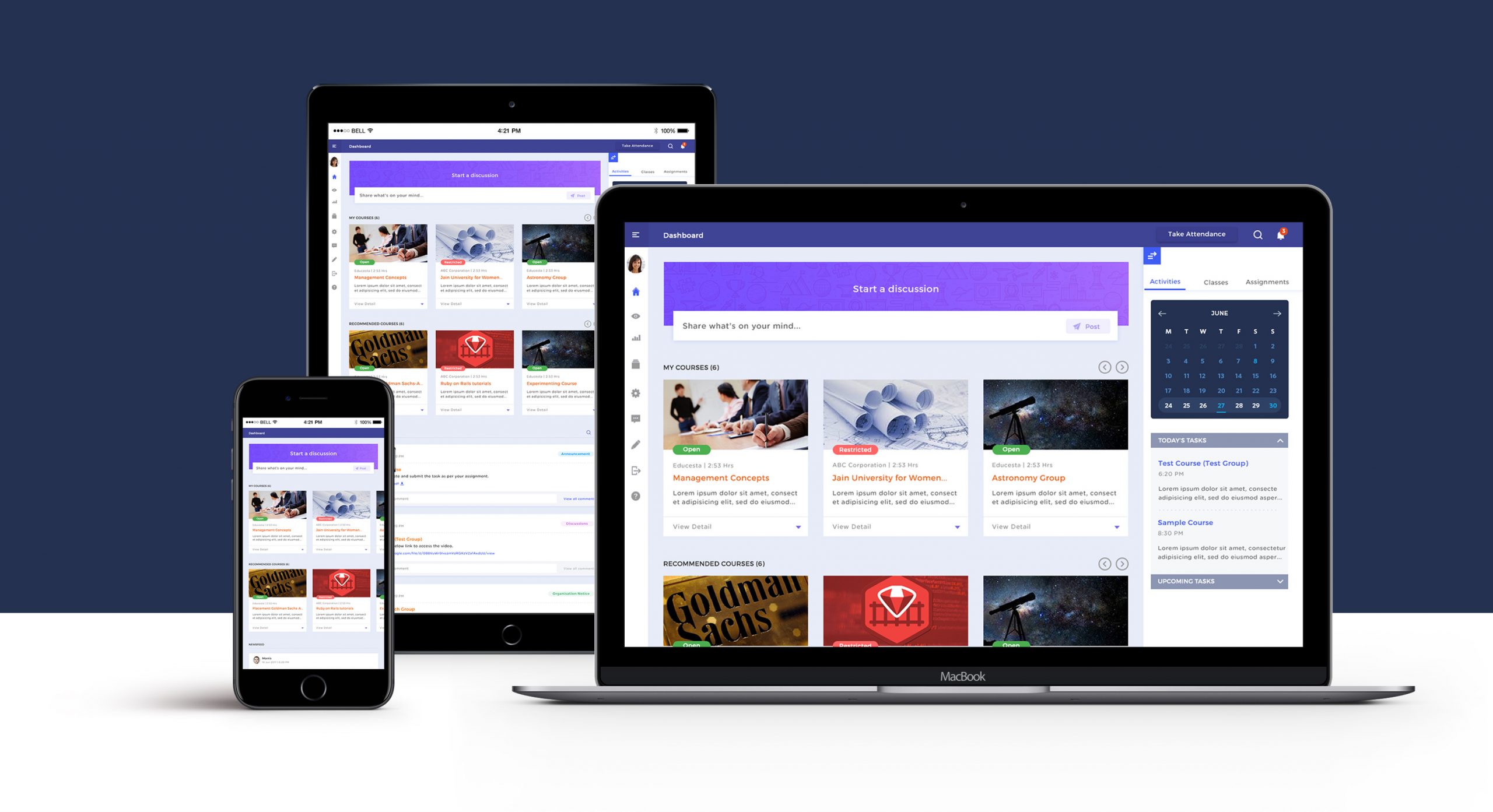
We used a discernable green and red to mark the accessibility of courses to the students. Read more about colours and psychology. The discussion panel was clearly demarcated from the course materials with the use of bold typography. The use of subtle yet simple iconography and easy to read fonts eliminated distractions and encouraged concentration.
Delivering on the Promise
We’re all strangers-no-more to the importance of virtual learning. With the use of our targeted design and extensive user research, we were able to strike the right balance of usability and aesthetics across the age spectrum. The engagement on the platform shot up from 60% pre-COVID to a full capacity of 100%. Not only did our creative collaboration with the established university helped impact the lives of lakhs of students, but it also made the whole journey of their educational pursuits smooth and hassle-free for everyone involved in the process.