GOT A UI/UX
DESIGN PROJECT?

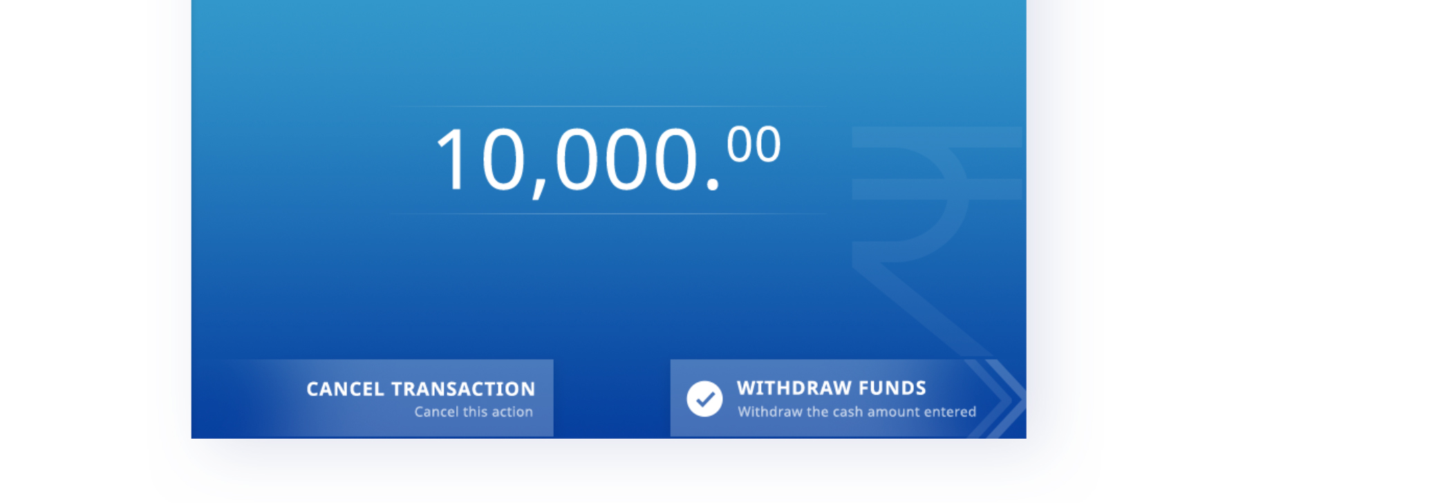
User Interface Design for ATM screens of a Major Indian Bank
Domain: Banking
Platform: ATM Kiosk Screen
Service: UX and UI Design
the challenge
A world leader in consumer transactions approached us to improve the experience of their ATM screens while adhering to the hardware specification for ATM machines.
the approach
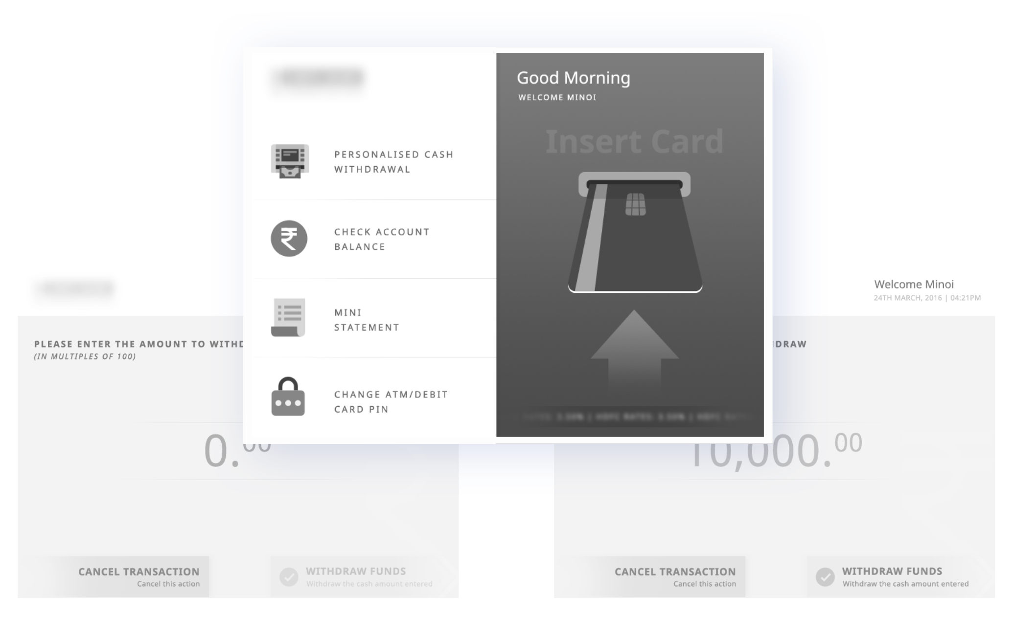
Users have a synonymous experience with ATMs the world over. All user interactions with ATMs need to be quick, clear to the point of no confusion and should have a high success rate. Our goal was to design the ATM screens in a way that the user journey was familiar and hassle-free.
UX Strategy
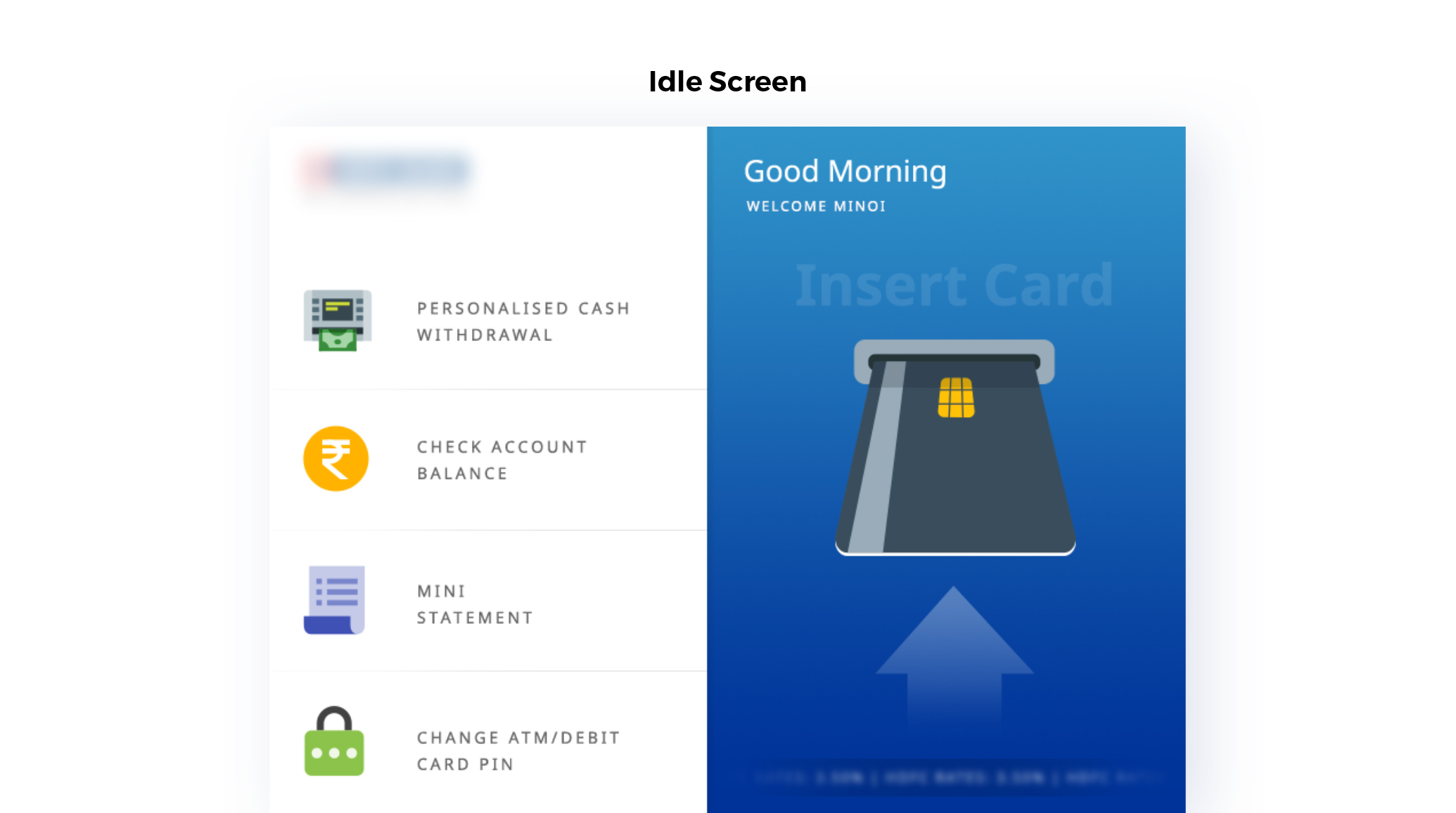
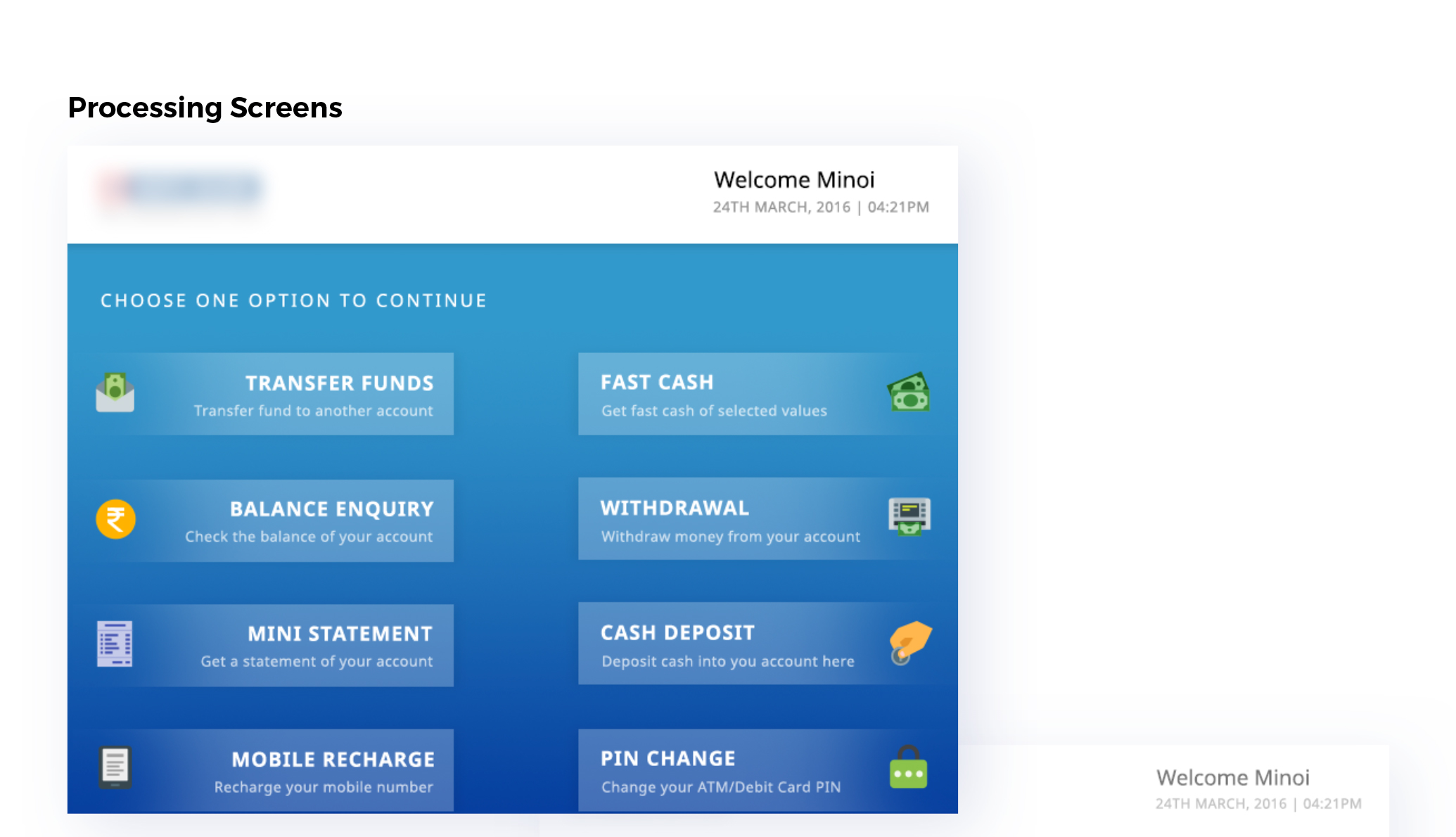
While developing the UX strategy, we had to design an experience using a layout with 8 buttons in fixed positions. We kept the user journey similar to the one users have with other ATMs. We designed a strategy with an aim to enable users to easily access the function they wanted on the main screen. This helped in facilitating faster decision making, while keeping in mind user’s current behaviours while using any ATM.
UI Design
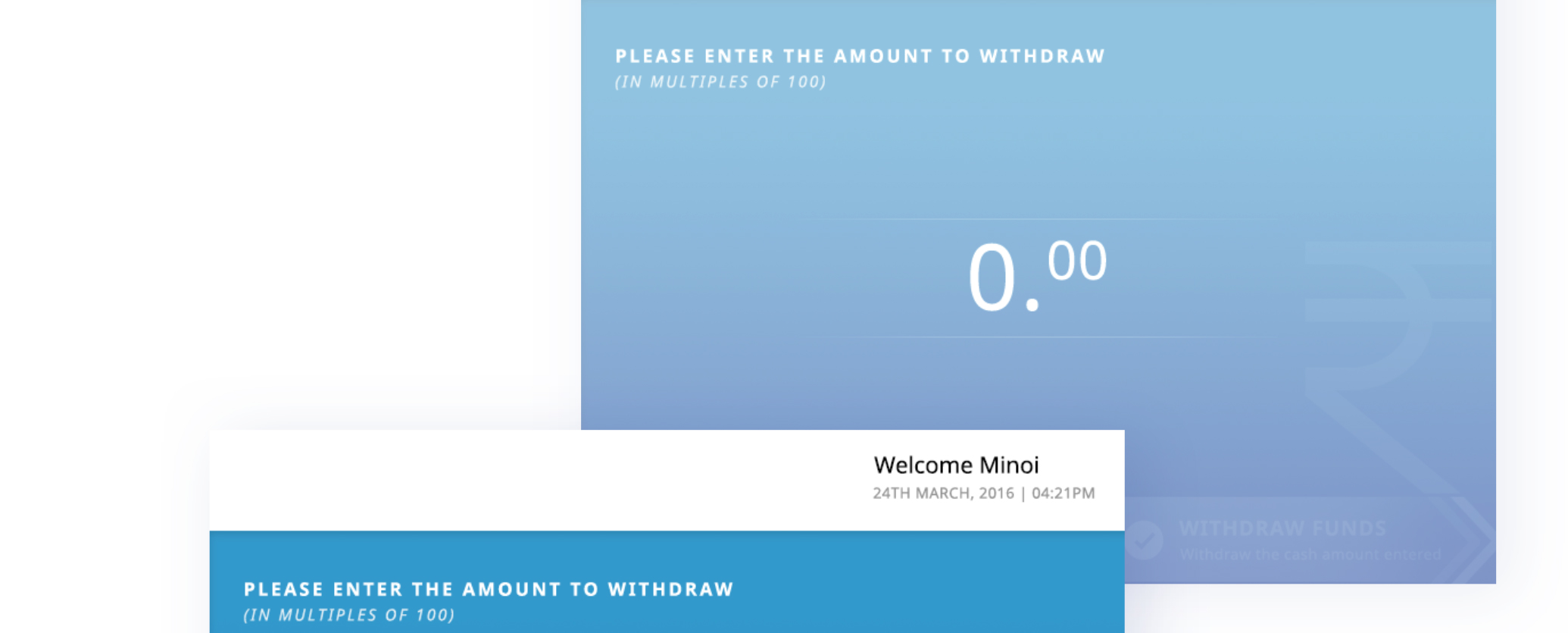
We created a refined user interface that minimised the displayed information. We introduced icons with text descriptions of each function so that users could quickly navigate to the desired function. The new data hierarchy allowed users to make decisions faster and save time while using the ATM.
Getting results & delivering on the promise is what we do best
Our end goal was to increase usability while staying true to the familiar experience of using ATMs for our users. We decreased cognitive load and kept the design intuitive so that it accomplished the task at hand as quickly as possible.