
GOT A UI/UX
DESIGN PROJECT?
7 Warning Signs Your Business Complexity Has Turned Into Product Complexity
Key Takeaways
- Business complexity becomes product complexity when users have to understand how the business works to use the product.
- Business rules create friction when users must figure out which rule applies before completing a simple task.
- Internal language becomes a barrier when users have to translate their goals into the company’s terminology.
- Product growth adds complexity when new capabilities keep adding decisions to common tasks.
- Edge cases become problematic when exceptions start shaping the experience for everyone.
- Product and role boundaries create friction when users must navigate internal structures to accomplish their goals.
- Good product design keeps necessary complexity while reducing how much of it the user has to manage.
Product complexity rarely arrives as one big, obvious problem.
It builds quietly. A new customer type needs another workflow. A new market brings different requirements. Teams add roles, permissions, integrations, configurations, and exceptions as the business expands. Each decision solves something, but each also leaves something behind in the product.
Eventually, tasks that once felt straightforward start asking more of the user. And because the change happened gradually, it can be difficult to tell when a sophisticated product simply became a complicated one.
That distinction matters more than it might seem.
Business Complexity Is Inevitable. Making Users Carry It Isn’t.
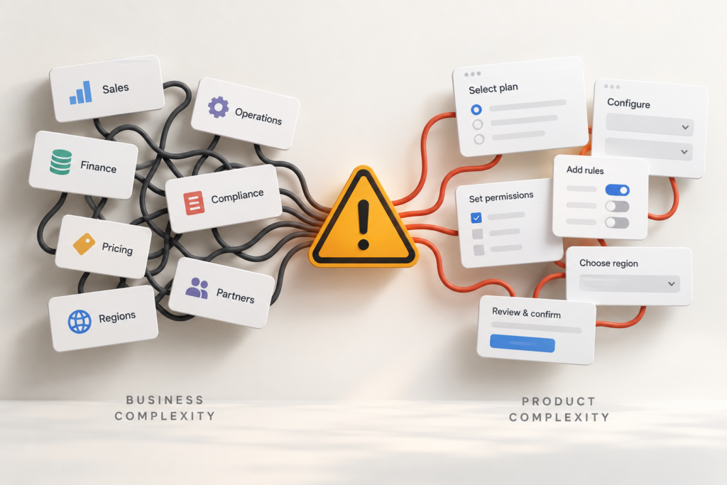
Business complexity is everything an organization has to coordinate as it operates and grows, from how it serves different customers to how its products, teams, rules, and systems work together.
Product complexity is different. It is the complexity people encounter while trying to use the product: the decisions they have to make, information they have to interpret, rules they have to understand, and steps they have to navigate to accomplish a goal.
The two are connected, but they don’t have to grow at the same rate.
Research from the MIT Center for Information Systems Research (MIT CISR) helps make that distinction clearer. In a study of 255 executives, researchers found that some product complexity creates value. In particular, companies with more integration across their product and service portfolios performed better.
But greater product variety also made it harder for customers and employees to get things done, and those difficulties were associated with weaker company performance.
That’s an important distinction for product teams. The goal isn’t to remove complexity simply because it exists. Some complexity is inherent to what the product needs to do:
- A sophisticated permissions system may genuinely need complex access rules.
- A financial platform may need multiple levels of controls.
- A product serving different markets may need to accommodate different regulatory or operational requirements.
The question is where that complexity gets handled.
A well-designed product can absorb some of it, translate some of it, and expose the rest only where it is necessary. When it doesn’t, people start doing more of the work required to make sense of that complexity themselves.
And that shift shows up in recognizable patterns. Here are seven warning signs that business complexity is starting to become product complexity.
1. Business Rules Start Showing Up in Simple Tasks
Business rules become product complexity when users have to understand the logic behind them before they can complete an otherwise straightforward task.
We encountered this while designing an enterprise identity and access management product. Authentication couldn’t work the same way for everyone. Admins and privileged users had access to more sensitive systems and actions, so stronger, multi-step authentication made sense for the level of risk involved.
But that level of friction wasn’t necessary for everyone. Our research showed that end users preferred convenient authentication methods such as QR login and biometrics, particularly for routine access where stronger verification wasn’t always warranted.
The security requirements were legitimate. But imagine making every user decide which authentication method is appropriate based on their role, level of access, or sensitivity of the action. The product would be handing a security decision back to someone who simply wants to log in or complete a task.
That distinction applies far beyond authentication. The same problem appears when users have to interpret eligibility criteria, approval rules, account types, or policies just to know what they can do next.
The warning sign: If a simple task increasingly requires users to understand which rule applies to them, your business logic may be leaking into the experience.
2. Internal Language Becomes Product Language
Every business develops its own vocabulary. Teams need names for products, processes, customer types, account states, service categories, operational statuses, and internal systems. The problem begins when those labels cross into the product without being translated for the people using it.
Imagine an ecommerce customer who wants to exchange a pair of shoes for a different size. To the customer, the task is simple: These don’t fit. I need a size 9.
Behind the scenes, however, the business might distinguish between a return, replacement, variant exchange, refund, or reorder. Those distinctions may determine how inventory, payments, logistics, and the order system handle the request.
Now imagine the product asking the customer to choose:
- Return & Reorder
- Variant Replacement
- SKU Exchange
- Order Modification
Before moving forward, the customer has to stop and figure out which internal definition matches what they want to do.
That’s the problem. The terminology may be perfectly logical to the teams running the business, but the user shouldn’t need to learn the company’s vocabulary before accomplishing a familiar goal.
And it isn’t limited to labels. Internal language can creep into navigation, filters, account types, product categories, order statuses, forms, and error messages, gradually making the product reflect how the organization operates rather than how users think.
The warning sign: If users have to translate what they want to do into what your business calls it before they can move forward, internal language has become product complexity.
3. Growth Creates More Decisions, Not Just More Capability
As products grow, they naturally gain capabilities. More workflows, integrations, user types, configurations, and controls can all be signs that the product is serving more needs.
The problem arises when every new capability also gives the user another decision to make.
Take a project management product. Assigning a task might begin with choosing an assignee and a due date. As the product expands, that same action could gradually involve:
- Which team or workspace?
- Which task type and priority?
- Which workflow?
- Who needs to approve it?
- Which visibility or automation settings apply?
Every option may be useful. But when capability growth consistently adds another choice to common workflows, the product is increasing what users can do by also increasing what they have to decide.
More capability doesn’t have to mean more decisions in every workflow. Defaults, automation, and sensible assumptions can keep common tasks from expanding alongside the product.
The warning sign: If adding capabilities consistently means adding more choices to common tasks, users are being asked to make more decisions simply because the product can do more.
4. Edge Cases Start Shaping the Main Experience
Products need to handle exceptions. The problem starts when an experience designed for the exception becomes part of the journey for everyone else.
Consider an ecommerce checkout. A business may need special rules for international orders, tax-exempt customers, restricted products, business purchases, or unusual delivery conditions. All legitimate. But if those requirements result in every customer seeing extra fields, choices, disclaimers, or steps, the exception is now shaping the standard checkout.
A useful test is simple:
- Who actually needs this field?
- How often does this condition apply?
- Could it appear only when it becomes relevant?
Edge cases don’t have to disappear. They need to stay contextual.
The warning sign: When users who don’t have the exception still have to understand, dismiss, or work around it, an edge case has started becoming everyone’s complexity.
5. One Goal Spans Too Many Product Boundaries
Users think in goals. Products often divide those goals into modules, systems, and areas of ownership.
We saw this while redesigning a D2C marketing platform. A marketer trying to launch a WhatsApp campaign needed customer intelligence, audience segments, inventory context, and campaign controls. But campaign creation involved disconnected screens, while customer, campaign, and inventory information was fragmented across the product.
From the user’s perspective, these weren’t separate jobs. They were all part of one goal: launch the right campaign to the right customers.
That changed how we approached the experience. Campaign creation became a guided end-to-end flow, with customer and segment management simplified and inventory visibility brought into the process where it was needed.
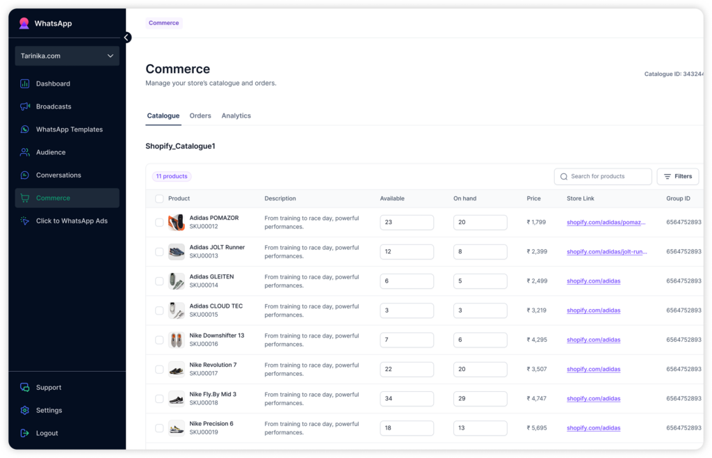
Inventory UI
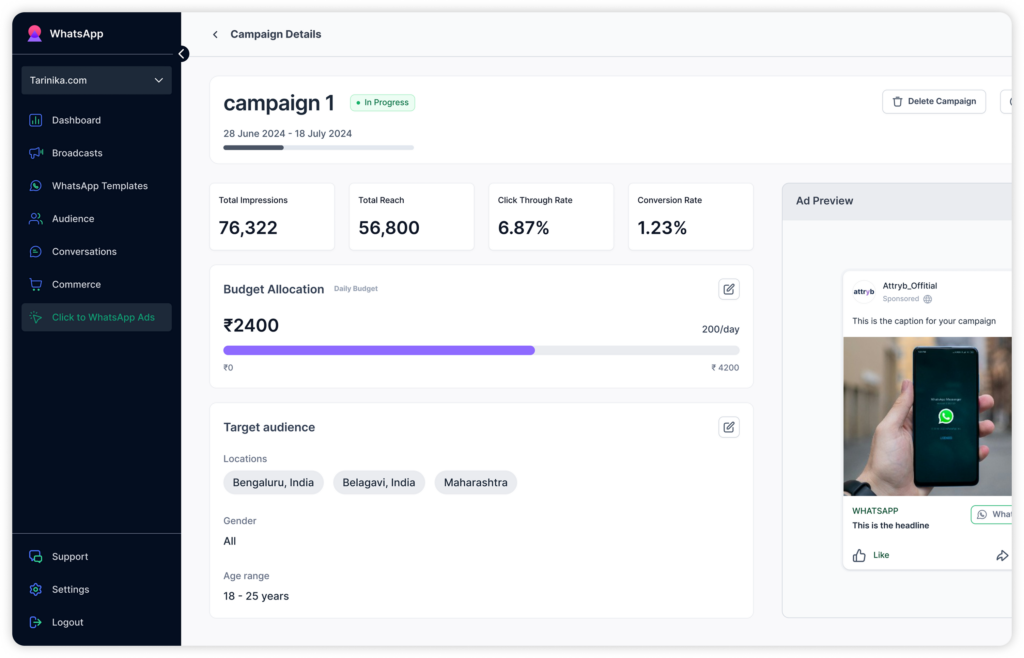
Campaign UI
The warning sign: If users have one goal but repeatedly need to cross modules, sections, or systems to accomplish it, your product may be reflecting how the business is divided rather than how the user’s work actually happens.
6. Role Complexity Starts Dictating How Users Get Things Done
Complex products often need different roles. Someone requests, someone approves, someone administers, and someone acts on the outcome. Those boundaries can be essential to how the business operates.
They become product complexity when users have to understand who owns what before they can figure out what happens next.
Imagine submitting a request and seeing:
Pending Level 2 Approval
The system knows who needs to approve it. The user shouldn’t have to decode what “Level 2” means, find the right person, or work out whether they need to do anything.
A product can instead translate the role structure into something useful:
- What’s happening: Waiting for Finance approval
- Who owns the next step: Finance team
- What you need to do: Nothing right now
- What happens next: We’ll notify you once it’s reviewed
The roles haven’t changed. The product has simply stopped making the user manage them.
The warning sign: If users regularly need to figure out whose responsibility something is before they can understand what happens next, your organization’s role complexity has started shaping their experience.
7. The Product Leaves the Connecting Work to People
Sometimes the product already has everything needed to answer a user’s question. It just doesn’t bring the pieces together.
Say a customer wants to know why an order hasn’t shipped. The order page shows its status, inventory shows availability, payments shows whether the transaction cleared, and shipping shows whether a carrier has been assigned.
The information exists. The answer doesn’t.
So the user has to:
- Gather the relevant information
- Remember and compare what each status says
- Reconcile information that may not tell the same story
- Work out the answer the product could have provided directly
Microsoft Research has documented the difficulty of switching among multiple tasks and contexts. While the research wasn’t specifically about fragmented product experiences, the implication for product teams is relevant: asking users to hold information in mind, compare it, and reconstruct the bigger picture creates work of its own.
The warning sign: If your product gives users all the information but still leaves them to work out what it means together, the connecting work has become their job.
Complex Doesn’t Have to Mean Complicated for the User
At Yellowchalk, we don’t believe in making a complex product simpler by removing what users genuinely need. Strip away too much capability, context, or control, and you haven’t simplified the experience. You’ve weakened the product.
Our job is to decide where the complexity belongs. Depending on the product, that could mean:
- Translating an internal rule
- Setting sensible defaults
- Connecting fragmented workflows
- Revealing exceptions only when relevant
- Bringing related information into context
The complexity may still exist underneath. The user just shouldn’t have to carry all of it.
That’s how we approach complex product design: preserve the sophistication the product needs, without turning it into unnecessary work for the user.
Conclusion
Complexity is often necessary. Making users manage all of it isn’t. The strongest products preserve the capabilities the business needs while making it easier for people to understand, decide, and act. If complexity is starting to get in the way of how people use your product, we can help you design a clearer way through it. Get in touch.
Frequently Asked Questions
1. How can you tell if a product has become too complex for users?
Look at the work users have to do beyond their actual goal. Frequent backtracking, unnecessary decisions, reliance on support, difficulty finding information, and workarounds can all signal that the product is demanding too much from them. User research, usability testing, support data, and product analytics can help identify where that complexity is occurring.
2. Should you remove features to reduce product complexity?
Not necessarily. A feature can be valuable without needing to be visible or equally prominent for every user. Before removing it, consider whether the problem is the feature itself or how it is organized, introduced, configured, or surfaced within the experience.
3. How do you simplify a complex product without limiting its capabilities?
Focus on simplifying the experience rather than reducing what the product can do. Use clear information architecture, sensible defaults, contextual actions, progressive disclosure, and role-relevant workflows so users encounter capabilities when they actually need them.
4. When should you redesign a complex product instead of making incremental UX improvements?
Consider a redesign when complexity is structural rather than isolated. If problems consistently span navigation, workflows, roles, terminology, and information architecture, fixing individual screens may only treat the symptoms. Smaller improvements make more sense when the underlying product structure still supports how users work.
5. How do you know which product complexity is necessary and which is unnecessary?
Ask whether the complexity helps users make a necessary decision, understand important information, manage risk, or complete their task correctly. If it primarily reflects an internal process, technical constraint, organizational structure, or edge case that the product could handle without user involvement, it may be unnecessary user-facing complexity.