GOT A UI/UX
DESIGN PROJECT?
YC Outlook Roundup : April

Do you know what really gets our goat at Yellowchalk? Design myths parading as facts, vague and unsubstantiated opinions, and incomplete research.
So to tackle all that, we started a new series we like to call YC Outlook!
We bust design myths, give you design facts, and get to the bottom of things. And all of this on a weekly basis!
We’re making it easy for you to go through and bringing you monthly roundups with added information and facts!
Read on and let us know what you think!
Myth: Mobile Users are Distracted

Fact-Check
Users prefer a smartphone over other available devices. In a study by Google, 77% of searches on mobile took place at home or at work, where they had other devices available to them.
The percentage of users that simultaneously use another device while using a mobile (57%) is lower when compared to when they use a PC (67%) or a tablet (75%).
This is why mobile-first design is not an option, but a necessity!
Furthermore, mobile engagement is now higher than desktop engagement!
According to reports, US smartphone engagement has overtaken desktop!
Another study shows that mobile has become the go-to device for other activities such as Radio (96% mobile), photos (96%), maps (90%), and instant messaging (90%) are among the many categories to see a huge shift to mobile.
Mobile-only usage is on a steady rise. 30% of Facebook’s active users, for example, access Facebook exclusively from their phones.
Myth: UX and Usability are the same
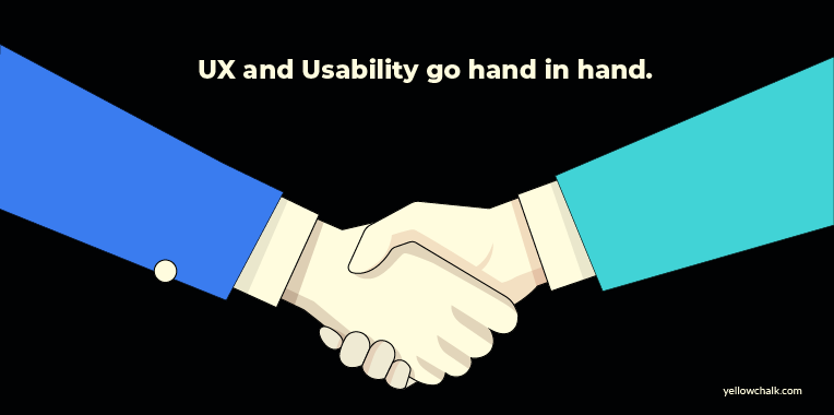
Fact-Check
UX is not the same as Usability.
UX is about how users feel when they use a system/product.
User Experience is concerned with “all aspects of the user’s experience when interacting with the product, service, environment or facility”.
Usability refers to the inherent user-friendliness and efficiency of the product/system interface.
Usability is mainly about the functional part of a product. In short, “Don’t make me think” is one of the typical principles for usability design. Usability mistakes also directly reduce your website conversions.
To sum it up: Usability relates to the ease with which users can achieve their goals while interacting with a product while user experience is concerned with the way users perceive their interaction with that product.
Though they are not the same, usability contributes to UX in a huge way!
Myth: More Choices = Higher Satisfaction

Fact-Check
This might seem like a no-brainer at first. The more choices you have to choose from, the happier you’re going to be. Right?
Wrong. Have you ever found yourself shopping online but getting overwhelmed with the number of choices you have 1) in regards to the shopping app you can use, and 2) in regards to the product you want to buy? (shoes, t-shirts, etc.) That’s exactly what’s going to happen to your user.
Having choices is a good thing and users are satisfied if they are in control of what they do but the more choices product offers, the harder it is to understand the product.
Too many choices lead to “decision paralysis” — a complete lack of ability to make a decision. This leads to frustration, which leads to the refusion of using your product. As the decision time increases, the user experience suffers.
Hick’s Law states that “the time it takes to make a decision increases with the number and complexity of choices”. Thus, Designers should provide an optimal quantity of choices in order to maximize the outcome.
To avoid decision paralysis, simplify choices for the user by breaking down complex tasks into smaller steps, or combine similar tasks into high-end categories.
Myth: It’s always Figma vs Adobe XD
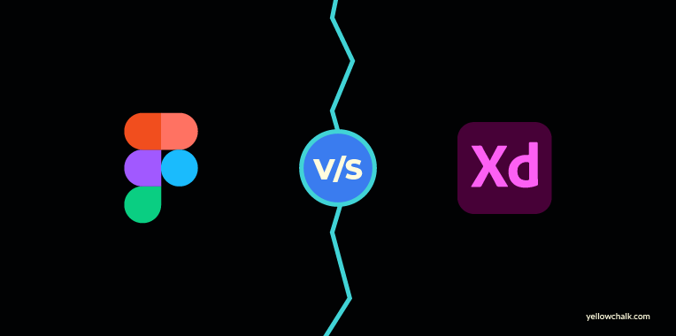
Okay, we’re not going to lie but this one is going to be a close call since designers in our office use both these tools. As any design tool, both Figma and Adobe XD have certain advantages and disadvantages. So we asked one of our designers to give us the advantages of both tools so you can make a decision on which one to use.
Fact-Check
Figma
- Plugins: Figma is a clear winner in terms of plugins.
- Features: Figma is a clear winner in this as well since they take into account all the small things needed to speed up the UI process.
- Symbols: Figma has an edge over Adobe XD in terms of how symbols are managed and also the ease of use.
Adobe XD
- Cost: Adobe XD is more economical than Figma, be it personal or team plans.
- Repeat Grid: The A feature of Adobe XD which is very useful when creating multiple components of the same nature, with different information.
- Prototyping: The helpful auto-animate and voice features in Adobe XD set it apart from Figma.
Let us know what you think of these design myths bust and drop us an email at [email protected] if you want us to dissect any design topics. Also, do check some case studies we have put up from our experience with clients from different domains.