GOT A UI/UX
DESIGN PROJECT?
The Ultimate Font Size Unit Guide for UI Designers
Many novice UI designers ask what size unit they should use for their projects, whether for a website or a mobile application. It can be challenging to determine the appropriate size, and it would be helpful to have a comprehensive guide on the subject. This blog provides the latest guidelines and best practices for font sizes for major platforms such as iOS 15, and Android. These size unit guidelines also hold good for material design and responsive web design. If you’re looking for font size recommendations, this is the page to bookmark.
The internet has revolutionised the media. I’ve found that the most influential change is the ability to communicate in two directions. In the past, we had television and radio, where only you could change the channel or turn it off. You had no influence on the content (unless you worked for a television or radio company) and no ability to respond. It was simple, one direct message.
So, how do we communicate with electronic devices today? I can distinguish voice dialling, keyboard, e.g. physical or touchscreen and pointer, e.g. mouse or finger. Going deeper, we have a user interface with interactive elements and buttons and input fields for gathering more detailed information. In this blog post, we try to answer how to design the best input fields.
Essential Units of Measurement for UI Designers
In UI design, there are various units of measurement, each serving a unique purpose. The units include:
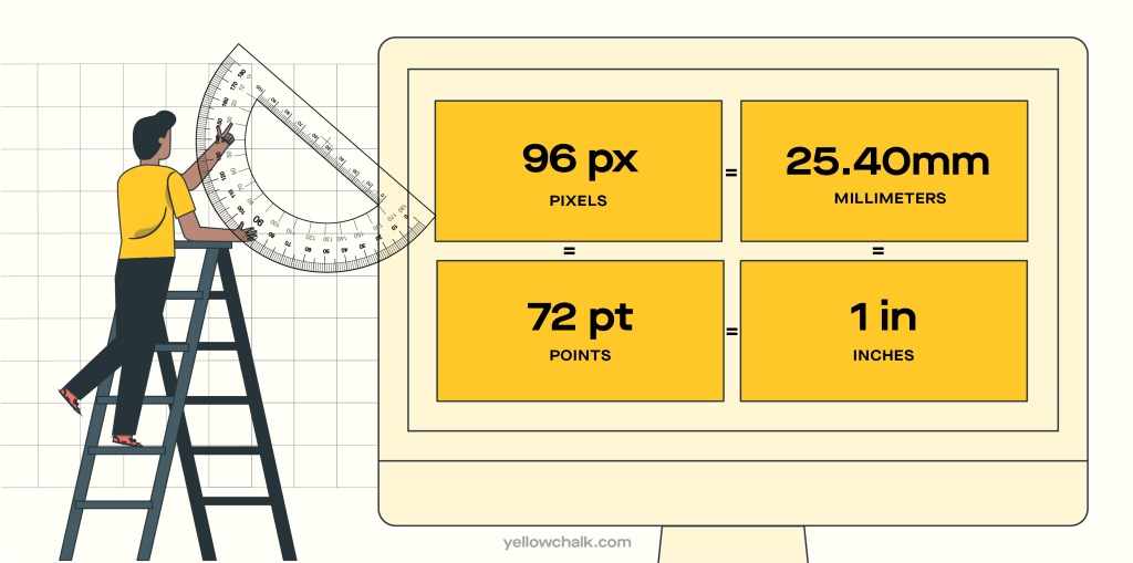
Px – Pixels
Corresponds to the actual pixels on the screen.
in – Inches
Based on the physical size of the screen.
mm – Millimeters
Based on the physical size of the screen.
Pts – Points
1/72 of an inch based on the physical size of the screen.
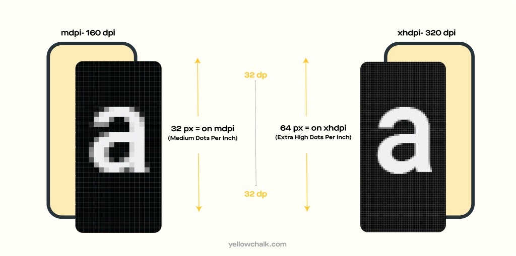
DIPs/DPs – Density Independent Pixels
An abstract unit that is relative to the physical density of the screen. One dp is equal to one pixel on a 160 dpi screen, but the ratio of dp-to-pixel varies with screen density, though not necessarily in direct proportion. Note that “dp” is more consistent with “sp,” though the compiler accepts both.
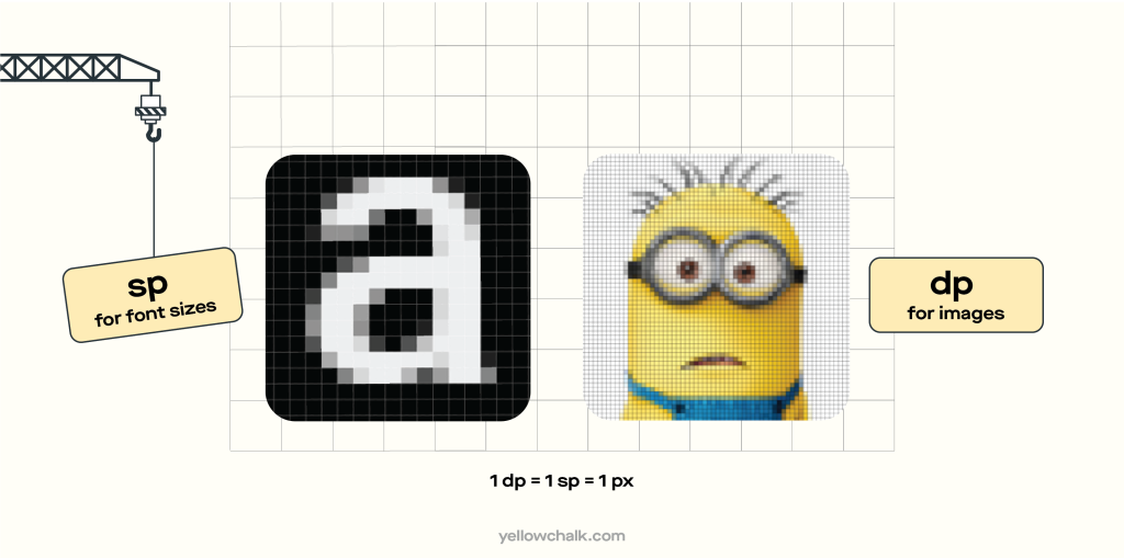
SPs – Scale Independent Pixels
For specifying font sizes that adapt to screen density and user preference, it is advisable to utilize a unit similar to dp but also scaled based on the user’s favored font size.
This unit takes into account the user’s font size setting, making it an ideal choice for ensuring font size consistency across various devices and screen sizes.
Note that the Android documentation is inconsistent on what “sp” stands for, with some referring to it as “scale-independent pixels,” and others calling it “scaleable pixels.”
EMs
EMs(Ephemeral) can be useful for setting padding on a text element in proportion to its size. Each browser has a default font size of 16px, and EMs scale the font size relative to their parent element.
If a font is 16 pixels:
- 1 em is 16 pixels
- 2 ems 32 pixels
- 1.5 ems Is 24 pixels
For example, on Webflow, you can also set the font size on a paragraph’s parent element, like a Div block:
- Select the parent element
- Change the font size (e.g. to 20 pixels) in the Style panel under Typography
When the parent element is 20 pixels:
- 1 em is now 20 pixels
- 2 ems is 40 pixels
- 3 ems — 60 pixels
REMs
Rems are a unit of measurement that is based on the HTML font size.
To calculate a rem value, you take the rem value you want to use and multiply it by the HTML font size, which typically uses the browser’s default font size unless you manually adjust it in your code. One benefit of using rem is that it allows for user preferences for custom text sizes to be respected.
To calculate a rem value, you multiply the desired rem value by the HTML font size, which typically utilizes the browser’s default font size unless manually modified in the code. One advantage of utilizing rem is that it respects user preferences for custom text sizes, allowing for a personalized reading experience.
VH & VW – Viewport Height & Viewport Width
VH is a measurement of the height of the browser’s viewport that scales proportionally based on the height of the viewport.
VW is a measurement of the width of the browser’s viewport that scales proportionally based on the width of the viewport.
VMax & VMin
When it comes to user interface (UI) design, two important factors that greatly impact the overall user experience are VMax and VMin. VMax refers to the maximum viewport size, while VMin represents the minimum viewport size. These concepts play a crucial role in creating responsive and adaptive designs that can accommodate various screen sizes and resolutions.
Designing with VMax in mind allows for the creation of interfaces that scale fluidly to fit larger screens without compromising usability. It ensures that the UI elements, such as buttons, text, and images, expand proportionally to utilize the available space effectively. By leveraging VMax, designers can optimize the user experience for users with larger devices, making the interface more immersive and visually appealing.
On the other hand, VMin focuses on the minimum viewport size and ensures that the UI remains functional and legible on smaller screens. Designing with VMin involves careful consideration of the layout, typography, and interaction elements, ensuring they adapt gracefully to limited-screen real estate. It prevents elements from becoming too small or crowded, which could lead to a frustrating experience for users on devices with smaller screens.
FR – Fractional Units
Fractional units (fr) operate within any element set to a grid.
In a 4-column grid, each column defaults to 1fr, which means each fr is equivalent to 1/4th of the grid. When adding a column, each fr becomes equal to 1/5th. You have the ability to modify these values, such as setting the first column to 2fr. Fractional units automatically scale elements, ensuring that all calculations, including column gaps, are done automatically.
Character Units
CH is great for sizing something like a paragraph or a heading to limit the number of characters someone has to read per line.
For example, If a paragraph has a maximum width of 60ch, it takes the selected font (the paragraph’s typeface) and sets the paragraph’s boundary (its box) to equal the width of 60 zeros.
CH lets you set the width of a text element when you’re trying to limit the number of characters (based on the width of the font’s zero character.)
What is the difference between px, dpi, dp and sp?
In the world of web and mobile design, it’s crucial to understand the various units of measurement used to define size and resolution. Four commonly encountered units are “px,” “dpi,” “dp,” and “sp.” Each of these units serves a specific purpose and is essential for creating visually appealing and responsive designs.
- Pixels (px): Pixels (px) are the fundamental unit of measurement in digital design. A pixel represents a single point of color on a screen. In web design, pixels are used to define the exact size and position of elements on a webpage. The size of a pixel is fixed and does not change with screen density or zoom levels. However, it’s important to note that pixel sizes can appear differently on screens with varying pixel densities.
- Dots Per Inch (dpi): Dots Per Inch (dpi) refers to the measurement of resolution, specifically the number of dots or pixels that fit within one inch. It primarily applies to printed media and physical output devices such as printers. A higher dpi value indicates a higher resolution and results in finer detail and smoother images when printed. However, screen-based design does not directly apply DPI (dots per inch) since screen resolution is typically fixed and cannot be adjusted.
- Density-independent Pixels (dp or dip) find application in mobile application development, particularly for Android platforms. These units, which are resolution-independent, ensure consistency across various screen densities. The dp unit functions as a virtual pixel that scales according to the screen density of the device. This ensures that elements maintain visual consistency across different devices, regardless of their pixel densities.
- Mobile application development utilizes Scale-independent Pixels (sp) for defining font sizes. Like dp, sp is a density-independent unit that adjusts according to the user’s preferred font size settings on their device. This guarantees that text remains legible and accessible, accommodating users with varying visual needs.
How Image Resolution Affects Print Size
The print size of an image is determined by its resolution. A resolution of 300 pixels per inch means that 300 pixels from the width and height of the image will be packed into every inch of paper when printed.
To calculate the actual print size, you divide the width and
height of the image in pixels by the resolution value. For example, if your image has a width of 6016 pixels and a resolution of 300 pixels/inch, the image will print at a width of approximately 20.053 inches. Similarly, if the height of the image is 4016 pixels with a resolution of 300 pixels/inch, the printed height will be roughly 13.387 inches.
Why Image Pixel Dimensions are Important

Although people often claim that image resolution is not significant for on-screen images, it is still crucial to ensure that images contain enough pixels to prevent pixelation, which can cause images to appear blurry or grainy, with individual pixels becoming visible. To maintain image clarity and prevent pixelation, it is advisable to use images with sufficient resolution.
Final Thoughts
Choosing the optimal font size is vital in UI design. Consider factors like screen size, viewing distance, and user demographics. It’s crucial to understand the difference in typeface sizes between digital and print media, as pixels are perceived differently. Legitimacy should not be compromised on either medium. Prioritise readability, establish hierarchy and use responsive design, effective white space, and contrast. Test and iterate based on user feedback.
By following the principles and best practices outlined in this guide, UI designers can select the optimal font sizes to enhance the readability and usability of their designs, ultimately improving the overall user experience.
Got some more useful tips for ui dashboard design? Get in touch with us, we’d love to hear your thoughts.