GOT A UI/UX
DESIGN PROJECT?
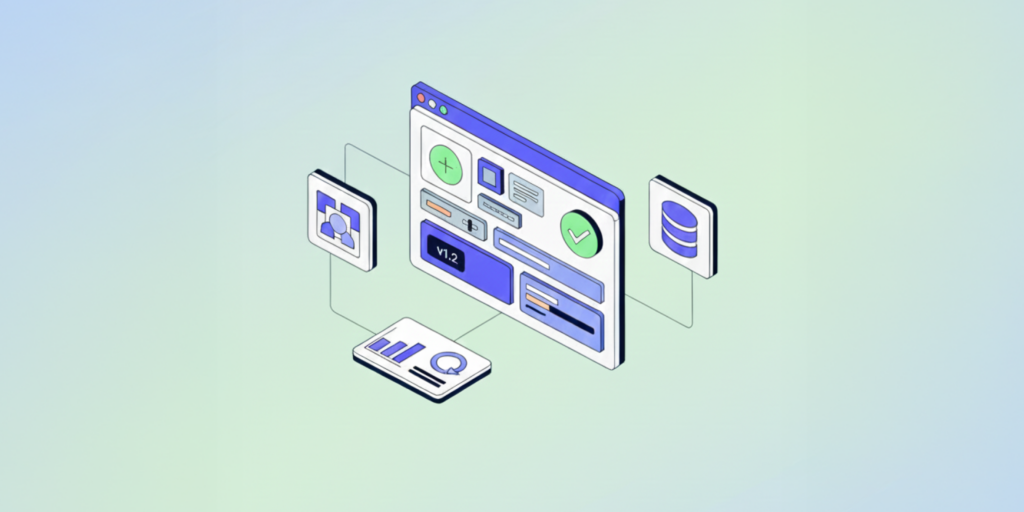
Design Tokens: A 20-Minute Checklist for Frontend Teams
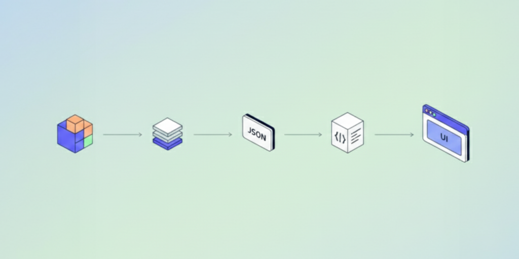
Design tokens are the smallest building blocks of a scalable design system. They translate every visual choice – colors, typography, spacing – into reusable, machine-readable variables. If you’ve ever struggled to align Figma with production CSS, tokens are the missing link.
Here’s your 20-minute design token checklist to bring order to chaos:
- Inventory existing styles.
Export your current colors, fonts, and spacings from Figma or CSS. Redundancy is your biggest enemy. - Merge duplicates.
If two blues look identical on-screen, pick one and deprecate the other. Less variance = faster design. - Name with purpose, not value.
Use logical naming like color.primary or text.heading.large. It’s easier to read and refactor. - Tokenize states.
Add tokens for hover, focus, and disabled. Accessibility and consistency live in these micro-interactions. - Automate the sync.
Use tools like Tokens Studio + Style Dictionary to bridge Figma and code. Every token update should auto-sync across platforms. - Document your logic.
A token without context is a variable without meaning. Write one-line intent for each: “Used for brand highlights,” “Used for error states,” etc.
Tokens make your design system flexible, not fragile.
Related: Design Systems in 2025