GOT A UI/UX
DESIGN PROJECT?
Designing for e-Commerce
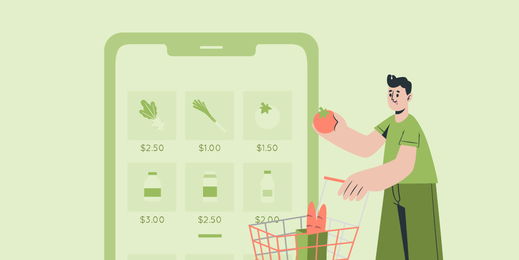
Just a simple glance through the apps on our phone can tell us how much we rely on e-commerce apps in this day and age. It covers all our needs from clothes to gadgets, to medicines. Anything you can name, you can get through an e-commerce app through your phone.
For the last decade, e-commerce has found hundreds of new ways to reach the customer. With the exponential growth of innovation, technology, and the internet, more and more buyers are turning to the experience of shopping online. To keep up with demand and make profits, more and more sellers are starting new channels and methods of responding to this trend. And this is the sphere in which the design of positive user experience directly moves profits.
The high availability of choices makes it absolutely imperative for your e-commerce platform to stand out. With almost unlimited options available to the consumer, it is no guarantee that just a good selection of products will be able to retain customers. With more than 80% of the online population using the Internet to purchase goods and services, the quality and user experience offered to the user makes a huge difference and should be differentiated for success.
By the year 2040, it’s estimated that 95% of all purchases will be through eCommerce and India has one of the fastest growing e-commerce landscapes. So it’s important that any e-commerce platform that needs to make an impact has to be designed well and stand out in a sea of choices. While there is no one trick to making that happen, there are a few things you can do to design a platform that provides a great user experience and creates user stickiness. But before we move onto our pointers, let us get on the same page by revisiting the exact definition of e-commerce.
What is e-Commerce?
“E-commerce is the activity of electronically buying or selling of products on online services or over the Internet.”
Now that we have that out of the way, let us talk about somethings you can do to create the best e-commerce platform:
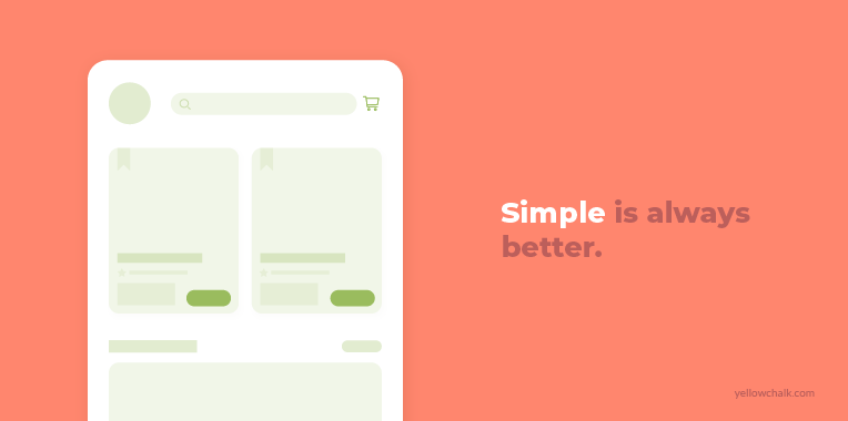
- Stick to Simplicity: One of the main rules to adhere to during the e-commerce design process is simplicity. When it comes to designing an ecommerce website, simple is always better. The more elements you have on the page (colors, banner ads, pop ups), the more it takes away from the entire point of the website—closing a sale. Remember, you don’t need a ton of bells and whistles on your ecommerce website because they only distract the customer from the main goal. Design to keep the focus on the sale.
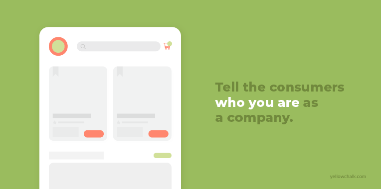
- Focus on Branding: People always want to buy from established brands where the chances of them being disappointed are minimal and where the design and interface looks trustworthy and not from faceless e-commerce sites that look like they’re trying to steal your credit card information. Building trust is a key factor in standing out as an e-commerce platform. Focus on your branding and tell the consumers who you are as a company, what you’re about, and how you’re different from your competitors. All of this plays a huge part in building a connection with your audience and driving sales.
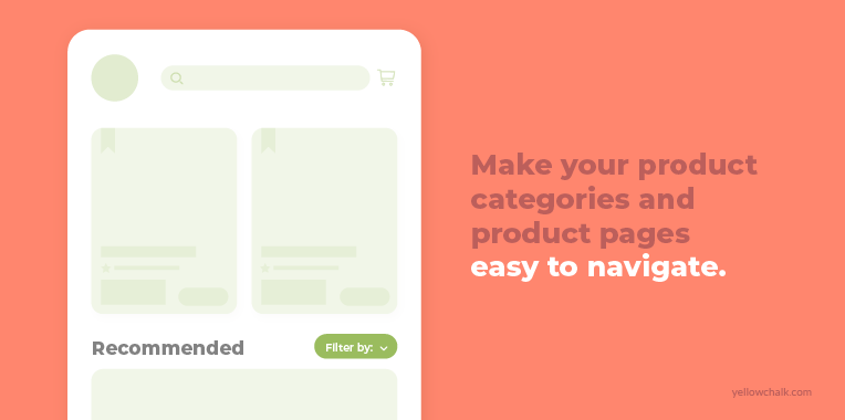
- Take advantage of Categories: There is nothing as uniquely frustrating as going to a website to find a product but not being able to make head or tail of the website. Nothing kills a sale faster than disorganized product pages. Make your product categories and product pages easy to navigate. Make it easy for your customers to search for products and to filter products by things like color, size, or product type. The easier you make your categories and pages to navigate, the easier it will be for your customers to find what they’re looking for—and the easier it will be for them to make a purchase.
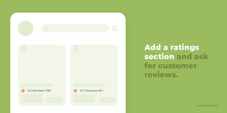
- Include Customer Feedback (wherever possible): 93% of customers read online reviews before buying a product. Social proof is a great way to build trust because your potential customers turn to online review sites to learn all they can about your service or product. When you’re designing your ecommerce site, look for ways to show your potential customers the positive feedback you’ve gotten from your existing customers. Add a ratings section where people can rate your products, add a testimonials section where you feature customer photos with a quote or two about what a great experience they had working with you. Ask customers to review your products—and what they like about them—and then add them to your blog.
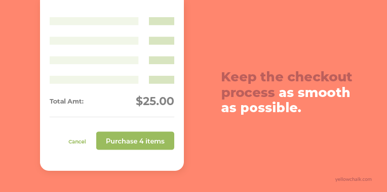
- Checkmate on Checkout: Remember what we said about disorganized product pages killing a sale at lightning speed? Well, a clunky checkout is definitely a close second. If your checkout process is a pain, you’re going to lose customers at the final stage of the sale. If you want people to buy from you, you need to make the process of buying as simple, straightforward, and pain-free as possible. Make your checkout page design clean, simple, and easy to navigate. Give your customers the option to register for your site or to check out as a guest. Once the purchase is complete, direct your customers to a confirmation page so they know everything went through.
In a nutshell, not all e-commerce websites can be designed with a one-trick formula to success. But there are certainly similarities in successful e-commerce websites. The main thing to remember is to build your page for easy navigation which lets users find what they’re looking for.
The team at Yellowchalk designed a standout online shopping experience for a player in the online marketplace in the US. Here are our insights from the process:
Yellowchalk Insights
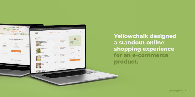
A player in the online organic marketplace in the United States wanted to add value to their customers’ grocery shopping experience by turning it into a differentiating digital experience.
We wanted to give consumers a reason to switch from traditional supermarket grocery shopping to an online grocery shopping website experience. Consumer demand for authentic brands is steadily on the rise and we aimed to achieve our goal by highlighting the organic aspect of all the brands and products that were offered by our client. We wanted to drive home the point that the groceries were ethically sourced, fresh, and organic in nature as opposed to homogenous name brand products available in every other supermarket.
We planned our strategy in a way so that it would offer end users an enhanced online experience consistent with physical stores. Our aim was to channelize user journeys and make user tasks as easy as possible.
While defining the UX for the site:
- Our user experience designers limited the use of elements to minimise the cognitive burden.
- We wanted the user journey to be smooth and cohesive to make users realize that the time and energy they spent on grocery shopping physically could be used for other more productive tasks in their daily routine.
- We always kept a consumer’s mindset while defining our UX strategy, which is why we highlighted incentives like discounts and subscriptions to special services to get new users started with their online grocery shopping experience.
Read the full story here: https://yellowchalk.com/projects/online-organic-store/