GOT A UI/UX
DESIGN PROJECT?
Good UX Design for Fintech Platforms
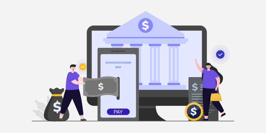
Fintech design is a big part of our lives and we’re all familiar with tons of fintech products without being aware of it. Don’t believe us? Think of Google Pay, think of PayTm, and even Cred, ZestMoney, and Goalwise (now Niyo Money). These are just some fintech products we use on a daily basis for online shopping, paying credit bills, and various other online miscellaneous payments.
The easy integration of these digital payment apps into our everyday lives has shaped the way we make payments and just generally shop with the entire online e-commerce industry. And the biggest reason these fintech products have been so successful and widely adapted is due to the trust factor built into them!
You might feel that building a trust factor into any product is not possible. How do you add a feeling of trust into a digital product anyway? And you’re right. There is no secret element you can use or design theory you can resort to adding trust to fintech products instantly.
What you can do instead, is to follow an approach where the users feel like they’re at the center of the product while clearing the thick brambles of the heavy financial space and adhere to fintech design rules that makes the product easy to use.
Not only is fintech unglamorous, but it can also be challenging to design for. Project requirements are often meticulously detailed and riddled with industry jargon. Designers have to strike a balance between effortless usability and ensuring a misguided tap does not leave the user in a financial fix.
So while designing for fintech may seem uninspiring, remember to think of it as a challenge, not an obstacle. Try to keep the tips we’re going to cover below in your mind!
Find a Connection between Money and Emotions
Money and emotions might seem diametrically opposed to each other, but finding the right spot between the two can help you connect with your audience. When designing for those moments, think about how people are when they are dealing with money rather than just relying on their logical behavior. A few simple actions like receiving your salary, paying your monthly installment without delay, or not incurring late fees on bills, for example, should call for a small moment of joy and celebration. The best way to celebrate these moments is through the use of user micro-interactions. Microinteractions allow users to provide quick feedback for their actions. Furthermore, this will inform you whether your app is working as expected or you need to make some changes.
Let us now look at some user experience factors to keep in mind while designing for fintech.
Fintech Platform Design: Things to Remember
• Great Copy is Crucial
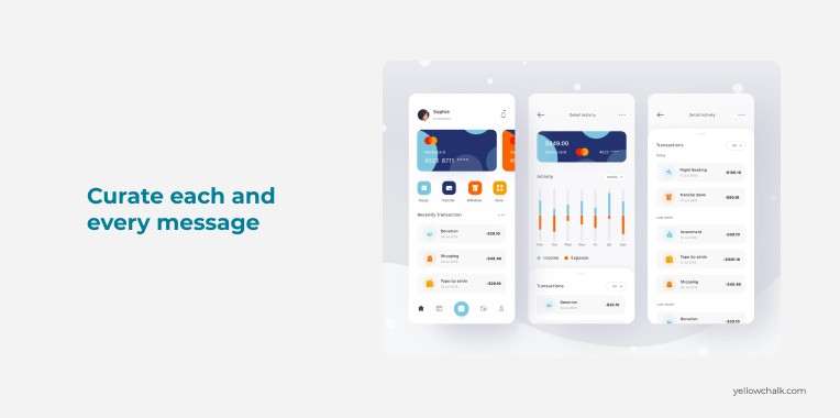
If you want your users to have a pleasant experience, make sure to curate every message they see on the screen. In fintech and finance, text copies are usually riddled with jargon. Extra care should be given to demystify any technical terms that are added to the copy. Although it is not possible to do away with jargon completely (since we are designing for fintech after all) what you can do is to provide as much context and information so that the user doesn’t feel overwhelmed. We need to design with content in mind, not just for it, with both designers and copywriters working closely together.
• Leverage Positive Friction
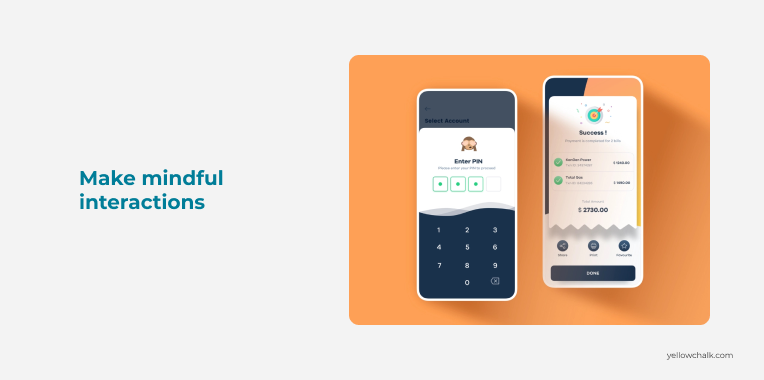
Positive friction in design is defined “as frictions that can disrupt mindless automatic interactions, prompting moments of reflection and more mindful interactions.”
Technology often seeks to make everything easy and instantaneous, often favoring impulses over intentions. Positive frictions make the interactions better because they put users in control of their actions and help raise awareness. When it comes to finances, if we are designing a product where our goal is to give people better control over how they spend their money, it also includes a moral obligation of giving the option to choose how not to spend it. We can leverage positive friction in a myriad of ways. We can use PIN authentication before payments, pop-up confirmations to prevent potential errors, and roadblocks to help mitigate impulsive decisions.
• Visualize Financial Information
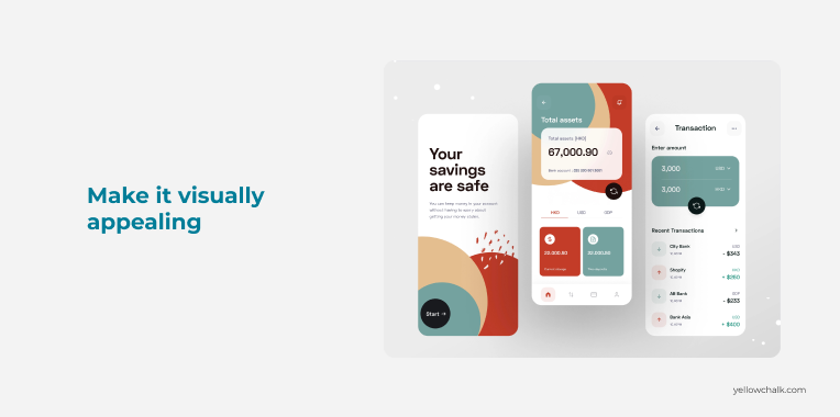
One of the most challenging aspects of fintech products is to make the heavy world of numbers look visually appealing. No user will stick with an app that doesn’t simplify the numbers and explain the story behind them. There are products that provide spending management features but have issues with visualizing them in a clean, comprehensible way. While cool graphs and fancy interactions add aesthetic value, they do not convey clarity to the users until planned properly. Categorization cannot be the only approach as it requires inputs from the users. Providing an additional breakdown by merchant/app can be an accurate way to help people make sense of their patterns. Giving users a view of their investments/savings and clear reminders of monthly payments visually is also a good way to present important information. Visual cues should be added for all unattended text.
• Design for Simplicity, not to Overwhelm Users
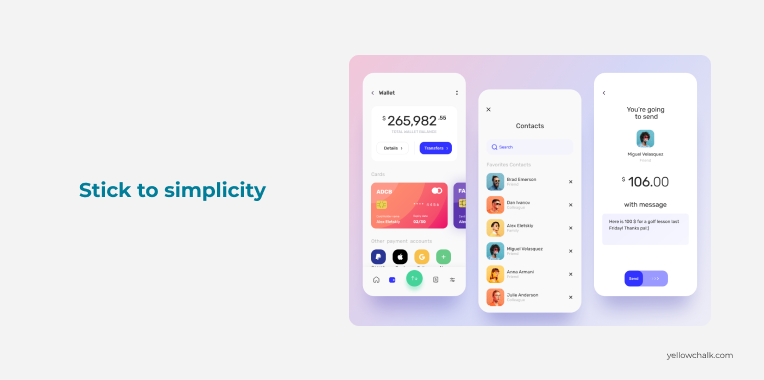
It takes very little to make financial things complex and confusing. Designing your fintech app with too many features can take a toll on the cognitive load of your target audience. It can leave them confused and unable to complete simple tasks. A good rule of thumb is to steer clear of an overcomplicated layout, tangled navigation, and unclear CTAs. Keep the page layout and content display to a minimum so that users don’t feel overwhelmed with too much content. Also, keep the important functionalities easily accessible and display cold financial data in the form of charts or graphs.
• Feedback All the Time, Every Time
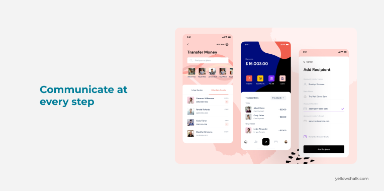
Providing responsive feedback to the user is a crucial aspect of usability. For a good fintech product, feedback is a non-negotiable factor. Users, especially the ones who aren’t digital natives, are much more reluctant to trust an app to handle their finances. They are usually the last ones to take up digital payments. When interacting with any financial services platform, for banking, investing, or budgeting, the users, especially older users require near-constant reassurance and validation that their information is safe and that the tasks they are completing are in fact, achieved. When users are interacting with a financial product, it is important they are provided feedback for their actions. It could be or confirmation of a transaction or any other action that they commit.