
GOT A UI/UX
DESIGN PROJECT?
The UX of Doubt: 5 Hidden Signals that Make Users Hesitate Before They Commit
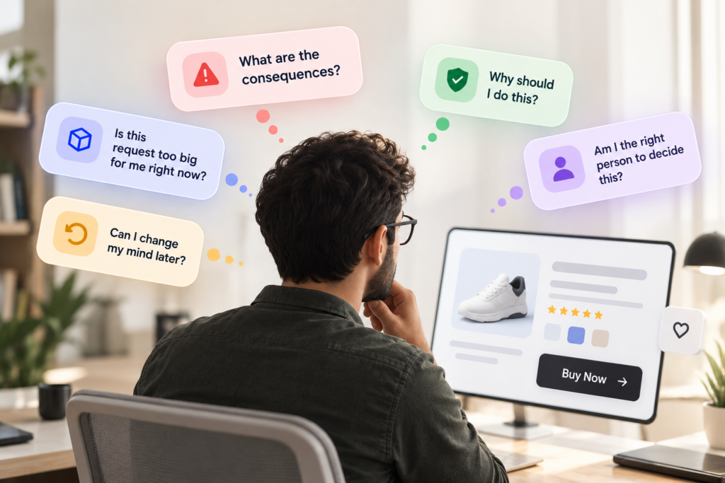
Key Takeaways
- A usable experience can still be difficult to commit to because ease of action and confidence in that action are two different design problems.
- User hesitation often comes from five unresolved questions: consequences, the size of the request, reversibility, the basis for acting, and decision ownership.
- Making a flow shorter, adding more information, or automating a choice can reduce effort without resolving the uncertainty behind the decision.
- Hesitation isn’t automatically a UX problem. In consequential decisions, the goal is appropriate confidence, not the absence of doubt.
- The right design response starts by identifying what the user is trying to resolve, then deciding what to clarify, justify, make reversible, provide evidence for, or leave in the user’s control.
UX doubt sounds simple enough: a user hesitates before committing.
What makes it difficult is that the reason for that hesitation is rarely obvious. A clear interface can still leave someone unsure. More information can create more doubt. Removing a step can make an action easier without making the decision any easier.
We’ve seen this across products where the obvious UX fix wasn’t necessarily the right one. Sometimes users needed more context, not less. Sometimes they needed to understand what would happen after they committed. And sometimes the hesitation itself was reasonable.
That is why doubt needs to be diagnosed before it is designed away.
The question isn’t simply, “What is stopping the user?”
It is, “What does the user still need to resolve before this commitment feels justified?”
The answer often sits beneath what looks like ordinary hesitation. These five signals can help you recognize what the user is actually trying to resolve.
1. The Action Is Clear. The Consequence Isn’t.
You can make an action perfectly clear and still leave the decision around it unclear.
We saw this while working on SecurePass, an identity and access management platform. An approver could understand what it meant to approve access. The harder part was understanding that decision in the context of the roles, permissions, and resources connected to it.
Our research found that approvers made faster, more confident decisions when they could see linked roles, permissions, and resource hierarchies together instead of moving between sections to piece that context together.
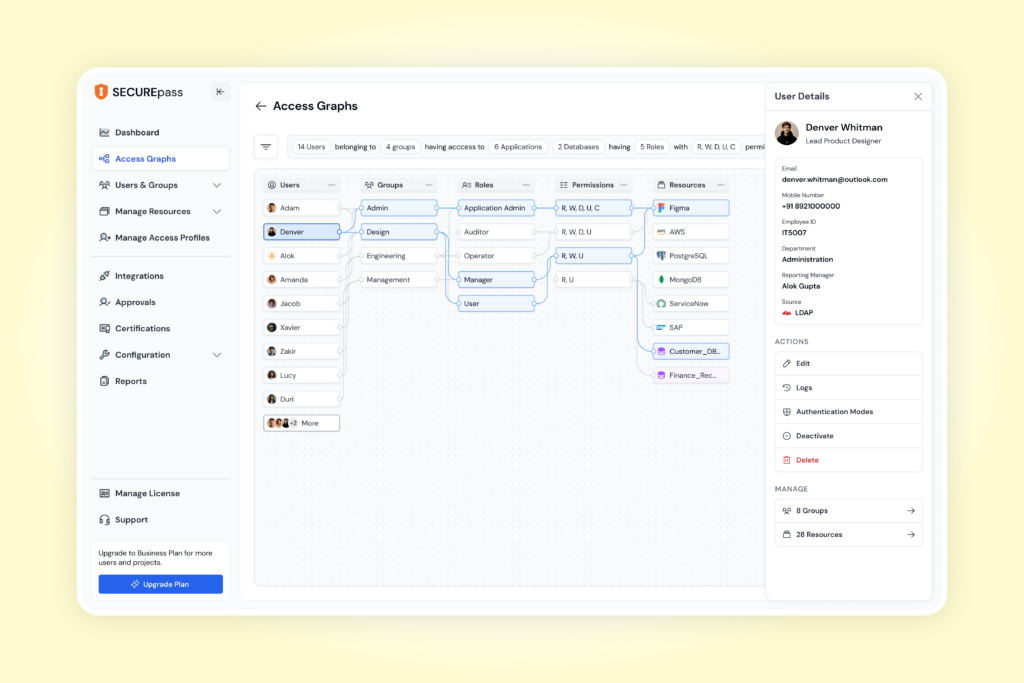
SecurePass UI
That points to a distinction worth making: action clarity tells you what you can do. Consequence clarity tells you what happens if you do it.
For an approval, permission change, financial transaction, or other consequential action, users may need to understand:
- What changes after they proceed
- Who or what will be affected
- What remains within their control afterward
This is why making the CTA more prominent or the flow shorter can miss the problem entirely. If the uncertainty sits on the other side of the click, improving the click does very little.
The more consequential the action, the more the design has to explain what the action sets in motion.
2. The Request Feels Bigger Than the Reason to Say Yes
Not every request carries the same weight.
- Giving an email address is different from sharing an identity document.
- Choosing a preference is different from connecting a financial account.
- Browsing a product is different from granting it access to something valuable.
As the request gets bigger, so does what the user needs to feel comfortable saying yes.
A 2020 study of 775 mobile users found that concerns about app permission requests were strongly associated with users’ overall privacy concerns.
This means the important question isn’t simply whether the request is understandable. Users also have to evaluate the exchange:
What am I giving access to, what does that expose, and do I have enough reason to accept it?
That can lead to different design decisions. The product might need to:
- Establish more context
- Explain the scope of access
- Make the value clearer
- Reduce what it asks for
- Reconsider when the request appears, where appropriate
The larger the request feels, the more the product has to justify what it is asking the user to exchange.
3. The Way In Is Clear. The Way Out Isn’t.
Sometimes the question holding up a commitment isn’t “Should I do this?” It is “What happens if I need to change this later?”
Think about the difference between:
- Money you can withdraw and money that feels locked in
- A permission you can change and one that feels permanent
- A subscription with a clear exit and one with vague cancellation terms
- A decision you can reverse and one that is difficult to undo
That matters whenever saying yes means committing something valuable, whether that’s money, access, flexibility, or control.
We saw the importance of flexibility while working on Finhaat, a financial-services platform serving users in rural and semi-urban markets. Its target investors often had fluctuating incomes, and the research found that long lock-ins could become a barrier. Small-ticket, non-committed savings were preferred, while easy redemption and instant access were important because gold could also serve as an emergency reserve.
There is evidence of the same broader principle in retail. A 2021 study in the Journal of Retailing and Consumer Services found that more lenient return policies could lower perceived purchase risk and improve patronage intentions. In other words, what happens after the purchase can influence how risky the purchase feels before it happens.
The design question is: Does the user understand what will remain within their control after they commit?
Because sometimes, the experience after commitment shapes the willingness to commit in the first place.
4. The Answer Is Visible. The Basis for Acting Isn’t.
Sometimes the product has already done its job of surfacing the answer. The hesitation comes from whether the user has enough reason to act on it.
We saw this while working on Zolnoi, an industrial AI and IoT platform. Users could see predictions and alerts, but our research found that limited explanations and confidence indicators made them hesitant to act solely on those recommendations.
The gap wasn’t more data. Users could see what was happening. They needed more context around why it was happening and what to do next.
That shaped the design response through:
- Progressive disclosure of supporting information
- Confidence indicators around predictions
- Intelligent prioritization of what needed attention
- Contextual guidance on why something was happening and what to do next
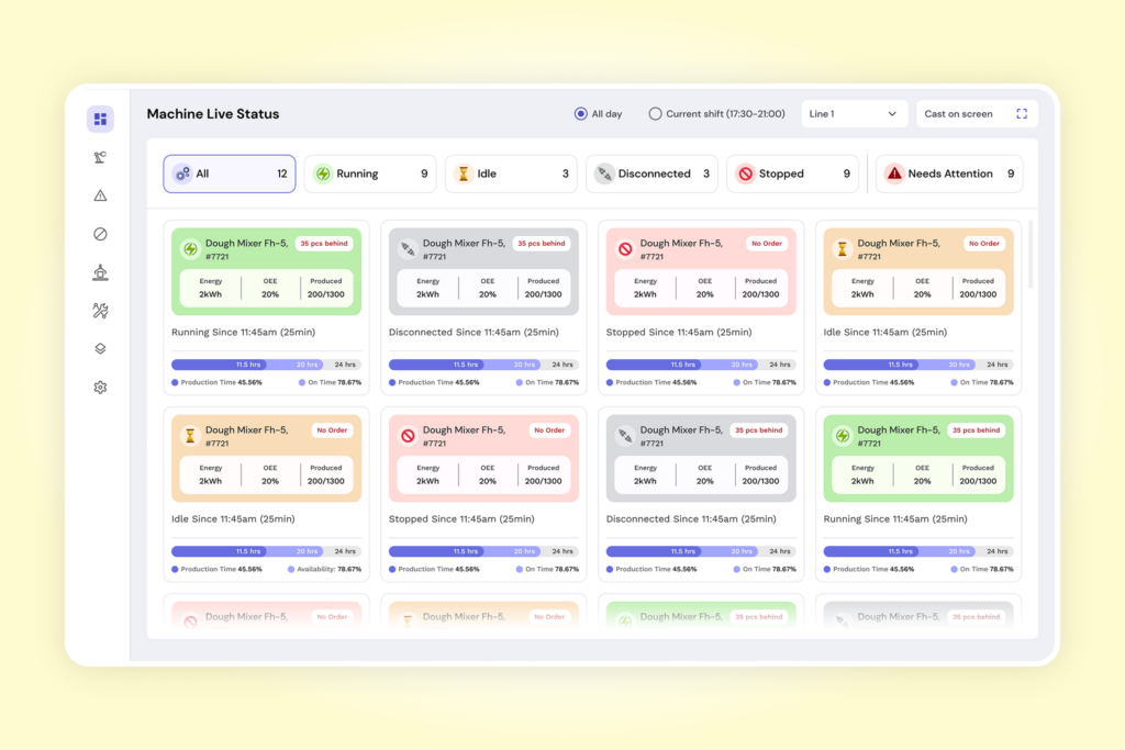
Zolnoi UI
Seeing an answer doesn’t mean you’re ready to act on it.
When the basis for a recommendation is unclear, making the recommendation more prominent doesn’t resolve the doubt. The user needs enough context to decide whether acting on it is justified.
5. The Decision Gets Easier. But Less Yours.
Products can make decisions easier by making more of the decision for the user. They can recommend one option, preselect a default, automate a choice, or narrow what the user has to decide.
That can be useful. But there is another variable to consider: how much of the decision the user still feels they own.
The 2024 study, “Let Me Decide: Increasing User Autonomy Increases Recommendation Acceptance”, tested this across three online experiments involving algorithmic recommendations. Participants were more willing to accept recommendations when they had greater choice autonomy, such as receiving multiple recommendations rather than only one. Giving users control over how many recommendations they received strengthened this effect further.
That doesn’t mean defaults, recommendations, or automation are inherently bad. The question is which part of the decision should the product resolve, and which part should still belong to the user?
For consequential decisions, look at whether users can:
- Understand what has been chosen or recommended for them
- Meaningfully choose something else
- Override or change the product’s decision where appropriate
- Retain control over the part of the decision that matters to them
This is where reducing decision effort and preserving decision ownership can pull in different directions.
Reducing decision effort can make a choice easier. But if that also reduces decision ownership, the product can introduce a different source of uncertainty.
How to Tell Which Doubt You’re Looking At
Knowing the five doubts is the easy part. The harder part is knowing which one is showing up in your product.
Hesitation can look remarkably similar from the outside. A user pauses, backs out, checks another screen, overrides a default, or asks support a question. But those behaviors tell you where something may be unresolved, not necessarily what it is.
So the behaviors below are best treated as signals to investigate, not proof of the underlying doubt.
| Doubt | What you might observe | How to test for it |
| Consequence | Users check other screens before committing, or contact support asking what happens next. | Ask users to predict the outcome of the action before they take it. Wrong or vague predictions can point to a consequence gap. |
| Exchange | Drop-off increases around permission, data, or account-access requests. | Ask what users believe they’re giving access to and what they would need to feel comfortable saying yes. |
| Reversibility | Users look for withdrawal, cancellation, edit, or exit information before committing. | Ask what they believe they could do if they changed their mind later. Look for uncertainty around what can be changed or undone. |
| Basis for action | Users verify recommendations elsewhere, delay acting, or ignore them. | Ask whether they would act on the information now and what else they would need to feel confident doing so. |
| Agency | Users override defaults or look for ways to edit automated choices. | Ask whether the choice feels like theirs and observe whether they look for ways to change it. |
The important part is that the same hesitation can come from very different unresolved questions. That means there is no universal “reduce friction” fix.
The better diagnostic is: What exactly is the user trying to resolve before committing?
This is where experienced product design becomes less about applying UX principles and more about making judgment calls.
At Yellowchalk, we don’t begin with the assumption that hesitation is something to remove. We look at what is creating it, whether that uncertainty is reasonable, and what the user still needs to make the decision with appropriate confidence.
That distinction matters because the wrong intervention can solve the visible behavior while leaving the actual problem untouched.
- A shorter flow won’t explain an unclear consequence.
- More information won’t necessarily make a recommendation easier to act on.
- A smarter default can reduce effort while taking away control the user wanted to keep.
Our role is to find which uncertainty actually matters, then decide what the product should clarify, simplify, expose, make reversible, or leave in the user’s hands.
Conclusion
A pause before commitment is easy to label as friction. The harder work is understanding what sits behind it.
That is where product judgment matters. Before simplifying a flow, adding reassurance, or automating a choice, teams need to know what the user is actually trying to resolve.
Yellowchalk helps product teams uncover these hidden decision barriers and design experiences that give users the clarity and control they need to move forward.
Book a 30-minute diagnostic call. Bring one flow where users hesitate, and we’ll tell you what they’re most likely trying to resolve.
Frequently Asked Questions
What is UX doubt?
UX doubt is the uncertainty a user feels before taking an action or making a decision in a digital product. It can happen even when the interface is easy to use because the user may still be unclear about what will happen next, what they are committing to, or whether they have enough information to proceed.
Is user hesitation always a sign of bad UX?
No. User hesitation can be reasonable when a decision involves money, personal data, permissions, health, security, or another meaningful consequence. It becomes a UX problem when the product creates avoidable uncertainty or does not provide the information and control users need to make the decision.
What is the difference between UX friction and UX doubt?
UX friction makes an action harder to complete, while UX doubt makes a user uncertain about whether they should complete it. A long form can create friction because it requires extra effort. A one-click payment can have very little friction but still create doubt if the amount, consequence, or reversibility of the transaction is unclear.
What causes users to hesitate before converting?
Users can hesitate when they do not understand what will happen after an action, feel that a product is asking for too much, are unsure whether a decision can be reversed, lack enough evidence to act on a recommendation, or feel they have lost control over the decision. The specific cause determines what the product needs to fix.
How can UX design reduce user hesitation?
UX design can reduce unnecessary hesitation by identifying the uncertainty behind it and addressing that specific problem. Depending on the decision, this may mean clarifying consequences, explaining why information or access is required, showing how an action can be reversed, providing evidence behind a recommendation, or giving users more control over the final choice.