GOT A UI/UX
DESIGN PROJECT?
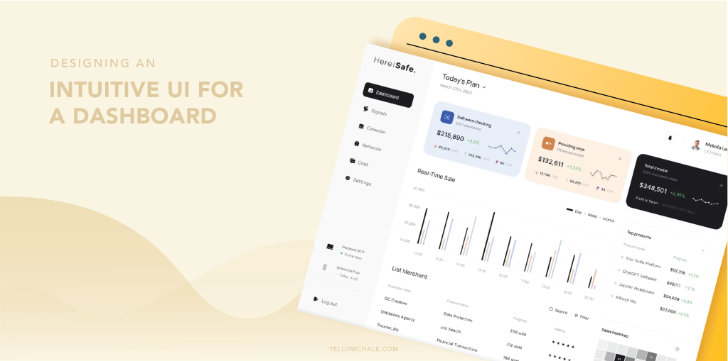
10 Tips for Crafting Effective UI Design of a Dashboard

How to Optimize UI Design of a Dashboard for User Experience?
A well-designed UI design of a dashboard can make all the difference in the user experience, providing a clear and concise way for users to interact with data and accomplish their goals.
A dashboard is a visual display of important data that helps organizations monitor their performance, make data-driven decisions, and track progress towards their goals. The design of a dashboard plays a critical role in its effectiveness, as it determines how easily users can access and interpret the data.
Unlocking the Secrets to Effective UI Design of a Dashboard: Key Characteristics to Consider
- Clear and Concise: A good dashboard should provide a clear and concise overview of the data it is presenting. It should be designed to help users quickly identify trends, patterns, and outliers. Cluttered or overly complicated dashboards can be confusing and may lead to incorrect interpretations of the data.
- Relevant: The dashboard should present information that is relevant to the user’s needs. Dashboard data should prioritise KPIs or metrics that align with the user’s role or business objectives, such as revenue and sales pipeline for sales, and conversion rates and website traffic for marketing.
- Actionable: A dashboard should not only present data but also suggest actions that can be taken to improve performance. The dashboard can identify a low conversion rate in a specific marketing campaign and provide suggestions for improving its effectiveness.
- User-Friendly: A good dashboard design should be easy to use and navigate. Users should be able to quickly access the data they need and customize the dashboard to suit their preferences. This includes features like the ability to filter data, change the time range, and select different visualizations.
- Timely: A live dashboard should provide up-to-date information that is relevant to the user’s needs. Data on the dashboard should be refreshed regularly, preferably in real-time or near-real-time, to enable users to make informed decisions based on the most current information.
- Visual: The dashboard should use visualizations to help users interpret the data more easily. This includes charts, graphs, and other visual representations that make it easy to identify trends and patterns in the data. Visualizations can also make the data more engaging and memorable, helping users to retain the information more effectively.
Top 10 Tips for Crafting Intuitive UI Design of a Dashboard
If you’re designing a dashboard, you want to create something that’s both user-friendly and visually appealing. A well-designed dashboard can provide users with valuable insights into key performance indicators and help them make informed decisions.
Here are 10 tips to help you create an effective UI design for a dashboard:
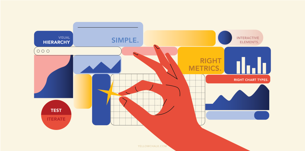
- Keep it simple: The first rule of dashboard design is to keep it simple. Avoid clutter and unnecessary details that can distract the user from the most important information.
- Choose the right metrics: Select key performance indicators (KPIs) that align with the goals of the dashboard and are meaningful to the user. Don’t overwhelm the user with too much data.
- Use visual hierarchy: Organize information on the dashboard using visual hierarchy principles to draw attention to the most important data. Use color, font size, and other design elements to create a clear visual hierarchy.
- Provide context: Provide context for the data by including trend lines, historical data, and benchmarks to help users understand the significance of the information. This can help users make informed decisions based on the data.
- Consider the user’s perspective: Design the dashboard with the user in mind. Understand their needs, goals, and workflows to create a dashboard that is intuitive and easy to use.
- Use interactive elements: Incorporate interactive elements, such as dropdown menus and sliders, to allow users to customize their view of the data. This can help users focus on the most important information.
- Choose the right chart types: Choose the right chart types for the data you’re presenting. Line charts are great for showing trends over time, while bar charts are ideal for comparing data across categories.
- Ensure consistency: Ensure consistency in your dashboard design by using the same color scheme, font, and design elements throughout. This can help create a cohesive user experience.
- Test and iterate: Test your dashboard with users and iterate based on their feedback. This can help you identify areas for improvement and create a better user experience.
- Use data visualization best practices: Use data visualization best practices, such as avoiding chartjunk and using appropriate color palettes, to create a dashboard that is visually appealing and easy to read.
The Final Steps in UI Design of a Dashboard: Key Considerations
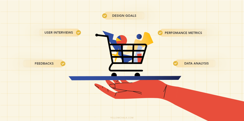
To ensure a dashboard design meets user needs, user testing and interviews with daily users are essential for providing necessary tools and reflecting goals, as the design process is incomplete without these steps. Incorporating user feedback and making necessary revisions will result in a well-designed and highly useful dashboard.
This feedback can be used to make necessary revisions to the dashboard design, ensuring that it meets the needs and expectations of the intended audience. Making these revisions can also help to avoid potential user frustration or confusion, resulting in a better overall user experience.
In addition to user testing and interviews, it is important to consider the goals of the dashboard and ensure that the design reflects these goals. The dashboard should provide users with the necessary tools to achieve their objectives, whether it is tracking performance metrics, analyzing data, or making informed decisions.
Overall, incorporating user feedback and considering the dashboard’s goals are crucial steps in designing an effective dashboard along with examples. By doing so, designers can create a tool that is not only visually appealing but also highly functional and tailored to the needs of its users.
Final Thoughts
In conclusion, a well-designed dashboard UI can be a powerful tool for users to interact with data and achieve their goals. By following these principles and tips, you can create an excellent dashboard UI that is simple, clear, and effective. A good dashboard is clear, concise, relevant, actionable, user-friendly, timely, and visual. By following these principles, organizations can create dashboards that help them make data-driven decisions, track progress towards their goals, and drive better business outcomes.
Got some more useful tips for ui dashboard design? Get in touch with us, we’d love to hear your thoughts.