GOT A UI/UX
DESIGN PROJECT?
UX and Positive Friction

The word ‘friction’ usually brings negative connotations to mind. Even the synonyms to friction are words like ‘abrasion’, ‘abrading’, ‘grating’, and ‘scraping’ to name a few. None of these bring a positive image to mind.
In a social context, the definition of friction is “conflict or animosity caused by a clash of wills, temperaments, or opinions”. Not another rosy image, to be sure.
While friction may have different definitions depending on the context, did you know that friction plays a big role in user experience design?
What is Friction in Design?
In experience design, friction is anything that prevents users from accomplishing their goals or getting things done. It refers to specific points during an interaction that prevents users from completing their tasks smoothly and painlessly.
The main reason design friction is villainized is because they run the risk of frustrating and disengaging the users with difficult interactions. UX designers work tirelessly to come up with smarter techniques to make sure that the user’s individual cognitive systems are overwhelmed.
The concept of friction doesn’t only have one function in UX design. What we’ve talked about refers to ‘negative friction’. Some examples of negative friction are:
- newsletter signup overlay covering the actual content
- difficult wording on a landing page
- needless optional questions in a checkout flow
Negative friction identifies itself by being the opposite of intuitive and effortless. It can be called the antonym of “Don’t make me think.”
But, the negative is always counterbalanced with a positive.
So what is a Positive Friction?
Positive frictions are defined as frictions that “can disrupt mindless automatic interactions, prompting moments of reflection and more mindful interaction”.
They make the interactions better because they help users achieve their goals quicker, more efficiently and put users in control of their actions and they help raise their awareness. For instance, we can offer shortcuts to log in quicker; provide purchase with one-click buttons; guide users towards a preferred option, etc.
Before we move on to how we can put positive design friction into action, let us take a look at how technology has affected the way we interact with products and awareness overall.
Technology and Awareness
Dr Sharon Horwood, a psychology professor at Deakin University said that “what we do find with technology like smartphones and tablets is that they have the tendency to increase our absent-mindedness, reduce our ability to think and remember, to pay attention to things, and regulate emotion. Most of us have our phones within arm’s reach. Even the possibility of a message or a call or something happening on social media is enough to divert our attention away from what we are doing.”
She also points out that excessive use of technology affects our executive function ability. Executive function is our ability to deal with cognitive tasks such as using working memory, engaging flexible thinking, and managing self-control.
This doesn’t come as a surprise as most of us are used to picking up our phones to check messages, or social media more times than we can count in a day. According to studies, the average millennial picks up the smartphone 150 times a day. This over-dependence on tech has become so commonplace that most of us don’t even realize that we’re partaking in a severely detrimental practice on a daily basis.
Overexposure to technology has many other side effects like depression, FOMO (fear of missing out), phantom vibrations, shorter attention spans, popcorn brain and phantom vibration syndrome.
With these points in mind, it becomes clear that we need more mindful and aware interactions on a daily basis when we’re dealing with technology.
So let us now look at a few ways in which positive friction can be built into designs to add a sense of intention.
How to Use Positive Friction in Your Design
Confirm Actions with Severe Consequences

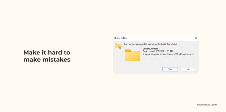
Error prevention is a basic usability principle in the realm of UX design. The most common use of friction in product design to make it hard to do something by mistake. This applies especially when it comes to nonreversible actions.
Anticipating Possible Errors

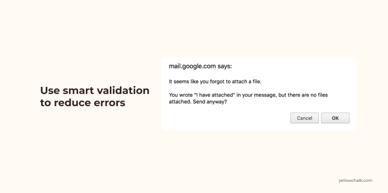
With the use of smart validation, you can check if the input format is right at the get-go. This is a good use of positive friction as it takes the broader context into consideration. It also helps to warns the user of actions that might cause a problem later on.
Delay Important Actions for Reconsideration

There should always be a feature to delay an important action. This gives the user some time to reconsider. An example would be the handy feature to “unsend” an email. It gives the users a few seconds after they’ve clicked the “Send” button to cancel it and fix any possible issues with the email. This means that the email delivery process lasts a few seconds longer, but the user can be at peace.
A clean user interface and uncluttered screens with only the required information should be presented to the users. Iconography that supports the content in a clear, legible way, and can reduce hesitation in the users should be used.
Double Authentication before Significant Actions

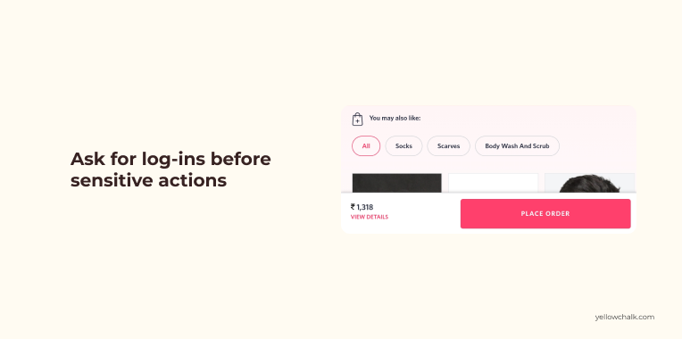
Having to log in again before executing a sensitive action is a good practice, especially one involving personal data. The classic example is requiring you to enter your current password before you can change it to something new. This applies even if you’re already logged in.
Taking a step back to think about our actions can instil a sense of thoughtfulness in our everyday actions. It makes them more intentional and our interactions with technology more measured.
