GOT A UI/UX
DESIGN PROJECT?
8 Golden Rules of Interaction Design

Just like there are rules to live by in life, there are some rules you should always follow while designing your user interface. Based on Ben Shneiderman’s 8 golden rules of UI design, these along with our actionable tips will make your design more accessible and comprehensible for your users!
1. Strive for Consistency
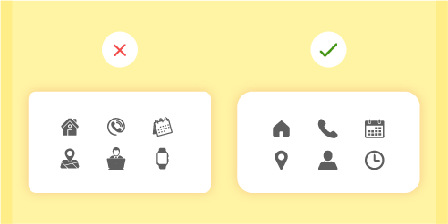
Jakob’s Law states that people spend most of their time using digital products other than yours, and their experiences with those products set their expectations. Failing to maintain consistency may increase the users’ cognitive load by forcing them to learn something new.
Your target audience should not have to wonder whether different words, situations, or actions mean the same thing. In other words, use all elements across your application consistently. For example, a certain style of the button should always do the same thing, or navigation should function logically, going deeper into the hierarchy.
Do not confuse your user — keep words and actions consistent. Use “The Principle of Least Surprise”.
Action items:
- Maintain consistency within a single product or a family of products (internal consistency).
- Follow established industry conventions (external consistency).
2. Seek universal usability.
The design should cater to both inexperienced and experienced users. This can be done by the use of shortcuts, which can be hidden from novice users. It can speed up the interaction for the expert user and the design can simultaneously cater to both the inexperienced and the experienced user.
Flexible processes can be carried out in different ways so that people can pick whichever method works for them. Allow users to tailor frequent actions.
Action items:
- Provide accelerators like keyboard shortcuts and touch gestures where possible.
- Tailor content and functionality for individual users.
- Enable customization so users can make selections about how to use the product.
- Automate frequently used operations.
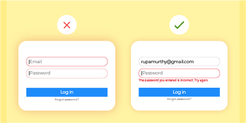
3. Offer informative feedback.
The design should always keep users informed about what is going on. Don’t keep the users guessing — tell them what’s happening. Do this through appropriate feedback within a reasonable amount of time.
When users know the current system status, they learn the outcome of their prior interactions and determine next steps. Predictable interactions create trust in the product and the brand.
For frequent and minor actions, the response can be modest, while for infrequent and major actions, the response should be more substantial. Users don’t like surprises. They want to be in control and trust that the system behaves as expected.

Action items:
- No action with consequences should be taken without informing the users.
- Present feedback to the user as quickly as possible (preferably immediately).
- Feedback should be relevant, comprehensible, and meaningful.
- Communicate with the user clearly to build trust.
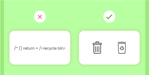
4. Design dialogs to yield closure.
The design should speak the language of your target audience. You should always use words, phrases, and concepts familiar to them, rather than internal jargon. The less the users have to guess the better. Make use of universal terms, making the information easier to understand and sound more natural.
The way you design depends very much on your specific users. Terms, concepts, icons, and images that seem perfectly clear to you as a professional may be unfamiliar or confusing to your users.
All sequences of actions should be organized into groups with a clear beginning, middle, and end. When a process is finished, always display a notification message, letting the user know that they have done all that’s needed.
Action items:
- Simplify language to ensure users can understand terms and words without having to look up definitions.
- Apply user research to uncover your users’ familiarity with terminology and technology.
- Supply the users with well-defined options for the next step.
5. Prevent errors.
No one likes the feeling that they’ve done something wrong. Neither do your users.
Good error messages are important, but the best designs carefully prevent problems from occurring in the first place. Either eliminate error-prone conditions or check for them and present users with a confirmation option before they commit to the action.
There are two types of errors: slips and mistakes. Slips are unconscious errors caused by inattention. Mistakes are conscious errors based on a mismatch between the user’s mental model and the design.
As much as possible, use user research to design the system so that the user cannot make a serious error. If an error is made, the system should be able to detect the error and offer a simple solution for handling the error.
Action items:
- Prioritize: Prevent bigger errors first, then little frustrations.
- Avoid slips by providing helpful constraints and good defaults.
- Prevent mistakes by removing memory burdens, supporting undo, and warning your users.
- Offer solutions for problems.
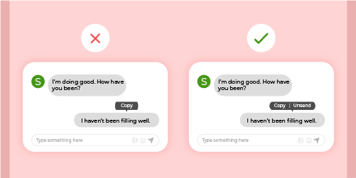
6. Permit easy reversal of actions.
Shneiderman puts it eloquently “This feature relieves anxiety, since the user knows that errors can be undone; it thus encourages exploration of unfamiliar options.”
In applications, this refers to the undo and redo functionality. Users often perform actions by mistake. They need a clearly marked “emergency exit” to leave the unwanted action without having to go through an extended process.
When it’s easy for people to back out of a process or undo an action, it fosters a sense of freedom and confidence. Exits allow users to remain in control of the system and avoid getting stuck and feeling frustrated.
Action items:
- Support Undo and Redo.
- Show a clear way to exit the current interaction, like a Cancel button.
- Make sure it doesn’t interfere with workflow.
- Single-action undo and action history.
7. Keep users in control.
Experienced users strongly desire the sense that they are in charge of the interface and that the interface responds to their actions. They don’t want surprises or changes in familiar behavior, and they are annoyed by tedious data-entry sequences, difficulty in obtaining necessary information, and inability to produce their desired result.
Rid your Interfaces of information that is irrelevant or not needed. Every extra unit of information in an interface competes with the relevant units of information and diminishes their relative visibility.
Simplify interfaces by removing unnecessary elements or content that does not support user tasks.
Action items:
- Keep the content and visual design of UI focus on the essentials.
- Don’t let unnecessary elements distract users from the information they really need.
- Prioritize the content and features to support primary goals.
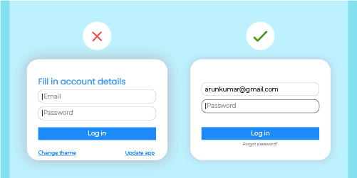
8. Reduce short-term memory load.
Recognizing something is easier than remembering it. Minimize the user’s memory load by making objects, actions, and options available. The user should not have to remember information from one part of the dialogue to another. Instructions should be visible.
Use iconography and other visual aids such as themed coloring and consistent placement of items to help the returning users find the functionalities.
Humans have limited short-term memory. Interfaces that promote recognition reduce the amount of cognitive effort required from users and are thus more successful.

Action items:
- Offer contextual help instead of a long tutorial to memorize.
- Reduce the information that users have to remember.
- Use visual aids to assist users.
It’s true that the approach to design the UI for any system or project is highly dependent on the research, target audience, client, and other related factors. In the same way, these 8 golden rules of UI design must be interpreted, refined, and defined by extended user research. Even though they have their limitations, they provide a good starting point for mobile, desktop, and web designers and serve as a good checklist throughout the process!
Read more about how to make an intuitive design for an e-commerce website, a case study of our UX and UI Design for Gumtoo, Singapore.