GOT A UI/UX
DESIGN PROJECT?
8 Essential Guidelines for Designing a Search Bar

A good search bar design – why is it important?
Imagine you visit a website with a particular product in mind, but there’s nowhere to type in your query!
Instead of scrolling through endless products that you’ve no interest in, you’d rather exit and shift to a different website, right? Most people with a search function where you can look for and access your desired product easily right?
Here is where a search bar is required. It is a conversation window that connects the user to your app or website.
A well-designed and prominently placed search bar adds to the user experience while improving conversion rates significantly. In fact, an efficient filter option placed along with your search bar can drastically improve your conversion rate. Continue scrolling to find out how to add filters to the search bar UI design and also how to design them.
How Effective is a Search Option

But first, let’s talk about the relevance of ‘Search’. If you view the internet as a large marketplace, then your website is merely one of many online stores on it, and you want to make sure that your buyers have a seamless experience while browsing through your web page. Now then, you cannot sell a product that your buyers are unable to locate, can you?
When users navigate through your webpage to complete a purchase, they expect a quick and pleasant in-app experience. The application’s UI must make it easy for the user to locate the product or service without causing excessive navigational challenges. This is why a search facility is required to ensure that the user’s experience is smooth and flawless.
How Important is a Search Bar for my Website?
Generally, larger sites, especially e-commerce websites benefit more from a functional search button than smaller websites where one can easily scroll through the content. As we already discussed at the beginning of the article, users looking for a particular content or category would rather prefer to type in their query than access them through your primary and secondary navigation options.
How to Design a Search Bar Effectively
1. Make it Noticeable – Display Prominently at an Expected Spot
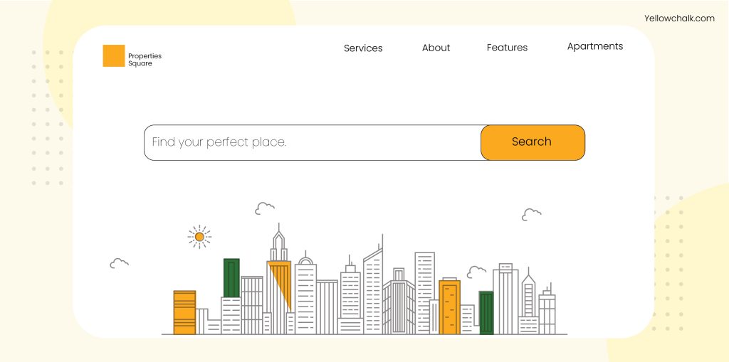
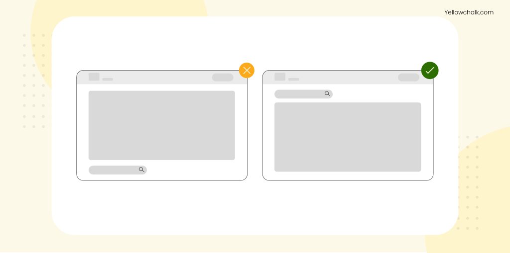
First things first, a search bar should be placed at a visible location. Depending on your website’s nature and primary goal, the location of the search bar can change. However, as a general thumb rule, usually, search bars are located at either the right corner or the centre at the top of a website. This ensures its visibility because users mostly expect the search functionality to be at the top.
Avoid placing a search bar at the bottom of a page, or hide it inside the menu, because it beats the purpose of accessibility. There can be one placed at the footer for better access, but that should only be in addition to the one already placed at the top.
Center the search bar, only when it’s essential for your website’s navigation. For example, if you’re designing a search engine such as Google or Microsoft Bing, the search bar should be placed front and centre.
2. Add Visual Cues – Place Icons or Search Buttons
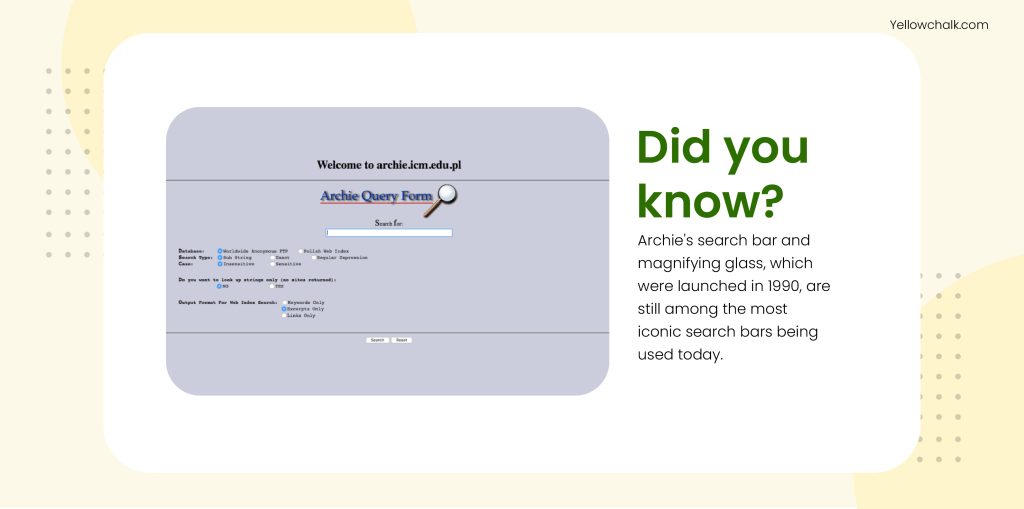
Visually, a magnifying glass is a great option to save space as well as convey the search functionality universally. If more space is available, a search button also works. Icons, however, are preferable to texts because they take up less room and are simpler to recognize.
3. Design a Search Bar with Placeholder Text
Another great way of increasing the functionality of a search button is by placing placeholder texts which act as a guide for users on how to go about their search.
4. Opt for Simple Designs with Search Filters
Don’t complicate search bars unnecessarily. A simple design works best in all cases. At most, a good search bar has additional options, i.e., advanced filters to simplify the user’s search experience further.
While Myntra’s website has undergone many changes over the years, the search option has remained prominently displayed, and they have improved their filtering options significantly.

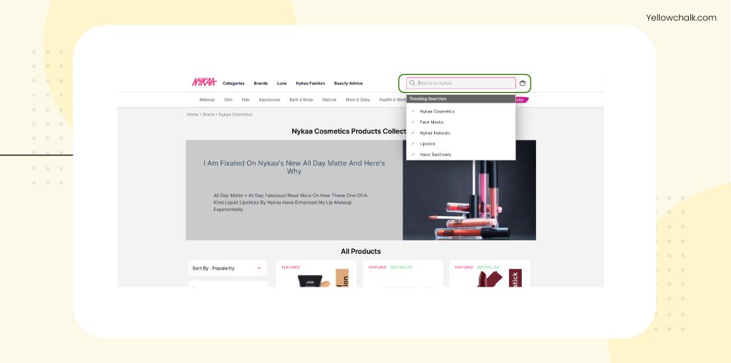
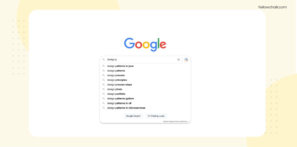
5. Include Auto-Filled Queries for the Best Search Bar Designs
Auto-suggesting options can help allow users to formulate their searches quickly. However, keep in mind that excessive hints and prompts might distract the user from their goals or even confuse them.
To avoid this, an easy way would be to differentiate between the two using bold text for the auto-fill options. A good example of this would be Google’s search engine, which is one of the top search engines available for use today.
6. Incorporate Search Bar options on Every Page
This is just a more accessible solution for users to skip to a particular content or category even while they’re browsing through other pages on your website. Also, in case your user hits a dead end at an error 404 page, it’s easier to get them out of there fast.

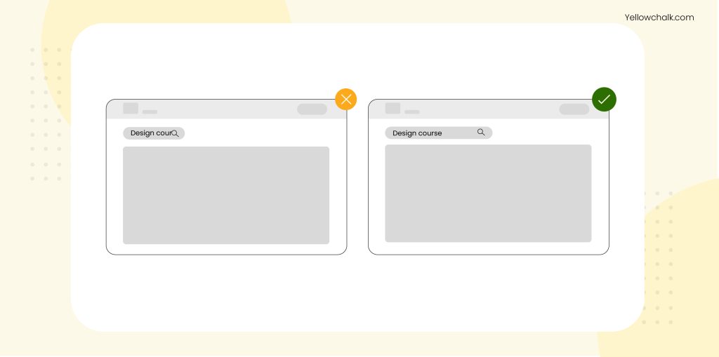
7. Make the Field Size Large
Poor usability results from users having to scroll back and forth to see what they have written in a search field that is too small for your website. If you make it large enough for users to see and edit as they please, it reduces the risk of typing errors.
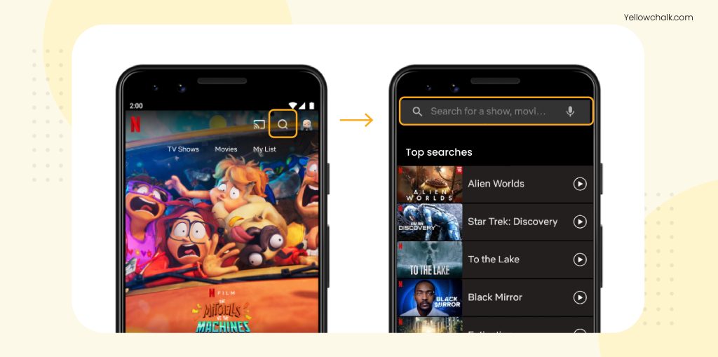
8. Adapt a Mobile-Friendly Approach
According to recent data, Google conducts over 8.5 billion searches daily, with mobile devices accounting for more than half of them. On mobile devices, it’s permissible to conceal your whole search bar behind a search glass icon and only make it visible when the icon is tapped due to a shortage of space.
While crafting a user experience for a website, it is easy to overlook the importance of the search bar. However, its significance is not unnoticeable. As it so happens, the design choices we make at the beginning can either drastically improve our navigation experience or diminish it.
Got some more useful tips for designing a search bar? Get in touch with us, we’d love to hear your thoughts.
