GOT A UI/UX
DESIGN PROJECT?
Designing for Color Blindness | Yellowchalk Design

We often take having a regular color vision for granted rather than investigating the mechanics of what allows us to see color. Color blindness — also known as color vision deficiency (CVD) — is a condition where you don’t see colors in the traditional way. Having color vision is possible due to photoreceptors in the retina of the eye known as cones. These cones have light-sensitive pigments that enable us to recognize color. Found in the central part of the retina, each cone is sensitive to either red, green, or blue light (long, medium, or short wavelengths). The cones recognize these lights based on their wavelengths.
The pigments inside the cones register different colors and send that information through the optic nerve to the brain, which enables us to distinguish countless shades of color. If the cones don’t have one or more light-sensitive pigments, they will be unable to see all colors. Products revolve around people. A designer’s work is to make sure the product is altered to fit the needs of the audience.
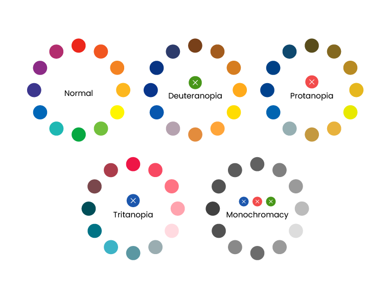
Most people with color vision deficiency can see colors. The most common form of color deficiency is red-green. This does not mean that people with this deficiency cannot see these colors altogether, they simply have a harder time differentiating between them, which can depend on the darkness or lightness of the colors.
Another form of color deficiency is blue-yellow. This is a rarer and more severe form of color vision loss than just red-green deficiency because people with blue-yellow deficiency frequently have red-green blindness, too. In both cases, people with a color-vision deficiency often see neutral or gray areas where color should appear.
Every type of color blindness causes inconvenience and this carries over to user experience. At its worst, colorblind people cannot use a product at all. It can upset users and can cause a business to lose potential clients too.
So it is very important to design in a way that is inclusive and does not hamper the experience of any user. Let us go through some practices to keep in mind while designing for colorblindness.
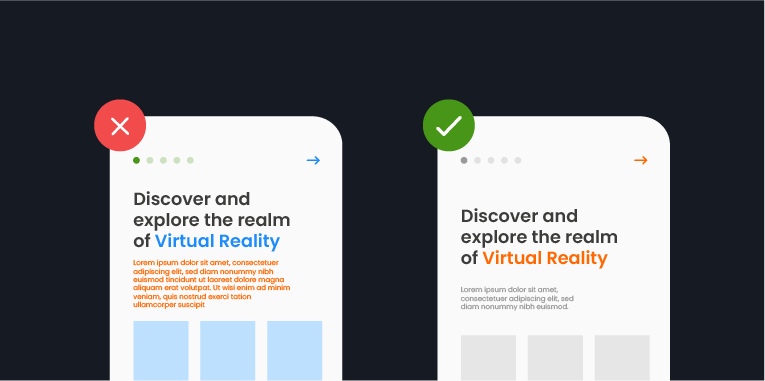
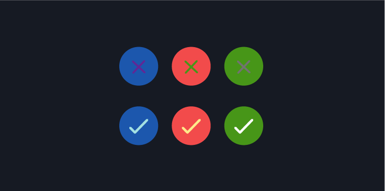
1. Use both Colors and Symbols
You shouldn’t rely on color alone to convey a message. Most error messages are displayed in red and our brain associated red with a warning/error sign. But certain types of color blindness might make it difficult or even impossible to see common red error messages. This is why it is a good idea to use both colors and symbols where users’ attention is required. A good example of this is Facebook’s form fields and the error messaging attached.
Fun fact: Facebook’s logo and the notorious blue color scheme were specifically chosen because Mark Zuckerberg is red-green colorblind and sees blue the best.

2. Keep it Minimal
It is always a good idea to limit the color palette you use for your website or product because the fewer colors you use in your design, the fewer instances there will be for the confusion.
The biggest advantage of minimalist design is that not only is it a timeless and aesthetically pleasing trend, but it’s also useful when you’re designing for color accessibility.
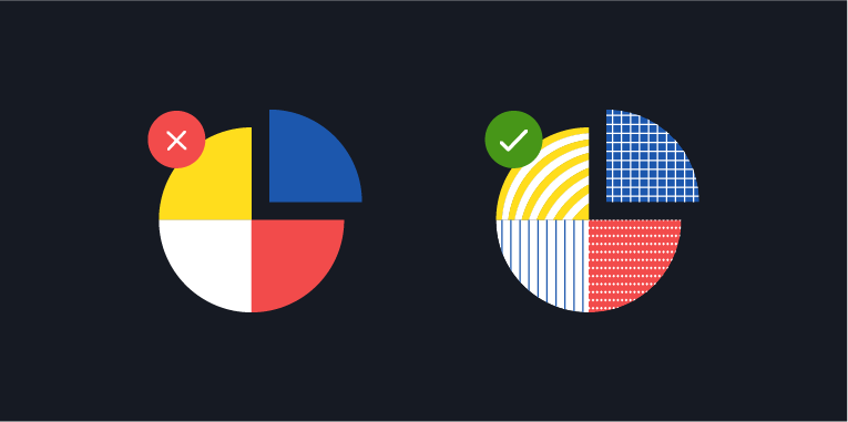
3. Use Patterns and Textures to show Contrast
If you are trying to present a graph, chart, or any kind of infographic on your website, try to use different textures, as opposed to multiple colors, for elements that require emphasis. It might be difficult for color-blind users to interpret graphs and charts. In this case, it’s better to use contrasting patterns and, where possible, place text instead.
If you are worried about the added traffic it is causing on your page, use differentiating colors that are not from the same shade range to help colorblind people identify and interpret the chart or infographic correctly.
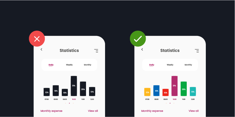
4. Be careful with Contrasting Colors and Hues
Try using a range of clearly contrasting colors and hues in your design instead of relying on black and white as your only contrasting colors. A brilliant example is the game Word Feud, which used uses four colors for its tiles. These colors have been picked in a way that they can be easily distinguished by those with or without color vision deficiency.
5. Avoid Bad Color Combos
It is a difficult task to pick out ‘safe’ colors to use in your design, that simultaneously look aesthetically pleasing and yet are accessible. Since color blindness affects people in different ways, this task becomes even more difficult. That being said, here’s a few color combinations to avoid because they’re a potential nightmare to color blind users:
- Green & Red
- Green & Brown
- Blue & Purple
- Green & Blue
- Light Green & Yellow
- Blue & Grey
- Green & Grey
- Green & Black
Design isn’t truly inclusive until it caters to users with needs different from the norm. Embracing diversity and promoting accessibility design is the future; the only design that’s going to get precedence is one that includes and considers the diverse range of users, crossing all barriers of inclusivity!
Drop us a line if you would like to improve the accessibility of your products.