GOT A UI/UX
DESIGN PROJECT?
5 Tips for Designing Killer Mobile UI
A good and efficient mobile UI experience is vital for any product that wants to make its impact felt on the audience.
The smartphone penetration in India according to Newzoo’s 2019 Global Mobile Market Report is 25.3%, which means that almost 350 million people in India use the smartphone!
Figures like this are telling of the fact that people use smartphones for the multipurpose use that they were intended for. In the climate of smartphones becoming more accessible and helping users achieve their goals right at their fingertips, it is essential for apps and products to be designed to help them accomplish the same.
So below we have five tips that can help you create amazing mobile UI:
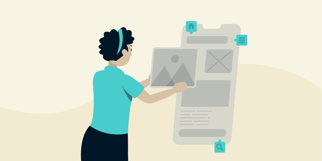
App Navigation

App navigation is crucial for mobile UI design and it should always be intuitive and friendly. Buttons should be clearly labelled without the use of jargons which can cause confusion. Make sure you create distinctive menu categories that do not overlap and allow the users to go back easily. Always highlight key/new features along with the ones you think users will have to use frequently. Ensure that navigation is never hidden from the user and follows the same pattern across the mobile app.
Declutter UI
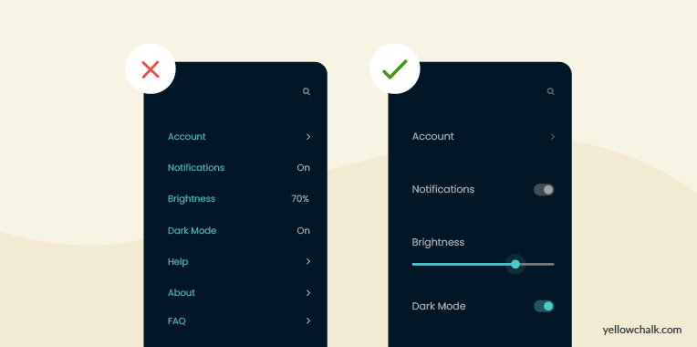
Remember that it is not necessary to display every possible information on the interface. You only need to organize content to make sure the user has a clear understanding of the available features. Too many design elements can make any phone app complicated and can increase cognitive load for the user. Clutter is one of the worst enemies of UI design. Since mobile screens have less real estate (as compared to desktops and laptops), make sure to get rid of unwanted elements. An easy way to declutter the screen is to use concise headlines along with brand colors and simple icons.
Finger-Friendly Tap Targets
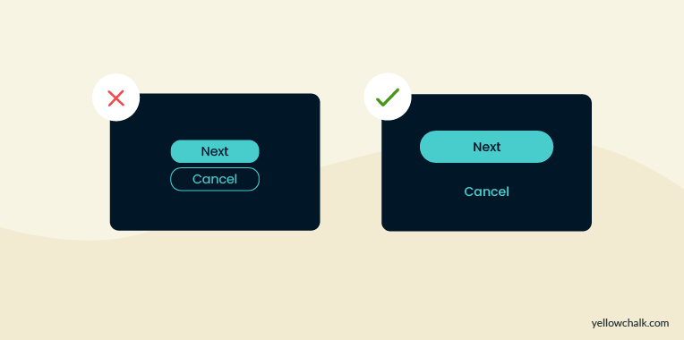
Design your screen layout after researching thumb-friendly zones. This will make sure that your tap targets are user-friendly, as they should be big enough for the users to tap on without hitting something else, or stretching their thumb to an uncomfortable extent. The tap targets should be big enough for the user to tap easily. The smaller the tap targets, the bigger the tendency for the user to tap the wrong target. Research indicates that the average human finger pad is 10 x 14mm and the average fingertip is 8-10mm, making 10mm x 10mm a good minimum touch target size. Make sure to have enough distance between 2 or more tap targets, so the user does not accidentally tap on the wrong target.
Accessibility

One of the most difficult things to do in design is to keep things simple. Simplicity is often mistaken for minimalism, which means the removal of elements. When you have a simple UI, a user can go through a number of actions with just a few steps.
A well-designed product needs to be accessible to different users. It needs to cater to users with vision disabilities, any type of blindness, motor and hearing impairments. such as users with low vision, any type of blindness, motor and hearing impairments. With the inclusive design, people with disabilities can perceive, navigate and interact with your product, which immediately makes it
Make it Responsive
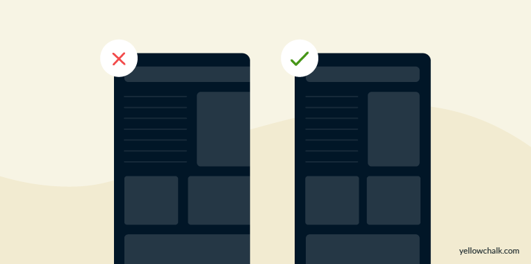
The user interface for any product today must be designed in a way that it is fully usable on a number of different devices and various mobile operating systems. Concentrating on responsiveness is also one of the proven tips to enhance mobile app design by improving its UI.
This is because when you design elements that fit the screens, regardless of the device users are using, they find ease in performing actions. This, in turn, encourages them to spend more time on your platform and add higher value. It also allows users to experience a sense of uniformity and seamlessness throughout their user experience.
Check out our work with the mobile-first education platform – OpenDoor.