GOT A UI/UX
DESIGN PROJECT?
How to Choose Color Palette for UI Design in 7 Easy Steps

Are you ready to add some serious pizzazz to your UI design? Then buckle up, fellow designers, because we’re about to dive into the exciting world of color palettes! Choosing the right colors can make or break your user’s experience, so it’s important to get it right. But don’t worry, we’re here to help. In this post, we’re going to share some tips on how to choose a color palette for UI design that will have your users swooning. They’ll keep coming back for more, we promise!
- Use Color Psychology
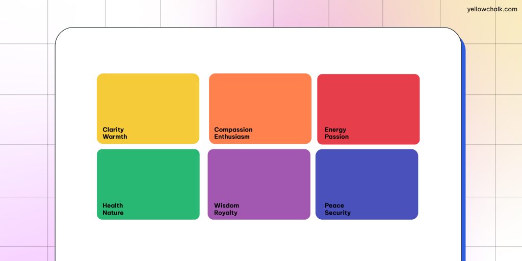
Color psychology is the study of how colors affect human behavior and emotions. By understanding color psychology, you can choose the right colors that will elicit the desired emotional response from your users. Different colors can evoke different emotions from users, so it’s important to choose colors that align with your brand’s personality.
For example, blue is often associated with trust and security, while red is associated with passion and excitement.
Tip: You can read more about color psychology and how to apply it in your design here.
- Consider Your Brand Identity
Your brand identity should be a guiding force when choosing the color palette for your UI design. Your brand colors should be present in your UI design to create a cohesive and consistent experience for your users. You should also consider the personality of your brand when choosing colors.
When we were trying to figure out how to choose the color palette for our UI design, we decided to go with a darker theme for a premium feel. Even though our brand color is primarily yellow, we decided to use it sparingly to highlight the text and icons. Furthermore, in order to not overwhelm the users visiting our website, we used white and pastel shades to differentiate between sections.

Tip: If your brand is playful and fun, you may want to choose bright and bold colors.
- Understand Color Theory, Color Models, and Color Spaces
The first step in choosing the right color palette is to understand color theory. Color theory is the science behind how colors work together and how they can evoke different reactions from users. By understanding it, you can choose the right colors for your UI design that will elicit the desired emotional response.
Additionally, it’s important to understand color models and color spaces. A color model is a color’s mathematical representation, while a color space is a specific range of colors represented using a particular color model. The most common color models are RGB (Red, Green, Blue), CMYK (Cyan, Magenta, Yellow, Black), and HSL (Hue, Saturation, Lightness).
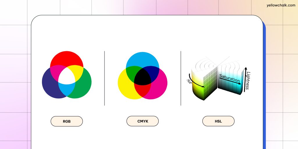
Tip: Exploring Pantone color palettes can also help designers find the perfect colors for their projects.
- Use Color Harmony Techniques
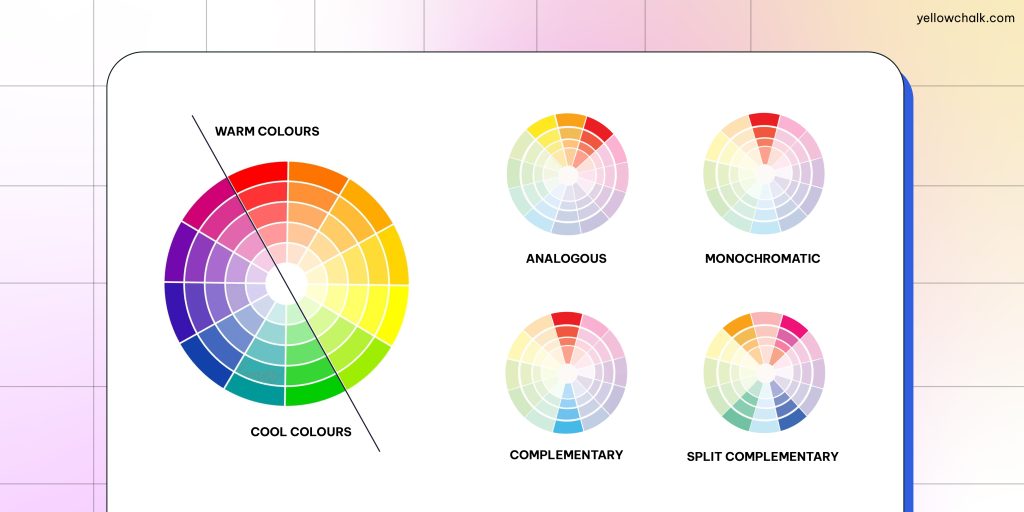
Color harmony techniques can help you choose colors that work well together and create a balanced design. Some common color harmony techniques include complementary, split-complementary, analogous, triadic, and tetradic color schemes. These techniques can help you create a visually pleasing color palette that enhances the user experience.
Tip: You can also use a color palette for app design. There are numerous pre-built color schemes that can save designers time and effort because they are typically mobile-first optimized.
- Make Good Use of the 60-30-10 Rule
The 60-30-10 rule is a useful guideline for creating a balanced and harmonious color palette in UI design. For example, you might use black, purple and white as your dominant, secondary and accent colors respectively. The black could be used for the background of your design, while the lighter purple shade could be used for buttons or headings. The white could be used sparingly to draw attention to specific elements, such as call-to-action buttons.
By following the 60-30-10 rule and experimenting with different color combinations, you can create a unique and visually appealing color palette that supports your UI design goals.

Tip: If you’re using warm gray as your dominant color for the background, go for a cool blue as your secondary color for icons and graphics, and a bright orange as your accent color for buttons and links.
- Consider Accessibility
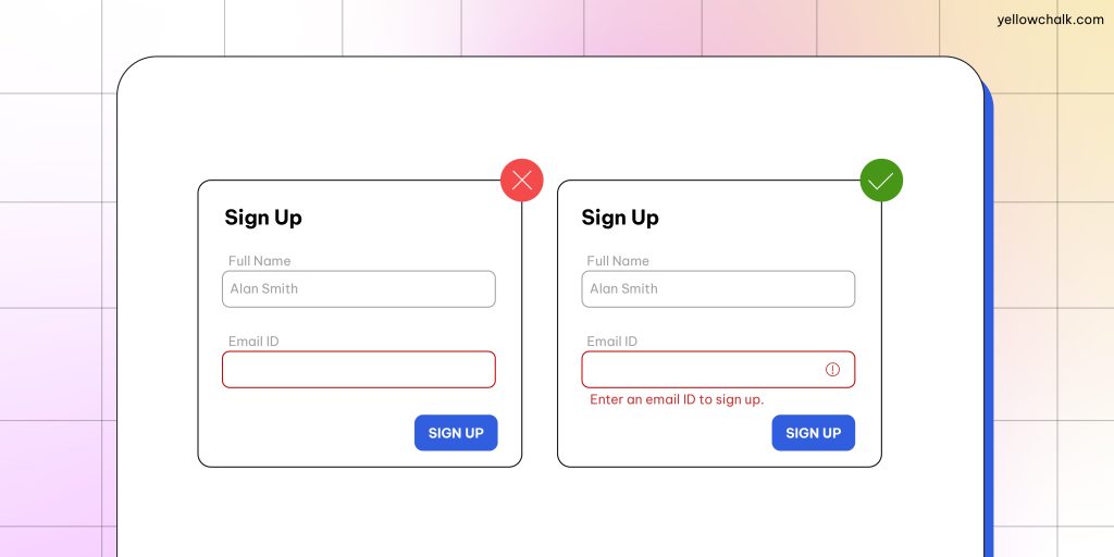
Accessibility is an important consideration when choosing a color palette for UI design. Certain color combinations can be difficult for people with color blindness or low vision to distinguish. To ensure accessibility, you should use high-contrast colors, use icons and avoid using color alone to convey information, and test your color palette with tools like WebAIM’s Color Contrast Checker.
Tip: You can also use a color palette for web design that is premade and optimized for readability and accessibility on different devices.
- Check, Run Tests, Check Again
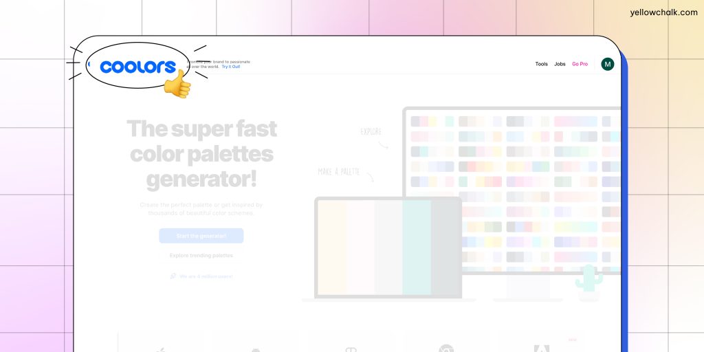
You can use tools like Adobe Color or Coolors to create color palettes and preview them in your UI design. It’s also a good idea to test your colors with real users to ensure that they are effective in evoking the desired emotional response.
Final tip: Go for a dark theme color palette for a sophisticated, modern look while also ensuring reduced eye strain and energy consumption.
You’ve made it to the end of our colorful journey! We hope that these tips on how to choose a color palette for UI design have given you the inspiration to select the perfect color palette. Remember, choosing colors is more than just picking out your favorite hues – it’s about creating an engaging user experience. By using these tips, you’ll be well on your way to creating stunning designs that capture the attention and imagination of your users. So, go forth and let your creativity flow!