GOT A UI/UX
DESIGN PROJECT?
Color Psychology in Design | Yellowchalk Design

Colors play a pivotal role in how you feel and how you perceive your surroundings. On a daily basis, we might be desensitized to color and how it affects us and the decisions that we make but they play a bigger role than we think. In this article, we will go over how color impacts our psychology and the role it plays in design.
In this article, we will explore:
- Color Psychology
- The Color Wheel
- Connotations and Meaning of Colors
- The Usage of Color in Design
- Color Mapping to Industries
Color Psychology
Color psychology is the study of colors in relation to human behavior. It aims to determine how colors affects our day to day decisions.
As we all know, color is a powerful communication tool and can be used to signal action, influence mood, and even influence physiological reactions. Certain colors have even been associated with physiological functions like increased blood pressure, increased metabolism, and eyestrain.
So how do different colors work? How is color believed to impact mood and behavior?
It’s a fact that every culture and country has different connotations of different colors. This is why your feelings about colors are often deeply personal and rooted in your own experience or culture. For example, some color associations, like red, green, and brown, can be explained by looking at where they appear in nature and what they meant for early humans. These colors often enough have universal associations. On the flip side, a color like white is used in many Western countries to represent purity but is seen as a symbol of mourning in many Eastern countries.
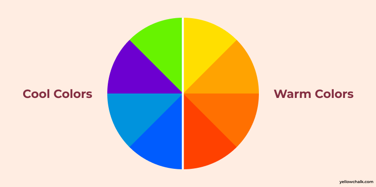
That being said, there are innumerable colors in the color spectrum. Warm colors, or colors on the red spectrum, are believed to evoke emotions ranging from feelings of warmth and comfort to feelings of anger and hostility.
Cool colors, or colors on the blue spectrum, are often described as calm, but can also call to mind feelings of sadness or indifference.
But before we deep dive into the world of colors, let us get some basic information on primary colors and the color wheel.
The Color Wheel
Almost all visible colors can be obtained by the mixing of three colors that are in widely spaced regions of the visible spectrum. If the three colors of light can be mixed to produce white, they are called primary colors and the standard primary colors are red, green, and blue.
A color wheel is an illustrative model of color hues around a circle. It shows the relationships between the primary, secondary, and intermediate/ tertiary colors and helps demonstrate color temperature. Digital teams communicate exact colors through the use of hex codes.
Understanding the Color Wheel
Many color wheels are shown using 12 colors. Using this color wheel as an example, it can be read as follows:
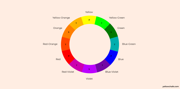
Color wheel with Three Primary Colors: Red, Yellow, Blue;
Three Secondary Colors: Orange, Green, Violet; and
Six Tertiary Colors: Red-Orange, Yellow-Orange, Yellow-Green, Blue-Green, Blue-Violet, Red-Violet, which are formed by mixing a primary with a secondary Three Primary Colors (Ps): Red, Yellow, Blue
Three Secondary Colors: Orange, Green, Violet
Six Tertiary Colors: Red-Orange, Yellow-Orange, Yellow-Green, Blue-Green, Blue-Violet, Red-Violet, which are formed by mixing a primary with a secondary
If you draw a line through the center of the wheel, and you’ll separate the warm colors (reds, oranges, yellows) from cool colors (blues, greens, purples).
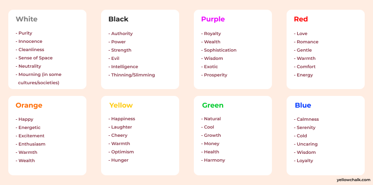
Color: Connotation and Meaning
Every color conveys meaning and a feeling. As we discussed above, this can be subjective based on different cultures and countries. But let us have a look at the broad connotations and meaning of the most commonly used colors.
All colors have a different meaning and are used to represent a certain feeling or emotion. It is very important that these colors are used in sync with what they represent. For eg, you would not want to use yellow in an imagery of sadness, or gray while talking about nature. This is exactly where color theory comes in. The correct usage of color to convey the right emotion, feeling, and the selection of color palettes to do the same is done through color theory. Let us explore color theory in the next section.
What is Color Theory?
Color theory is a framework that informs the use of color in art and design, guides the curation of color palettes, and facilitates the effective communication of a design message on both an aesthetic and a psychological level.
Color evokes feeling. It incites emotion. And it’s not any different when it comes to selecting colors for your business. When you’re designing your logo, product packaging, website, and everything else associated with your brand, color psychology, and color theory play a big role. in mind. Colors are powerful tools, and you can make a powerful statement, or send the completely wrong message, with the color palette you choose.
The Usage of Color in Design
So now let us look at how you can pick a color palette and use it effectively in your designs:
- Choose your Colors Wisely
Commonly, color palettes are made up of six colors. These colors should include one dominant color, four accent colors, and one standard color for your text (which is usually black or grey). Your dominant color is what your customers will associate with the brand, so be careful when reflecting on what this color should be.
- Don’t skimp on Contrast
Color contrast is core to any interface, as it makes each element noticeable and distinct. User interfaces containing only shades from the same color family are unlikely to draw users’ attention—and run the risk of being a complete headache to navigate. On the other hand, the text could become illegible if the contrast is too much. So while it is important not to skimp on contrast, it is also important not to overdo it.
- Stick to Conventions
It’s easy to get carried away with aesthetics over practicality when working with colors. Any user interface doesn’t only have to be visually pleasing but should also be accessible, easy to navigate, and enjoyable to use. Understand the limitations of your users when you are working with “edgy” designs as they can confuse your users, and make them work harder than they need to.
Let us look at some common UI conventions and best practices:
- Using a dark color for text to ensure legibility
- Keeping light colors for backgrounds
- Using contrasting colors for accents
- Sticking to classic call-to-action colors—such as red for a warning sign
- Validate your Choices
The best way to confirm the impact of your color palette is by conducting some user testing! Color palettes should never be a matter of personal preference, no matter how much you adore the colors you’ve chosen. Getting user feedback at the earliest opportunity will ensure you’re creating an interface using colors that your users will love.
After looking at the role color plays on our mind, a basic understanding of color theory, the connotations and meaning of different colors, and how to pick the right color palette, let us now dive into colors commonly used by different industries, and the associations attached with it.
Color Mapping to Industries
Color psychology has become a vital part of branding and logo design in modern commerce. Let us look at which color is generally associated with and used by different industries.

Here is a case study of one of our projects for an asset management software we designed for a client in Singapore. We used a range of different colors to denote the statuses of the assets.
We might forget the importance of color while navigating our day-to-day lives, but going by all that we have learnt in this article, we know that color intrinsically plays a role in the decisions that we make and the things we choose. More importantly, as a business, it plays a huge role in how our brand is perceived and remembered by a consumer/user. So the next time you try to downplay the importance of color, remember that it can be the make or break factor for you to retain and gain customers!