GOT A UI/UX
DESIGN PROJECT?
Typography 101: How to Choose the Right Brand Font
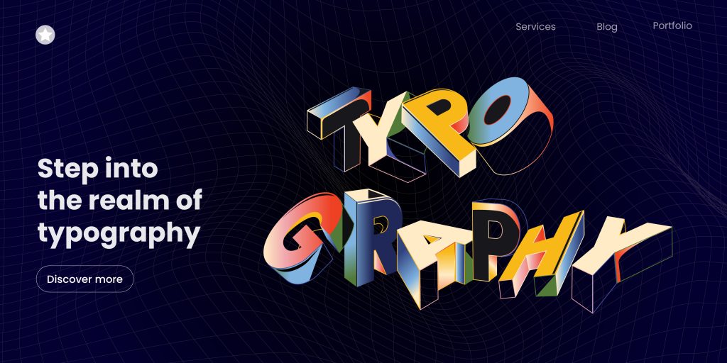
Welcome to the wonderful world of typography, where a font is not just a font, but an essential component of your brand identity. The font chosen for your brand can make a significant difference in whether it is remembered or forgotten. It’s the tool that can help you communicate the personality of your brand and the values you stand for. So, how do you choose the right leading typography for your brand?
First of all, there’s a common misconception font and typeface are one and the same. People do tend to use it interchangeably, but typeface and font have different meanings. To make things easier for the reader, we’ll however be using the terms font and typeface interchangeably.

In this blog post, we’ll delve into the world of leading typography, typefaces styles, branding typefaces, and typeface style guides. We’ll guide you through the process of choosing the perfect brand font to create a strong and memorable brand identity.
So now, let’s start with the basics.
Typography, the art of arranging typefaces to achieve legibility, readability, and visual appeal, encompasses the science of making informed choices. This includes selecting the appropriate typeface, determining its size, incorporating suitable typeface colors, and establishing optimal line spacing. Color psychology, an integral element in this process, contributes to the overall visual impact of the text, enhancing both readability and aesthetic appeal.
How do you get that right? Let’s find out.
Typeface Styles
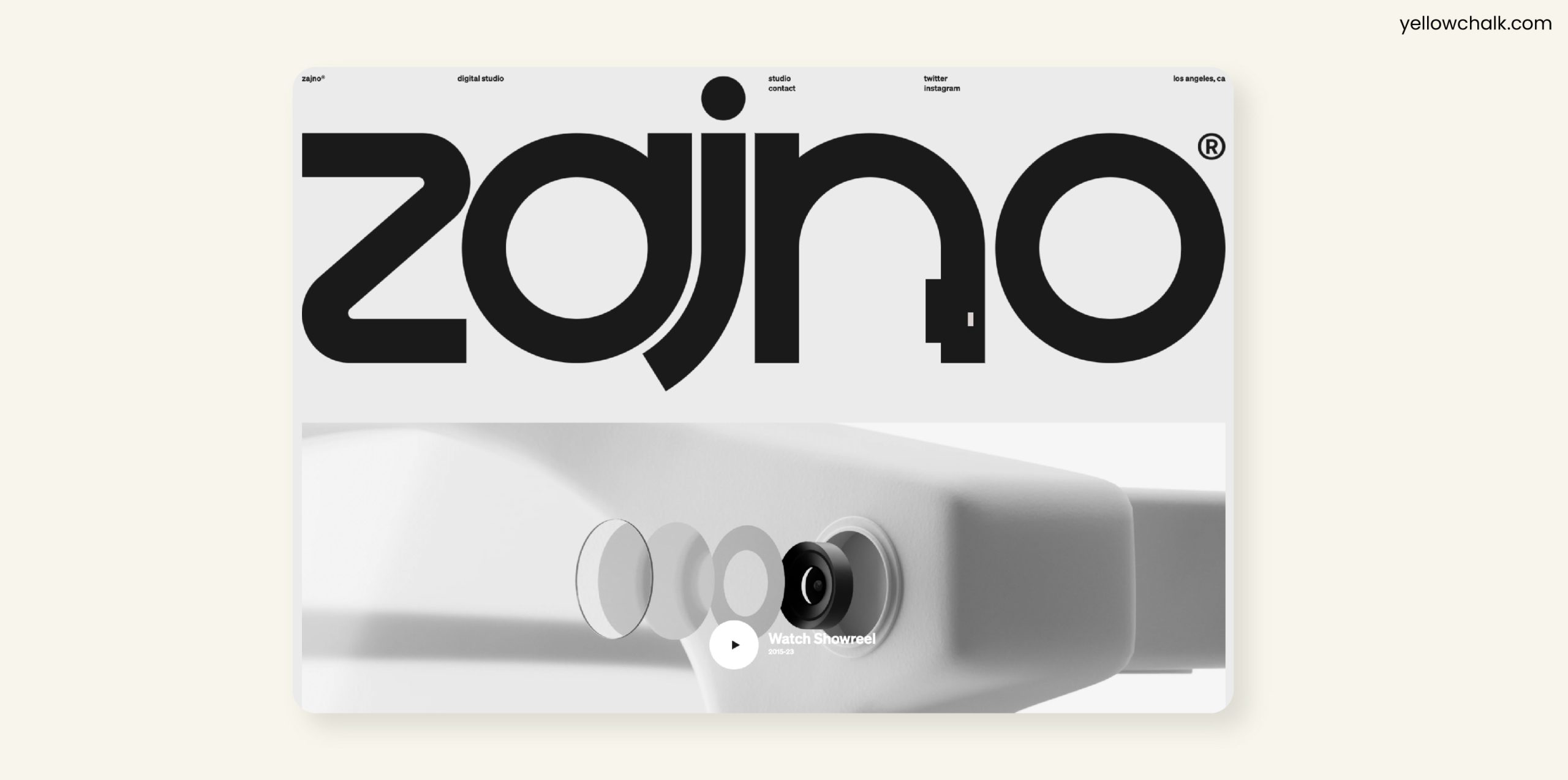
Typefaces styles, which we commonly refer to as fonts as discussed earlier are the variations of a typeface, such as bold, italic, light, and regular. When selecting a font for your brand, it’s important to consider the personality of your brand and what message you want to communicate to your audience. For example, while designing for a tech startup, a bold and modern typeface is perfect. But a luxury brand should go for a classic and elegant typeface.
Branding Fonts
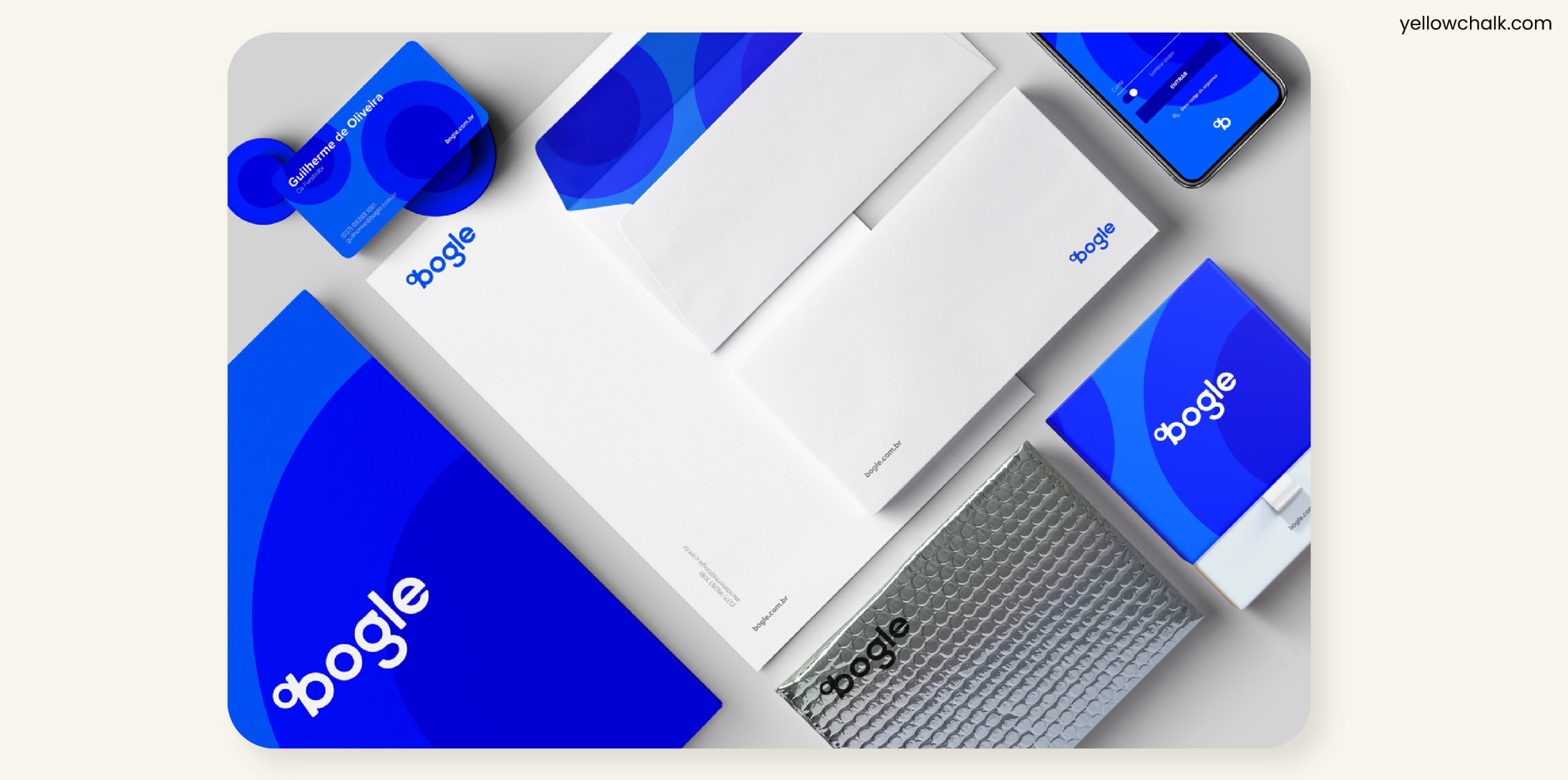
When establishing a brand, you choose specific fonts or typefaces to represent it. All marketing materials, including logos, websites, social media graphics, and print materials consistently utilize these branding typefaces. Choosing a consistent branding typeface is crucial to creating a cohesive and recognizable brand identity.
When selecting a branding font, consider the readability, legibility, and scalability of the typeface. You want your branding font to be easily recognizable in all sizes and mediums, and to convey the personality and values of your brand.
Typeface Style Guides
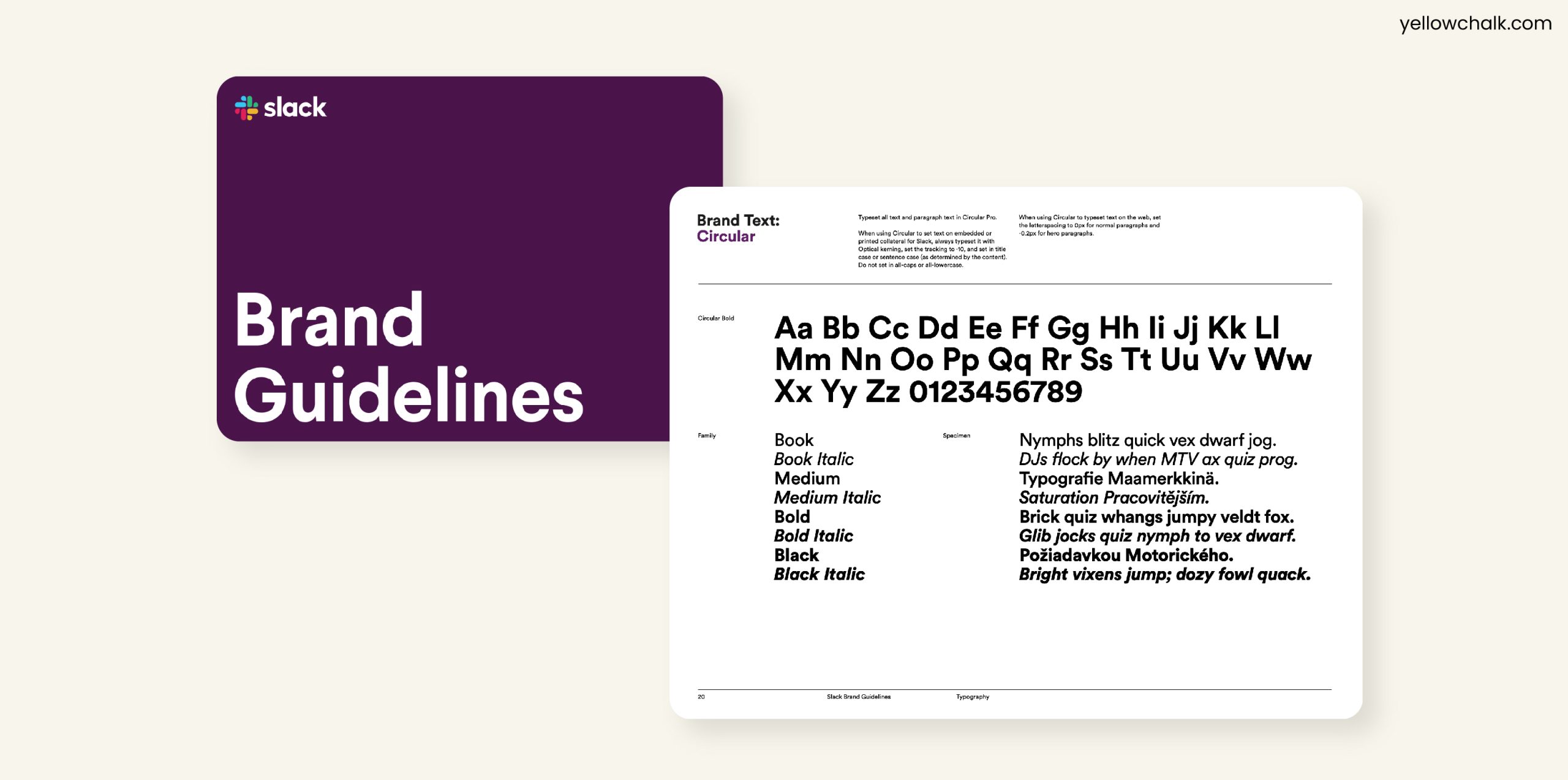
A typeface style guide is a document that outlines the specific usage guidelines for a brand’s typefaces. It includes details such as the typeface family, fonts, sizes, colors, and usage rules for each typeface. Having a typeface style guide ensures consistency in branding and helps everyone who works with the brand to use the correct typefaces.
Different Categories of Typefaces
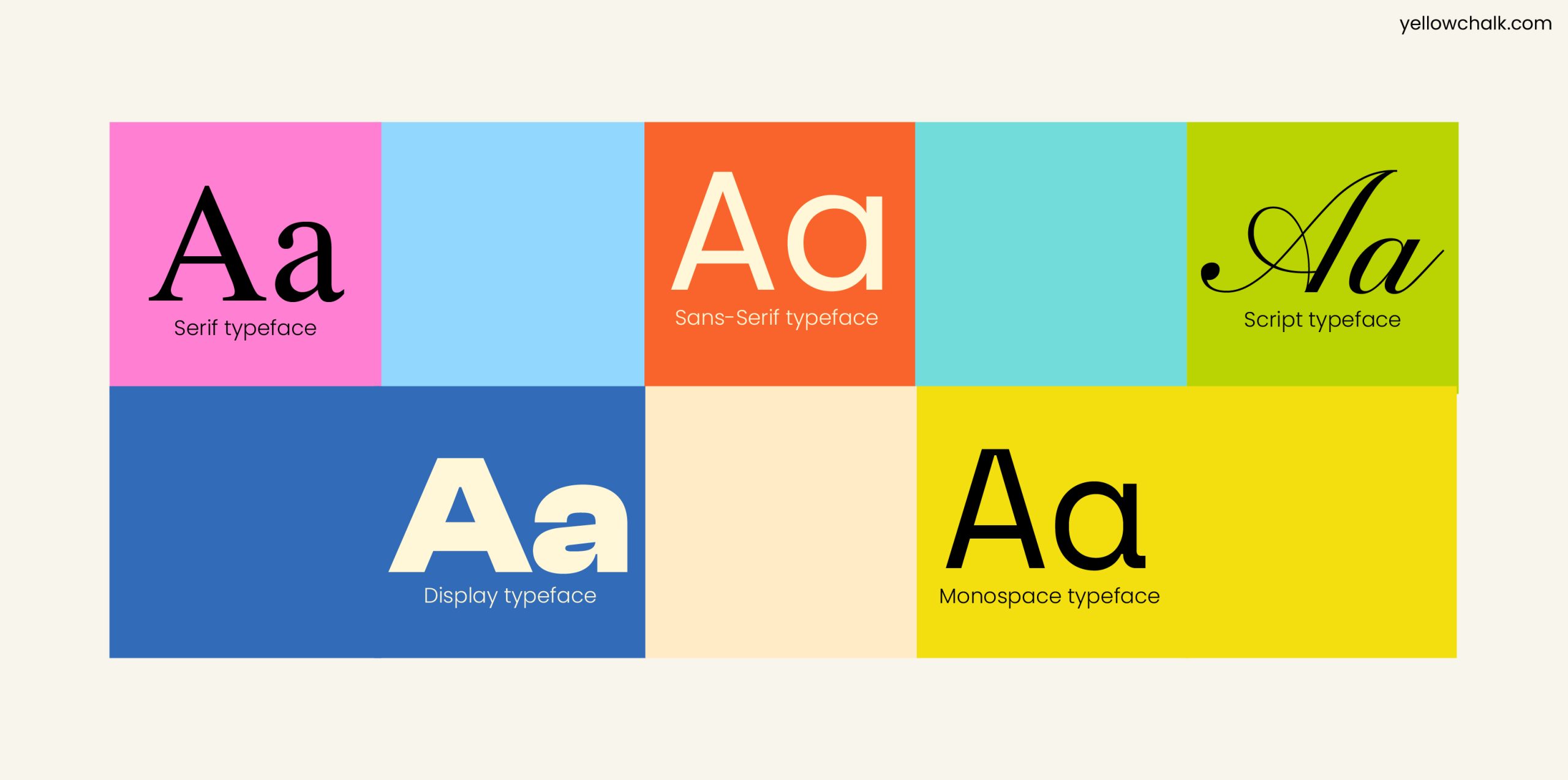
Serif Typefaces: Serif typefaces have small lines or flourishes at the end of each letter. Luxury brands or companies in the finance and legal industries often use serif typefaces. This is because they can communicate a sense of history and tradition. Print materials like magazines, books, and newspapers use these serif typefaces.
Sans-Serif Typefaces: Sans-serif typefaces don’t have small lines or flourishes at the end of each letter. They are viewed as modern, clean, and simple, making them a popular choice for tech companies or startups looking to convey a sense of innovation and forward-thinking. Designers use Sans-serif typefaces for digital materials, such as websites often as they tend to be more legible on screens.
Script Typefaces: Script typefaces look like handwriting or calligraphy, with elegant and flowing lines. They can convey a sense of creativity, and luxury making them a popular choice for brands in the beauty and fashion industries. However, readers find it difficult to read script typeface in small sizes, so they use them for headlines or logos.
Display Typefaces: Display typefaces grab attention and make a statement. They can be bold, and playful, and are a popular choice for brands who portray fun or creativity. Display typefaces are typically used for headlines or logos, as they can be difficult to read in longer passages.
Monospace Typefaces: Monospace typefaces have the same width for each letter, making them look more mechanical and uniform than other typefaces. Professionals often use them in programming or coding, as the consistent width can make it easier to read and edit code. You can use monospace typefaces to convey a sense of simplicity or minimalism.
6 Tips for Brand Typeface Selection
- Evoke the right emotion
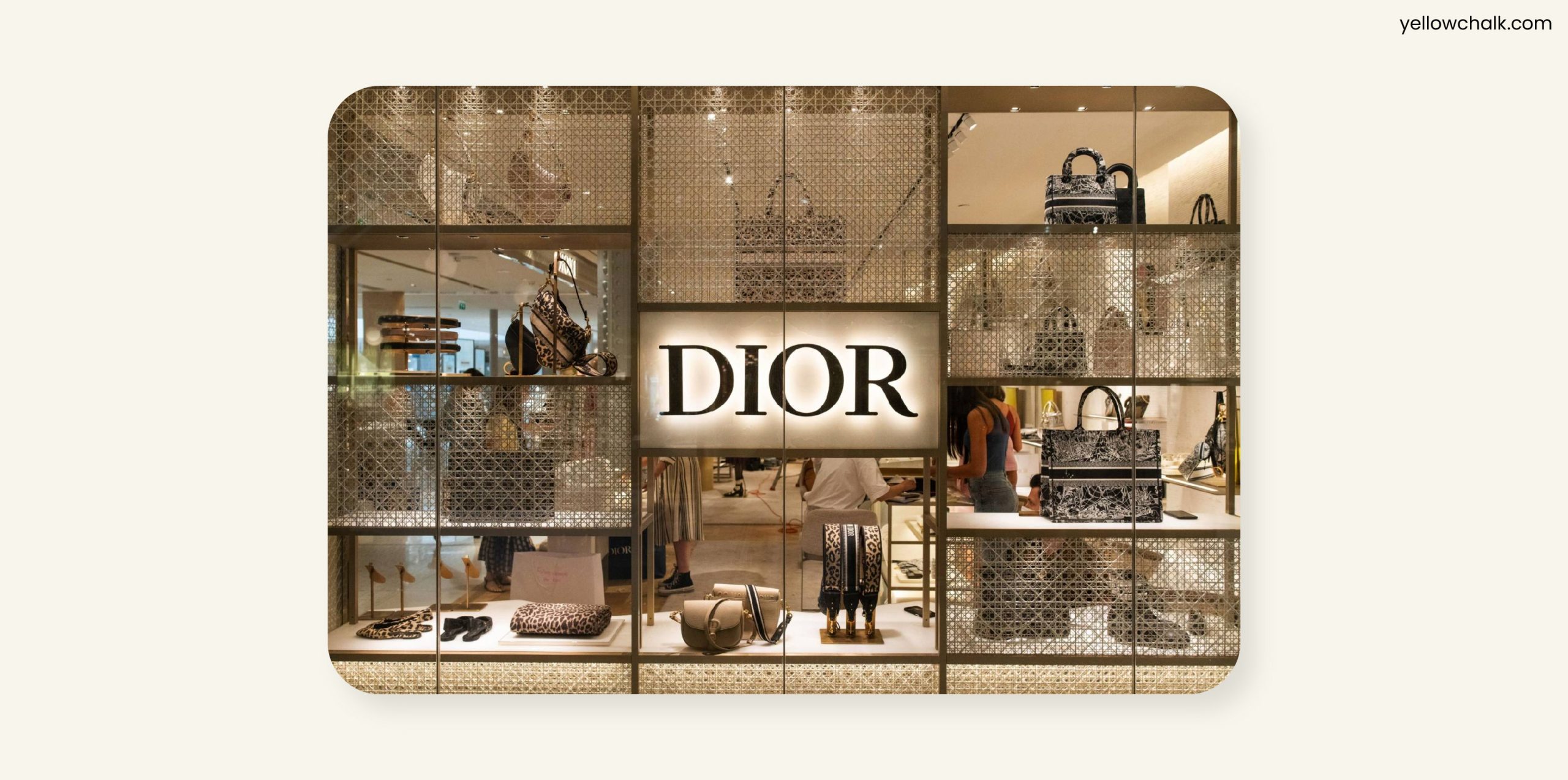
Always choose typefaces that add value to your brand. Different typefaces can communicate different moods and emotions, so it’s important to choose one that reflects your brand’s personality and values.
For example, if your brand aims to convey luxury or elegance, you may consider using a typeface like Baskerville. Baskerville is a serif typeface that has a classic, sophisticated look and feel, and it’s clean lines and elegant proportions can communicate a sense of luxury and refinement.
- Consider factors such as legibility, scalability, and versatility
You’ll want to choose a typeface that looks good in a range of sizes and mediums, from billboards to websites. A typeface that is legible will help ensure that your message is conveyed effectively. Their scalability will allow your design to be used in a range of sizes. Versatility will enable your typeface to be used across different mediums, from print to digital.
One example of a typeface that meets these criteria is Helvetica. Designers have used Helvetica, a sans-serif typeface in various contexts for over 60 years. Its simplicity and clean lines make it highly legible, and it is easily scalable without losing its clarity. Moreover, it is incredibly versatile, making it an excellent choice for a range of design applications, from logos to body text.
- Harmonize with visuals and tone
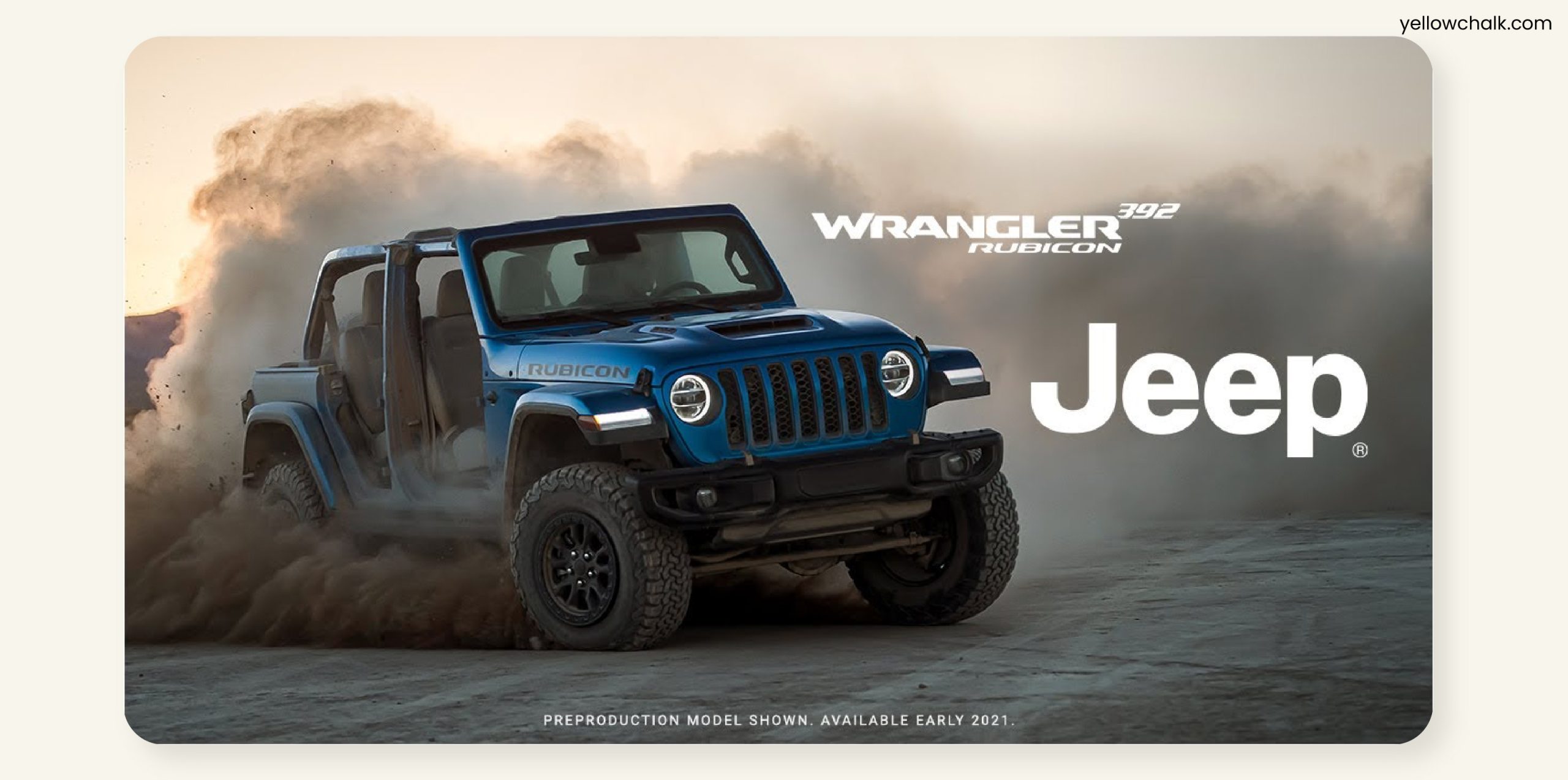
Does the design go hand in hand with the brand’s visuals, content type, and aesthetics? Check that the typeface and fonts you use are in harmony with the brand’s overall content and tone of voice.
What we mean to say is that, if you’re designing for a children’s platform which is heavy on visual depth, the design would be cute, bright, and colorful, so you’d have to choose a typeface that goes with that particular aesthetic. Here usually simple fonts like Sassoon Primary and Futura work best with large and bold font styles for easier readability. You can read more about what typefaces suit children here.
- Determine suitable font pairings and test rigorously.
Check your typeface’s relevance and compatibility before applying it to your design for your brand font. Also, since you need to combine different typefaces for visual hierarchy, experiment with different variations before settling on the perfect pairing that works for your brand’s design. Pairing typefaces can be tricky, as certain combinations can clash and create a jarring visual effect. Here is an example of a typeface pairing that does not go well together:
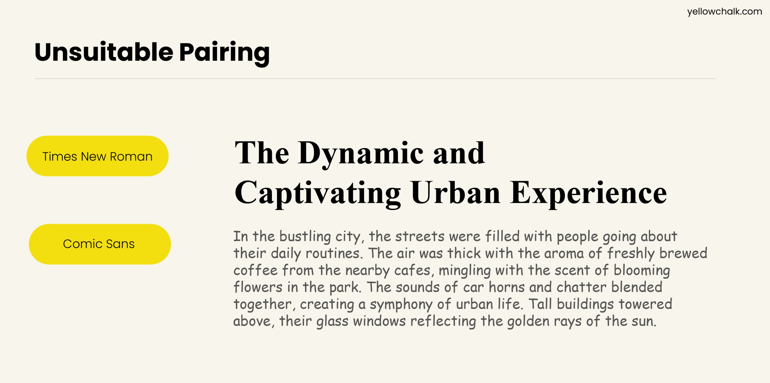
Comic Sans and Times New Roman: Comic Sans is a playful, whimsical typeface. In designs aimed at children or for informal purposes, designers often use comic sans. Times New Roman, on the other hand, is a classic and formal serif typeface that is commonly used in academic or professional settings. Pairing these two typefaces can create a jarring contrast in tone and style, as they are at opposite ends of the spectrum.
- Consider customizing exclusive typography
You can customize existing leading typography or even create a unique font that is exclusive to your brand. This can set your brand apart from others and create a distinguished identity for it.
For example, Netflix has its own style of cinematic typeface. They designed Netflix Sans to have it stand out on a screen. Interestingly, there is a small curve at the top of the lowercase “t” that draws reference from the early CinemaScope lens.
While rebranding, we also came up with a custom-designed typeface for the redesigned logo. You can check it out here.
- Focus on security and protection
Safety is one of the most important factors to take into account while designing a website. You should consult web catalogs to find a secure typeface. Look at Adobe Typekit or Google Fonts, since they’re reliable and accounted for.
Following are 5 popular Adobe and Google fonts that are used widely across products and websites:
Google Fonts
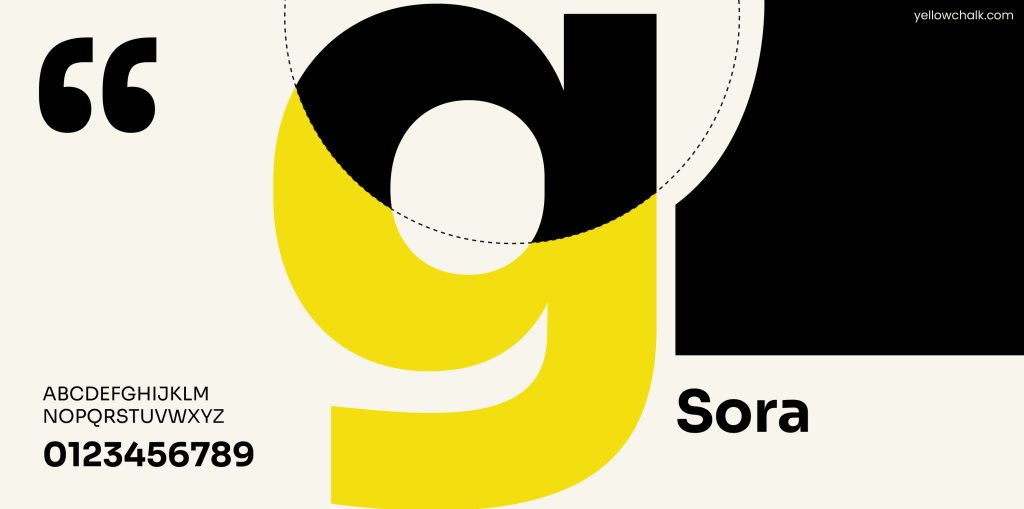
- Sora – Sora is a sans-serif font designed for legibility and readability on digital screens. The go-to typeface for interface design and branding, Sora is a sans-serif typeface. It can be used in a multitude of financial contexts. Sora has low-resolution aesthetics and early screen typography, with effective clarity and readability, ideal for apps and website interfaces.
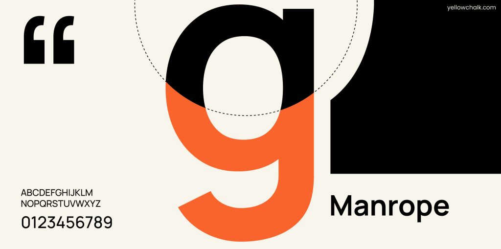
- Manrope – Manrope is a geometric sans-serif font with a balanced and modern appearance. Drawing inspiration from the flowy handwritten script of writers, Manrope was created to act as a tool for script education. Over the years, it has been modified to adapt to the fields of web design and print production. This typeface has a semi-condensed, clean and minimal look to it.
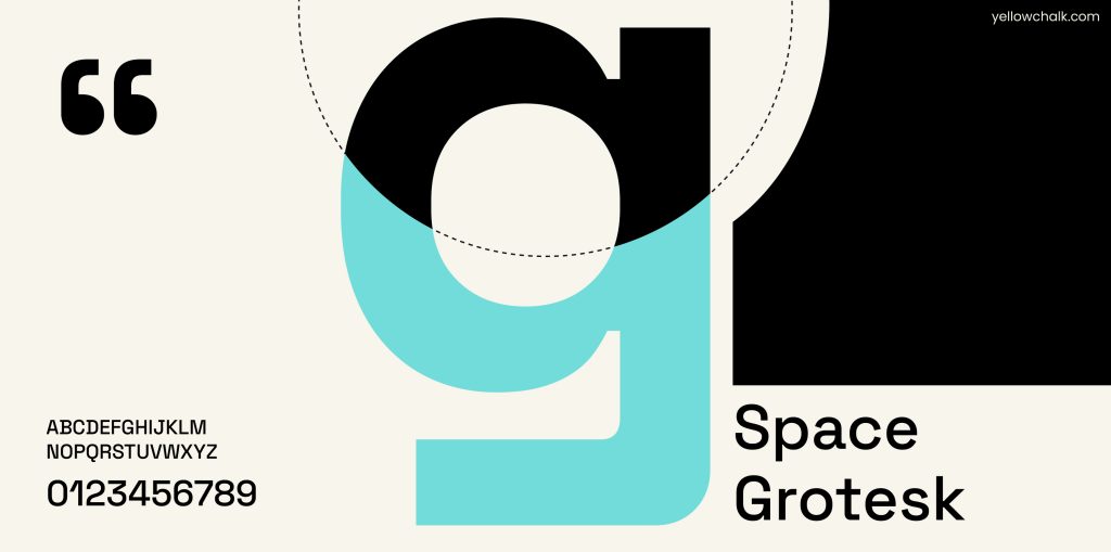
- Space Grotesk – Space Grotesk is a sans-serif font inspired by mid-century design. it is mainly intended for use in headlines and display text. A symmetrical sans-serif typeface, it is based on the fixed-width Space Mono family from Colophon Foundry. Space Grotesk keeps the unique characteristics of the monospace while being optimised for enhanced comprehension at non-display sizes.
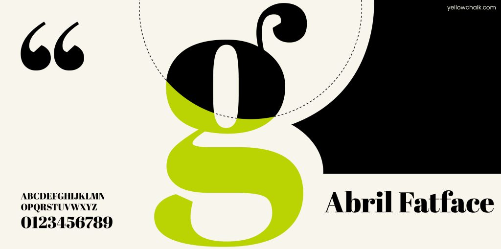
- Abril Fatface – Abril Fatface is a display serif font with high contrast and thick serifs, designed for use in large sizes. The hefty titling fonts employed in 19th-century advertising posters in Britain and France served as an inspiration for this typeface. The design has a polished feel that gives any headline an appealing look thanks to its thin serifs and tidy curves.
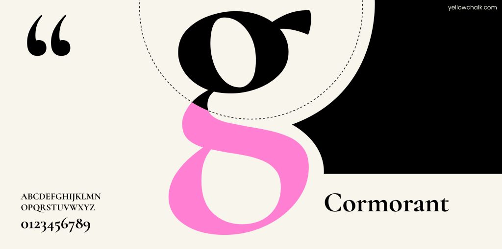
- Cormorant – Cormorant is a family of serif fonts with a classical appearance and a range of styles suitable for various design projects. The project currently comprises a total of 45 font files spanning 9 different visual styles and 5 weights. There were no specific references for it’s design; its creator Christian Thalmann of Catharsis Fonts mostly came up with it from scratch.
Adobe Fonts
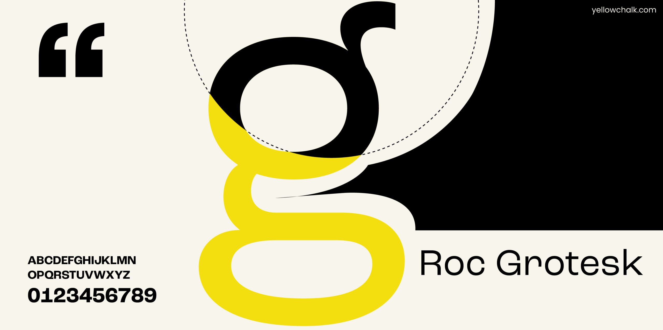
- Roc Grotesk – Roc Grotesk is a sans-serif font with a distinctive style that combines geometric and humanist design elements. This collection has 45 fonts in all, with nine weights and five widths. Along with Turkish, the character set also supports languages from Western and Central Europe.
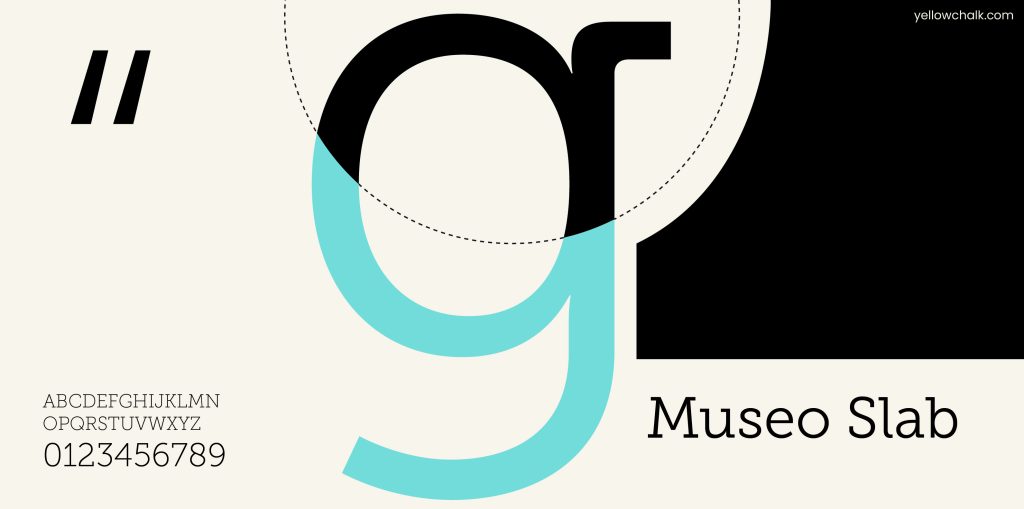
- Museo Slab – Museo Slab is a sturdy and versatile slab serif font with a wide range of weights and styles. This popular Museo font family’s slab serif variation is a wonderful place to start to give your design a contemporary but legible touch.
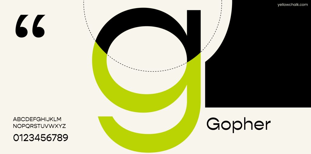
- Gopher – Gopher is a sans-serif font with a friendly and approachable appearance, designed for use in body text. There are 48 fonts overall in the Gopher family, ranging from hairline to heavy. Contrast in typefaces often occurs vertically but Gopher gives the geometric sans style a distinctive appearance by flipping that contrast. It makes the sides thicker and the tops and bottoms narrower.
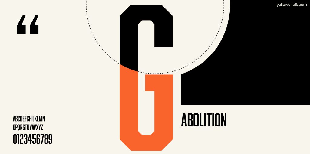
- Abolition – Abolition is a decorative display font. Vintage wood type and American poster design are the inspiration behind its style. With an affinity for looking great on posters and industrial buildings, it is a condensed display typeface. The creator altered Bourbon substantially to make this sans-serif variation of it.
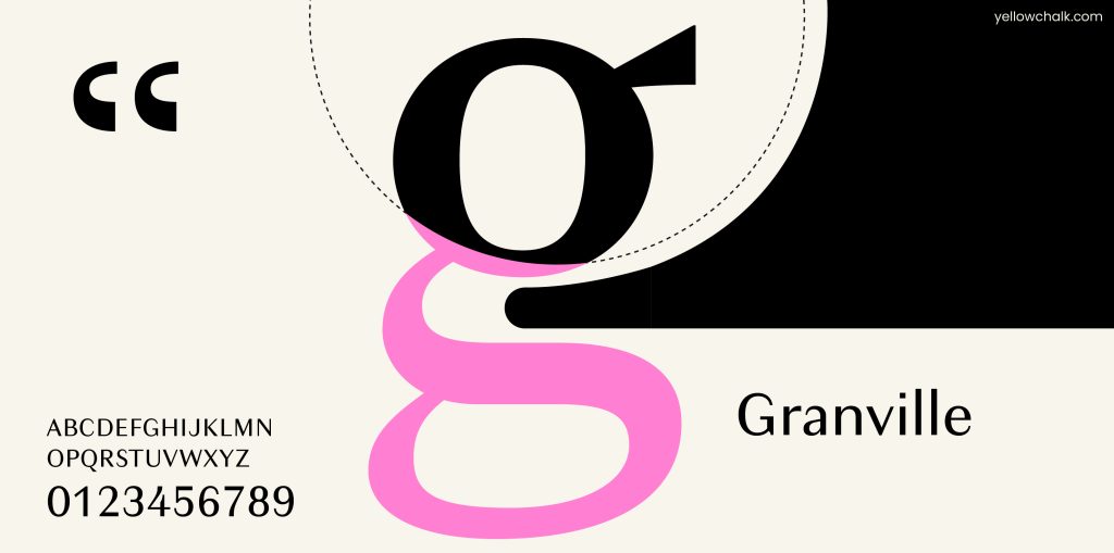
- Granville – In the middle of the twentieth century, advertising text and billboards frequently used the modulated sans serif. It had clear contrast between thick and thin strokes. Granville is a reimagining of this thick-thin style similar to the early French Moderns. One can’t however, tie it to any particular era. Granville’s personality is created from tiny nuances and it is a highly versatile design.
Typeface Trends
Typeface trends can be a great way to stay up to date with the latest design trends and make your brand feel fresh and modern. According to Looka’s blog, some of the predicted typeface trends for 2023 include display serifs, variable typefaces, geometric sans-serifs, serif revival, and handwritten and brush scripts. These typefaces can add elegance, flexibility, modernity, and personalization to your brand’s typography.
However, keep in mind that trends can blow off as quickly as they gain popularity, so don’t just use typefaces for your brand which are trending right now.
Summing Up
In conclusion, choosing the right brand font is a crucial step in creating a successful branding strategy. Remember to consider your brand personality, typeface style, branding typefaces, and typeface style guide when making your decision. With the right typeface, your brand can communicate its message clearly and effectively to your audience and create a lasting impression that will stay with them long after they have interacted with your brand.
