GOT A UI/UX
DESIGN PROJECT?
Embracing Dark Mode: The New Emerging Design Trend and Its Advantages
In recent years, a new design trend has taken the digital world by storm – dark mode. With its sleek and elegant aesthetics, dark mode has become increasingly popular across various platforms and applications. This visually striking design choice offers a refreshing alternative to the traditional light mode. In this blog post, we will delve into the details of dark mode, exploring its rise to prominence and uncovering the numerous advantages it brings to both users and developers.
Dark Mode UI in the Spotlight
Dark mode has emerged as a prominent design trend in response to the increasing prevalence of digital devices in our lives. With the growing reliance on smartphones, tablets, and computers, users are spending significant amounts of time interacting with screens. Consequently, concerns about eye strain, reduced battery life, and overall user experience have prompted the widespread adoption of dark mode.
In the early days of computing, the concept of a “screen” as we know it today was quite different. The term “screen time” now represents our interaction with any digital device, but it’s worth remembering that the earliest computers didn’t have screens at all. Instead, they relied on punch-card printouts and flashing lights to convey information. The first programmable computer, the Manchester Baby, introduced in 1948, utilized cathode ray tubes (CRT) for its display. CRTs were initially developed during World War II for radar systems, where electron guns illuminated phosphors behind a glass screen. However, early CRT technology was not efficient enough to illuminate an entire surface without causing damage. This limitation led to the iconic black backgrounds with green, white, or amber text that characterized computer screens in the ’70s and ’80s. In those early days, dark mode was the default setting for computer screens.
From a scientific standpoint, dark mode addresses several crucial factors affecting our digital interactions. By reducing the amount of blue light emitted from screens, dark mode helps alleviate eye strain and reduces the disruption of our sleep patterns caused by excessive exposure to bright screens. This makes it an ideal choice for low-light environments, improving readability and minimizing distractions.
Dark mode’s impact on user experience extends beyond its visual appeal. The darker color palette creates a sense of elegance and sophistication, offering a refreshing alternative to the traditional light mode interfaces. It allows users to focus on content, particularly when working or consuming media, by providing a distraction-free environment. Additionally, dark mode caters to users with low vision or sensitivity to bright light, enhancing accessibility and inclusivity in digital experiences.
Why is Dark Mode The Latest Trend?
Dark mode has emerged as a prominent design trend in response to the increasing prevalence of digital devices in our lives. With the growing reliance on smartphones, tablets, and computers, users are spending significant amounts of time interacting with screens. Consequently, concerns about eye strain, reduced battery life, and overall user experience have prompted the widespread adoption of dark mode.
Dark mode, in essence, employs dark or black backgrounds with lighter-colored text and elements, as opposed to the traditional light mode with a white or light-colored background and darker text and elements.
The Dark Knight (Mode) Rises
The rise of dark mode can be attributed to a variety of factors. Firstly, our extensive screen time is a primary driver behind its popularity. Whether for work, entertainment, or socializing, we spend hours each day glued to our devices. This can result in eye strain and fatigue, which dark mode has been found to alleviate for many individuals.
Aesthetics also play a crucial role in the widespread adoption of dark mode. Many users find dark mode visually appealing, as it exudes a sleek and modern vibe. Additionally, dark mode is easier on the eyes in low-light environments, making it a preferred choice for nighttime usage.
From a design standpoint, dark mode presents both challenges and opportunities. Designing for dark mode can be more complex, as designers must consider color contrast, shadows, highlights, and other visual cues to ensure that elements are clearly visible. However, dark mode also allows for greater creativity and experimentation, enabling designers to play with contrasts and textures in innovative ways.
Dark mode also has implications for accessibility. While it is essential to ensure that designs are accessible to everyone, individuals with visual impairments may find dark mode more conducive to reading and interacting with content. This emphasizes the importance of designing with accessibility in mind and offering options that cater to different user needs.
The future of dark mode is promising, with its continued prevalence as a standard option. Additionally, we can anticipate the emergence of new variations, including alternative color schemes and dynamic designs that adapt to the time of day or user preferences.
Advantages of Dark Mode

Enhanced Visual Comfort
One of the primary advantages of dark mode is its ability to reduce eye strain. The high contrast between dark backgrounds and lighter text or elements creates less visual fatigue, particularly in low-light environments. Dark mode’s reduced luminance minimizes the impact on the eyes, resulting in a more comfortable reading and browsing experience.
Improved Readability
Dark mode offers enhanced readability, especially when reading for extended periods. Dark mode improves legibility and scanning by reducing brightness and increasing contrast. This benefit is particularly advantageous for users with visual impairments or conditions like dyslexia, as the higher contrast enhances readability.
Extended Battery Life (for OLED Displays)
Dark mode can extend battery life on devices with OLED displays. Since OLED screens can turn off individual pixels when displaying dark or black pixels, dark mode consumes less power, allowing users to enjoy longer usage times.
Focus and Attention
Dark mode can create a more immersive and focused environment, enabling users to concentrate better on the content at hand. By reducing distractions and minimizing the visual noise often associated with bright interfaces, dark mode helps users direct their attention to the primary content. This advantage is particularly valuable in applications such as photo and video editing, where color accuracy is crucial.
Aesthetically Pleasing and Modern
Dark mode has gained popularity due to its visually appealing and modern aesthetics. The dark background provides a sophisticated and elegant look, making interfaces appear sleek and polished. Dark mode also allows other design elements, such as vibrant colors and icons, to pop, creating a striking visual contrast that adds to the overall user experience.
Effective Strategy for Implementing Dark Mode on Your Website
Utilising dark mode in design can have a powerful impact on various platforms, including mobile apps, smartwatches, and TV interfaces. However, it’s crucial to implement it correctly to ensure a positive user experience. Here are some essential tips to consider when designing a dark mode website or app interface:
Determine When to Use Dark Mode
Dark mode should be implemented strategically, considering factors such as brand identity, compatibility with the existing color palette, and the type of content being presented. If your brand’s colors already lend themselves well to dark mode, it’s a favorable starting point. However, if your brand relies on a wide spectrum of colors or if changing to a dark mode aesthetic compromises the brand identity, it may be best to explore other options.
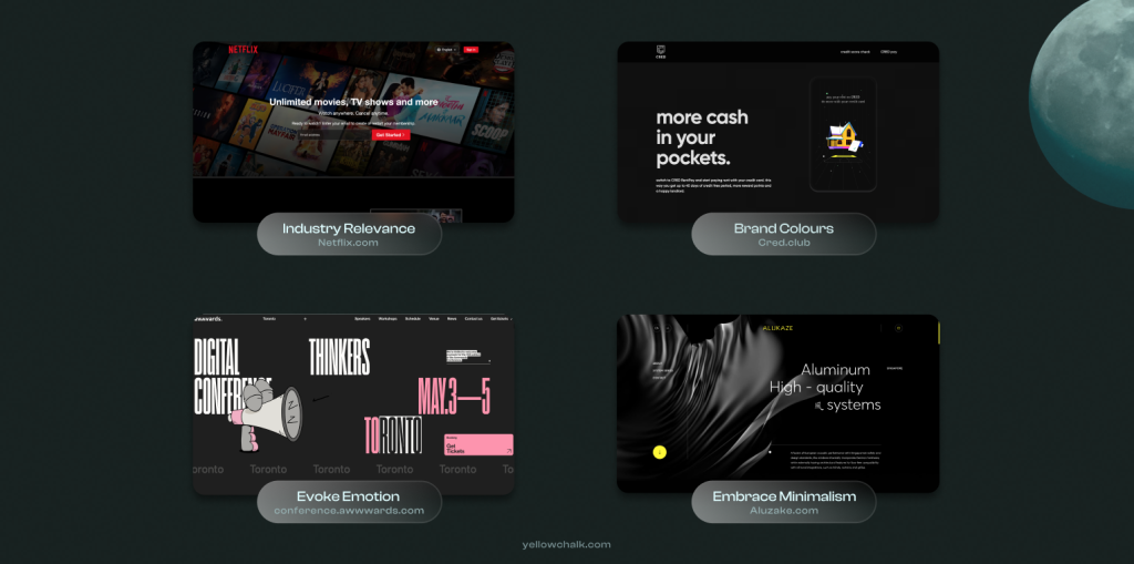
Match Your Brand Colors
When implementing dark mode, ensure that it aligns with your brand’s overall color scheme. The transition from light mode to dark mode should feel seamless and maintain brand recognition. Consistency in colors and visual elements is key to creating a cohesive and harmonious user experience.
Consider Industry Relevance
Dark mode can be particularly suitable for industries associated with nightlife and entertainment. Brands operating in these sectors can leverage dark mode to enhance the overall atmosphere and create a sense of high energy that resonates with their target audience.
Embrace Minimalism
If your design aesthetic already leans towards minimalism with limited content, dark mode can complement it well. However, in situations where text plays a crucial role, legibility should be carefully considered. Dark mode has the potential to amplify visual clutter, making it even more challenging to navigate a screen that is already crowded.
Evoke Emotion
Dark mode can be an effective tool for creating specific emotional responses. The reduced visibility and increased contrast inherent in dark mode can evoke a sense of mystery or drama. If your brand aims to elicit these emotions, dark mode can serve as an ideal visual vehicle.
By carefully considering these tips and tailoring dark mode implementation to your specific brand and content, you can create a visually compelling and user-friendly experience that captivates your audience.
Conclusion
Dark mode has emerged as a new and exciting design trend, revolutionising the digital user experience. With its myriad benefits, including enhanced visual comfort, improved readability, extended battery life (for OLED displays), improved focus, and a modern aesthetic, dark mode has become a favoured choice for many users and developers alike. As we continue to embrace technology in our daily lives, dark mode will likely remain a significant aspect of the evolving design landscape, providing users with a visually appealing, comfortable, and immersive digital experience.